Iconic Evolution: Valeros

Tuesday, May 14, 2019

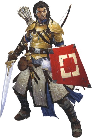
We did it! We've made it through all 11 updated iconics who will appear in the Pathfinder Core Rulebook in August! There's a twelfth iconic, of course, who didn't get a video because he hasn't evolved from a previous iteration, but never fear—Fumbus doesn't mind sharing the spotlight with his friends, especially not Valeros, who the goblin alchemist is particularly fond of for his ability to drink so much! Sure, it's ale and not pickle brine or strange alchemical concoctions, but Fumbus appreciates anyone with an appetite (or thirst) that rivals his own. Valeros is one of the iconics who changed the most between editions, switching out his second sword for a shield. Check out this short video of a conversation between artist Wayne Reynolds and Paizo's Publisher and Chief Creative Officer, Erik Mona, for a glimpse into the mind of Pathfinder's most iconic visual artist and the first official look at the new version of Valeros, the iconic fighter!

And that wraps up our Iconic Evolutions series. Thanks for taking this journey with us! Next week, we'll start looking at some of the changes to the Pathfinder setting as presented in the Lost Omens World Guide, also releasing on August 1. Stay tuned for a glimpse into the Age of Lost Omens, where your characters are set to embark upon their greatest adventures.

Mark Moreland
Franchise Manager
More Paizo Blog.
Tags: Fighters Iconic Evolutions Iconics Pathfinder Roleplaying Game Pathfinder Second Edition Valeros Wayne Reynolds
1 to 50 of 69 << first < prev | 1 | 2 | next > last >>
Grand Lodge

Huzzah!


Hmm. . . Radical, yet reminiscent. TWF to Sword and Board. His armor looks much slimmer making him look smaller than he really is, and seems like a hit and run type fighting style. I’d have to see a side by side comparison to know if i like one better than the other, but i can’t think of a critique to give. This just looks very well done and the different, although very reminiscent, new art style.

Overall: Good job, looks very well done. : D


2 people marked this as a favorite.
Pathfinder Roleplaying Game Superscriber

Valerie is still a sexy human fighter, and I think the shield adds nice touch and a splash of color to his look.

Well done Wayne, also love the details like the holes in his clothes.


9 people marked this as a favorite.

Looks like Valeros got hit with the slimming brush as well, losing some of his muscle tone with it. Not sure I'm fond of that overall theme in the art.*

The gear I really like, especially in the hirez version that makes it clear just how much he has been through.

Sovereign Court

I miss his mug.


1 person marked this as a favorite.

Aw, he rescued some poor kid's kite. And now I'm remembering how many times in the second Spider-man movie game I had to catch that balloon.

Dark Archive

5 people marked this as a favorite.
Pathfinder Adventure Path Subscriber

His mug is still there. Befitting a Caydenite, his shield is protecting it.


I like the new and improved Valeros.

Liberty's Edge

8 people marked this as a favorite.

This is the first PF2 Iconic art I legitimately just like less than the PF1 version.

I think it's mostly some of the color choices (I'm not a huge fan of the shape of his shield, but it's not the end of the world). The really bright yellow/gold of his armor (too bright, IMO) just goes really badly with the red and white shield, for me.


4 people marked this as a favorite.
Blog wrote:
Fumbus doesn't mind sharing the spotlight with his friends, especially not Valeros, who the goblin alchemist is particularly fond of for his ability to drink so much! Sure, it's ale and not pickle brine or strange alchemical concoctions, but Fumbus appreciates anyone with an appetite (or thirst) that rivals his own.

Valeros just hasn't tried a nice Andoran Spicy-Sour Pickle Wild Ale or Dill Pickle Ustalavic-Style Gose yet.

---

I never paid much attention to 1E Valeros, but 2E Valeros still looks nifty I guess. I think I like this less muscle bound version better; he's still strong and intimidating to foes without having to keep up his membership at Unrealistic Super-Muscle Gym.

Dark Archive

The face certainly has a lot of personality.

I'm not sure I like the personality, but there's a lot of it. :)


5 people marked this as a favorite.
Pathfinder Adventure Path, Lost Omens, Starfinder Adventure Path, Starfinder Roleplaying Game Subscriber

In one video or another, the Directorsaur actually talked about Valeros a while back, about how he was actually a fighter whose strength was lower than some of his other scores because of the fighting style he began with... so his build doesn't fuss me much.

One thing that works far better for me (purely because of how Valeros is portrayed in the comics and in fiction snippets) is that he looks cockier here- which is funny, since he took to using a shield after, you know, dying. Old Valeros' "iconic" image (rather than his other appearances) looked downright somber, so this captures his personality better.


1 person marked this as a favorite.
Set wrote:

The face certainly has a lot of personality.

I'm not sure I like the personality, but there's a lot of it. :)

I do like that smirk


I like Valeros's new facial expression, and I think this picture communicates his personality well. The shield is too clashy for me. I generally like the trend of turning up the color on the Iconics, but it's too much here.


4 people marked this as a favorite.

I am very curious on the color choices here. Why a bright red shield? Why the goldish-yellow armor? I would have liked to see a more tarnished, brassy, colored armor, and as for the shield, anything that wasn't so bright would be okay, but would have liked to see a more earthy/wood color.

Lastly, the shape of the shield. Since he is the Iconic Fighter, it would have been nicer to see a more..... traditional shield. Something with less of a point at the top, and rounded coming down to the bottom. I'm all for Fantasy getting away from historical designs, but something less "Kite" shaped and more "Shield" shaped. I can only hope that will shields being dented and broken, that Valeros finds something a litter nicer as he levels. :D


15 people marked this as a favorite.
Pathfinder Roleplaying Game Charter Superscriber; Pathfinder Starfinder Adventure Path, Starfinder Roleplaying Game, Starfinder Society Subscriber

I know some people have noticed the smaller physiques in Pathfinder 2, but the Pathfinder Society brought in mandatory testing for a reason and if physiques are smaller now that pretty much paints a clear picture of what was going on behind the scenes with potions of Bulls Strength.


1 person marked this as a favorite.

But that flamewar aside, I like this one. The stance is a little odd and I kind of echo the other comments about the color scheme and the shield, but overall I do like it.

It's a lot brighter than the old one, but still seems nicely grungy at the same time. That outfit's definitely seen some hard use. I like the layering on the armor too.


all right.

best looking so far. past Seoni even though I dont like her new look....

taht cloak of hers..


3 people marked this as a favorite.
Xenocrat wrote:
Valeros's and Sajan's scrawniness make Amiri less objectionable in hindsight - clearly PF2's art direction has adopted an all is chaos, nothing matters, YOLO approach to this sort of thing.

I think there's something to that. Part of the reaction to Amiri may just have been that she was first. The others make it clear that it was part of an overall art shift, not intended to be a specific change to her.

That said, I don't think it's anything like "all is chaos, nothing matters, YOLO". It's just a shift in art style.


11 people marked this as a favorite.
Xenocrat wrote:
clearly PF2's art direction has adopted an all is chaos, nothing matters, YOLO approach to this sort of thing.

I'm pretty sure this isn't the case. We repeatedly sent naunet missionaries to WAR's studio trying to convert him to Chaos, but he always answered that he wasn't at all interested.*

* When we kept at it, he threatened to redraw all 2E proteans as hideous warty extraplanar frogs -- EWWWWWWW! -- so we're leaving him alone.


:-)


1 person marked this as a favorite.

Yeah, I'll agree that it now seems to be more art direction/style than intentionally drawing the characters to appear skinnier looking than their originals. Everyone is skinnier in look. Amiri and Valeros are a bit off to me, but it is what it is.

However, that breastplate is hideously bright.

I do like the smirk though. Actually, all the faces I like in the new versions.


Less Bro, more Daario?


2 people marked this as a favorite.

I agree with the others about the colors being too bright. That's an issue with all of the iconics, the colors are just much brighter and more "comic-booky" for lack of a better word. And here it just seems odd. The breastplate is too shiny gold, the shield is just too red (and weirdly shaped and kind of small looking) and the white padded skirt just really makes it all look worse in contrast. The shield placement in this image is also a bit odd. Looks more like it's boss gripped than strapped the way the shield is supposed to be. The distance from his arm just looks wrong.


5 people marked this as a favorite.
Deadmanwalking wrote:

This is the first PF2 Iconic art I legitimately just like less than the PF1 version.

I think it's mostly some of the color choices (I'm not a huge fan of the shape of his shield, but it's not the end of the world). The really bright yellow/gold of his armor (too bright, IMO) just goes really badly with the red and white shield, for me.

Having listened to Wayne's reasoning for why he designed Valeros the way he did (specifically, that Valeros picks up and uses equipment from all over the world on his travels), I'm actually kind of digging the fact that his armor and shield clash a bit. It certainly feels like he picked them up from two entirely different locations.


1 person marked this as a favorite.
Xenocrat wrote:
Valeros's and Sajan's scrawniness make Amiri less objectionable in hindsight - clearly PF2's art direction has adopted an all is chaos, nothing matters, YOLO approach to this sort of thing.

I think it's more YA than YOLO. Most of them have been slimmed down to builds you'd find in a much younger crowd. I can't say I care for the change. That said, when I was a kid I really liked the D&D cartoon characters and they were similarly physically disconnected from their abilities. If a new group of kids needs something like this, then cool.


6 people marked this as a favorite.

Personally, I LOVE that cocky grin of his. Kinda says, "yeah, I can take you". Or in his case, "what you gonna do? kill me? yeah..been there, done that, got better, try again"


Love the grin, and I agree that combined with the slimming down of all the Iconics he Looks a lot younger. Which may be intentional, but we don't know. There is always the trouble that the iconics look the same across all Levels they represent.
Also sad to see the mug go - it was a great world-building and character Detail. I'm sure further Images will include it again, but it's still missing.


2 people marked this as a favorite.
Pathfinder Adventure Path, Lost Omens, Starfinder Adventure Path, Starfinder Roleplaying Game Subscriber
DerNils wrote:

Also sad to see the mug go - it was a great world-building and character Detail. I'm sure further Images will include it again, but it's still missing.

The mug's right there.

Behind his shield- that's not a scabbard opening, that's his friggin' tankard. Might be he polished it up a bit.


Ohh, thanks for pointing that out - I indeed thought that was his scabbard! I think I am not the only one to make that mistake, the positioning very much Looks like a scabbard, and the colouring does not scream metal mug to me.

Anyway, good news everybody, the Mug is alive!


2 people marked this as a favorite.

I clicked on the image to get a full shot of it and...it looks great. The shield isn’t s glaring red, nor the breastplate too bright. To me. I can see how it might be for others.

@Wayne - the level of detail here is quite incredible. The way you’ve painted the light and shadow catching on the padded skirt to create puffs and shallows is amazing. Deep kudos. Also, is there anywhere we can see the three pages of shield sketches? And just somehow, this shield evokes old Basic and early Advanced DnD module/book art... Very nostalgic...


2 people marked this as a favorite.
Pathfinder Roleplaying Game Superscriber

Hah, my friend who strongly identifies with Valeros is going to love this.

Also all the comments about the mug being covered by the shield now has me picturing him literally holding the mug with his shield grip hand, so that he can sip from it while he blocks. 10/10 mental image. :P


Can somebody illuminate for me the reasons for the change from twf to sword & shield style?


4 people marked this as a favorite.
Pathfinder Roleplaying Game Superscriber
Nicos wrote:
Can somebody illuminate for me the reasons for the change from twf to sword & shield style?

In character the reason is that Valeros died and decided to take steps to avoid repeating the experience.

Out of character the reason is that the devs a) wanted an iconic fighter that focuses on a more iconic build for the class, and b) wanted an iconic that shows off 2e's fancy new shield rules.

Shadow Lodge

3 people marked this as a favorite.

3 notebook pages of shields, and THAT's the one you go with?!

Liberty's Edge

If the white thing behind the shield is his mug then it looks like he lost his sword sheath. On the old art the sheath hangs down his left side. Looks like it is absent here.

Grand Lodge

I'd say it's behind the shield, pointed behind him.

Shadow Lodge

2 people marked this as a favorite.

Yes, we see those heroes every day.

Customer Service Representative

12 people marked this as a favorite.

Deleted some posts. Folks, we’re not here to pick apart the anatomy of our iconics, or to give critiques on Wayne’s art just because it’s not your exact interpretation of what you think a body should look like. Critiques are fine and dandy, but we’ve already given guidelines for what is and isn’t appropriate to discuss when these art blogs are published. Criticism based on gendered body stereotypes isn’t one that’s up for debate.

It’s perfectly ok to discuss the way the iconics’ bodies may have changed with the new iteration of their portraits. Questions like “when I imagine a fighter with 18 strength, I picture XYZ. It's hard for me to imagine how a strength of 18 would look like the artwork. Would someone help me understand how this could work?” is a respectful way to have a dialogue about the changes. But things like “Person X can’t look too bulky, she’s a woman,” are not what we’re looking for.

If you have any questions or concerns regarding a moderation decision, please contact us at community@paizo.com.


4 people marked this as a favorite.
Pathfinder Roleplaying Game Superscriber

None of the iconics look weak, to me, but I think average is a good term. The 2e versions of the iconics look more like people, and less like superheroes.

I can see that not being to everyone's taste, but it works for me.

1 to 50 of 69 << first < prev | 1 | 2 | next > last >>
Community / Forums / Pathfinder / Pathfinder Second Edition / General Discussion / Paizo Blog: Iconic Evolution: Valeros All Messageboards

Want to post a reply? Sign in.