


| Dana Huber RPG Superstar 2015 Top 32 , Marathon Voter Season 8, Dedicated Voter Season 9 aka dien |
| 3 people marked this as a favorite. |

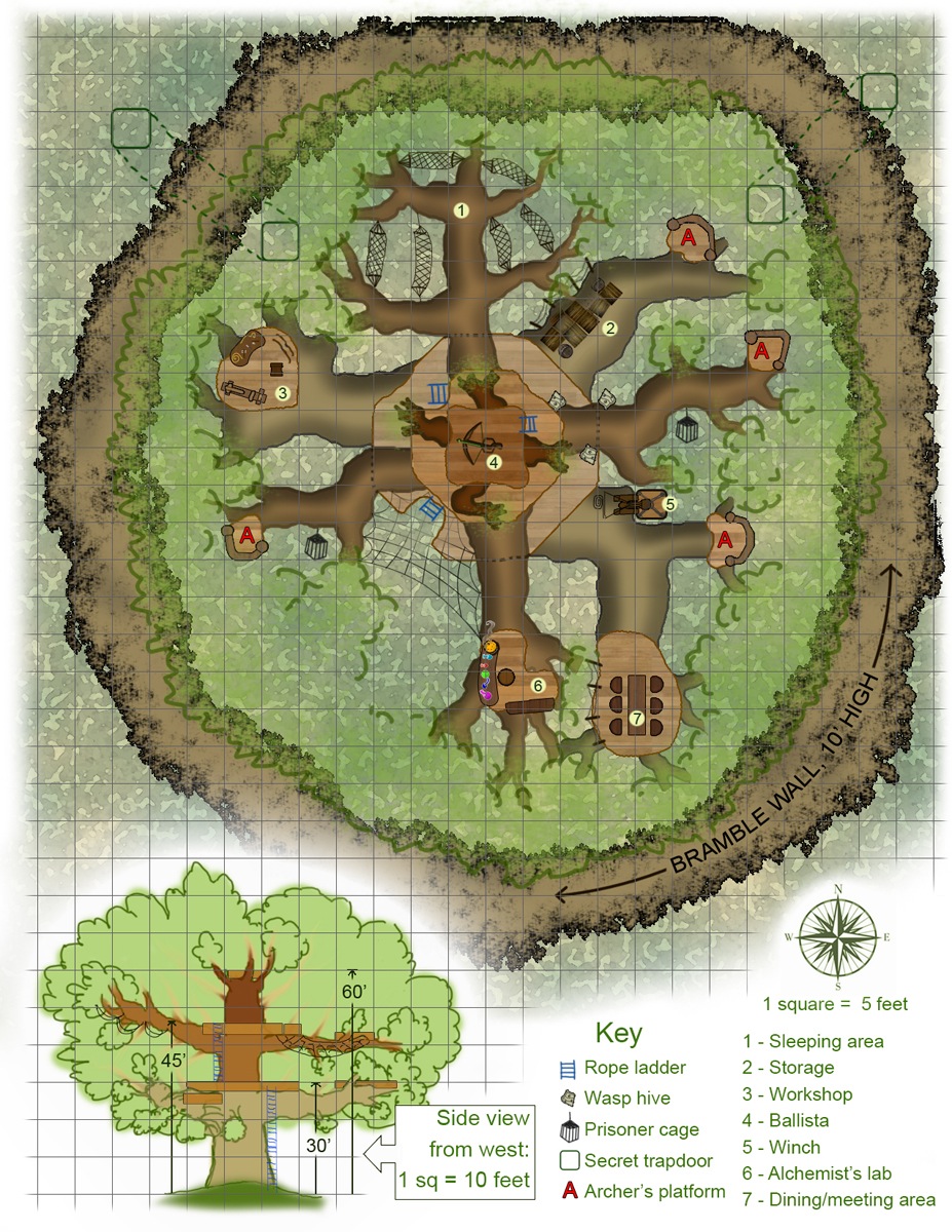
Elven Guardpost on the Tanglebriar Border
| Robert Lazzaretti Cartographer |

Nice looking map reference upon first glance.
There is a compass rose and scale present on the map.
Nicely detailed map reference. Well done.
Sort of a been here before location unfortunately sad because the map itself is nicely done just not very inspired.
I do not recommend this map to progress to round 3
 Crystal Frasier
Contributor
Crystal Frasier
Contributor
|

The Good
This is a colorful location, and the details are excellent. You don't see a lot of treehouses these days.
This is a different idea for a dungeon, and I like it. PCs have a lot of ways they can explore, but they'll be vulnerable to threats in other parts of the encounter the whole time.
It has a key, scale, and compass.
The Bad
The layout is a little confusing, imposing a multi-leveled structure's various stories onto one map. This map would be far better off breaking the various levels into their own maps.
This is a very small space for a full-page map. It feels like a half-page map, or a half-page map if you broke out the two levels into their own maps for clarity.
I have no idea what the dotted line structures in the northeast and northwest represent
My Judgement
A good idea, well-rendered but not well communicated; I'm on the fence. My gut says a weak recommendation to advance to the next round.
 Owen K. C. Stephens
Modules Overlord
Owen K. C. Stephens
Modules Overlord
|
| 1 person marked this as a favorite. |

Drawing from my blog on maps, and the rules for the round, I’ll judge the maps on a number of questions.
Is It a Full Page Map?
Yes. It manages to get in a full (small) stronghold, its defensive wall, a secret entrance, and a side-view that clears things up without eating up a lot of page space.
Does The Map Have A Compass Rose and Scale? Are They Used Well?
Yes, and yes.
Is The Map A Place I Want To Adventure?
Yes, especially since there's some opportunity for ambushes and siege encounters. It would also make a fun base of operation. On a practical level, the briar wall gives the tree a defensive element it would otherwise lack, which helps make defend-the-tree encounters more fun.
Is the Map Clear?
The two central platforms are right over each other, so it's hard to tell what's being mapped there. Are we just seeing the higher of the two platforms? Also, the netting could be mistaken for webbing, and it's a little hard to tell what level it's at even with the side view. The hammocks are pretty big according to the scale, so I'd like to know if they are just big hammocks, or cargo nets, or traps, or what.
Is the Map Detailed?
Even though this must convey multiple levels, and interior rooms, and secret tunnels, and a briar wall, it adds details like tables and chairs. The side-view is small (which is appropriate) and conveys useful information. I'd want to have the designer add some details, but the map is worth doing that.
The new twist and good overall design to a standby idea push this into being a map I DO recommend proceed to round 3.
| Jacob W. Michaels RPG Superstar 2014 Top 16, RPG Superstar 2012 Top 16 , Marathon Voter Season 6, Marathon Voter Season 7, Marathon Voter Season 8, Dedicated Voter Season 9 aka motteditor |
First reaction to the map itself is that looks cool, which is a good reaction, though of course I'm trying NOT to judge on artistic merit.
Looking closer, it's a little difficult to make out what's on which level (and without the side view, it'd be impossible), but it does look like there are different colors. I think I'd prefer separate maps for each level if I saw this published.
Massive trees aren't anything really new, but at the same time, I think there's a reason they're popular. They're cool adventuring sites that bring you into a three-dimensional combat, and I think I'd enjoy running or playing in this location.
I haven't made any decisions yet, but my gut reaction is I like this and I'll consider voting for it.
 James Casey
RPG Superstar 2014 Top 16
,
Marathon Voter Season 7, Marathon Voter Season 8
aka Jrcmarine
James Casey
RPG Superstar 2014 Top 16
,
Marathon Voter Season 7, Marathon Voter Season 8
aka Jrcmarine
|

This is a nice map that I like. The location idea does hearken back to the Gygaxian modules, but I still like it.
I believe the dotted areas are tunnels that lead through the brambles, but that really should be labeled. Also I assume the bramble wall surrounds the base of the tree but the bramble wall is missing in the side view of the location. It should be there and wouldn't posed a problem because it is only 10 ft high and the first level of the tree is 30ft high.
I am on the fence for this one.
| Lucus Palosaari Star Voter Season 6, Star Voter Season 7, Star Voter Season 8, Star Voter Season 9 |
| 1 person marked this as a favorite. |

At first blush, this map might "seem" like something that isn't worth including (it's a representation of something that many books might comment on "the elves have various watchtowers throughout the forest" etc.) BUT, and here's why it's my 4th favorite... it's a really well done version of this old idea AND I could see many adventures based on this thing.
From finding it, taking it over, defending it, retaking it, hiding in it, a chase through it, etc. the possibilities are endless.
I would love to use this as a parties' early "base of operations" in a Kingmaker-esque exploration and conquest game.
Also, excellent addition of the side view of the tree.
| John Bennett RPG Superstar 2011 Top 8 , Dedicated Voter Season 6, Star Voter Season 7, Dedicated Voter Season 8 aka John Benbo |

This is definitely an ambitious map to take on. I agree with the comments about making each story its own map- as it is, I would find this somewhat difficult to use at the table.
| Rite Publishing |

I think this would make a very good isometric map, its real weakness it is done two dimensional here.
| RJGrady |

An excellent map, but up against some tough competitors in the multilevel map arena.
| PFW1-K1 |
BEEP BOOP for more information PLEASE SEE:
Tanglebriar, home of the demon lord Treerazer; and Kyonin, the elven nation containing Tanglebriar.
| Maurice de Mare RPG Superstar 2013 Top 16 , Marathon Voter Season 6, Marathon Voter Season 7, Marathon Voter Season 8, Dedicated Voter Season 9 aka Darkjoy |

10th map I have seen, your current rank is 5-6 ish, nice visuals, but not enough meat.
| Feros Champion Voter Season 6, Champion Voter Season 7, Champion Voter Season 8, Champion Voter Season 9 |

The artistry of this map cannot be denied. It is probably the most beautifully done elven tree guard post I have ever seen. There are some nice little details and the whole is very well constructed with some thought into how such a base would be set up for proper use.
The problem is that there is almost nothing new here. The only thing making this a Golarion elven guard post is the name and the addition of wasps nests (connected to Calistria, no doubt). This isn't a very exciting locale. It's great as the detail of a larger regional map that has a number of these posts scattered around, but that is all.
Sadly I will not be voting for this beautifully done map as it does not have a strong enough fantasy feel.
| frank gori RPG Superstar Season 9 Top 32 , Marathon Voter Season 6, Marathon Voter Season 7, Champion Voter Season 8, Marathon Voter Season 9 aka GM_Solspiral |
| 1 person marked this as a favorite. |

Challenge: Is this map difficult to execute? Does it in my opinion demonstrate the characteristics of a Superstar designer?
Technique: Did the designer show some skill and consideration in the choices made on the map. Are the words used in the key wise choices that add to the overall utility of the map?
Utility: Can a GM/cartographer make sense of the map and make immediate use of it?
Overall:[b] I'll rate the Map as an A for strong recommends B for weak recommends C on the bubble D for weak rejects F for Do not recommends
Challenge: A tree/map is challenging as heck. You picked a trope and re imagined it well in my opinion.
Technique: This is beautiful and interesting and borderline art.
Utility: I am going to use this as in I will print it... heck I could frame it.
Overall: A for me as in this deserves a vote. Some naysayers might deride it as a trope or call out the general utility but in my eyes this is totally a rule of cool issue.
 Sporge
|

At first glance I want to vote for it, but the devil is in the details. The tiered structure makes it hard to tell where things are. If someone is able to fly or just good at acrobatics questions to the gm will be can I get to x platform in such amount of movement and I am not entirely clear where each is in relation to each other.
I'm also guessing because of the stacked boxes that you can walk on the larger branches just fine, but it isn't really called out which ones are flat or which ones you need to balance on.
Last issue not so much in the mapping, but why did they let wasps nest so much so near to the center of their base? Either they are raising them or the wizards/ druids should have removed them ages ago haha.


| Oceanshieldwolf Dedicated Voter Season 6, Dedicated Voter Season 7, Marathon Voter Season 8, Star Voter Season 9 |

Very beautifully rendered.
I'm afraid there isn't really much here beyond the fact that this is a (extremely, really cool) treehouse guard post. With an alchemist's lab and some wasp nests.
I don't agree that this is confusing, the side view specifically indicates even the direction it is viewed from - there are a lot of little details that show the designer has thought about brachiation and arboreal habitation - which makes me think they could do so for other maps too.
It's not a grand adventure or even a mysterious one. I feel like I've seen it before as well.
However, it is very well done, and logical within its own parameters. Which is what you want in a turnover for an adventure. The Ophidian Coil showed promise - this does too.
| Mark Griffin RPG Superstar Season 9 Top 8 , Dedicated Voter Season 7, Star Voter Season 8, Star Voter Season 9 aka Mark D Griffin |

My favorite thing: I like the idea of an encounter in a tree where you could be getting hit from all sides from different branches.
Other things I like: It's very pretty, and I could see this being an actual layout of a guard-post in Kyonin
My least favorite thing(s): Doesn't feel like a full page map, it needs something more. Also I find the side view a little confusing. Also if I wanted to see a tree mapped somewhere near the Tanglebriar, I want it to be a tree dungeon. Show me Witchbole!
Will I vote for it: This guy is definitely in my top 16, but not in my top 8. I believe in comes in at my 13th spot, so I will not be voting for this map but I hope you proceed to round 3.
| Dana Huber RPG Superstar 2015 Top 32 , Marathon Voter Season 8, Dedicated Voter Season 9 aka dien |
Thanks to everyone who has taken the time to comment!
I'm biting my tongue hard on answering questions I've been asked, of course, due to the contest rules, but the feedback has given me ideas on how I could have done this map better. Thanks!
 Avatar-1
Star Voter Season 6
Avatar-1
Star Voter Season 6
|

I am so confused with this map. The more I look at it, the more I like it and the less I understand it. So I stop and take a closer look, and still can't work it out, and somehow I still want to play in it. Would it be easier to understand if it wasn't rendered? Maybe, maybe not, I dunno.
What is happening here?
|
verdigris
Dedicated Voter Season 6, Marathon Voter Season 7, Dedicated Voter Season 8
|

I love this map! I like the levels and the secret tunnels leading through the briar wall. I think the coloring on the side view was enough to help me figuring out which level each platform was on. I would (and am) definitely considering using this in an adventure.
| Jaragil Marathon Voter Season 8 |

Even though it's such a cliché, I actually haven't seen that many elven treeforts before, so points for that.
At first, this looks great, but the more you look at it, the more you start to pick up on the minor mistakes. Like the fact that it is a bit hard to read after all. It's also pretty confusing why there's webbing between those two branches, or why alchemist's lab of all things. I also have no idea how that ballista is supposed to work through all those branches and leaves. Through sheer inertia? How are you supposed to aim at anything unless it's an especially sparse tree, but in that case you're plainly visible.
But, I do like it just the same. The different levels seem logical, are smartly not on top of each other more than they have to, it seems to have all the necessary spaces for it to be functional as a guardpost and I could definitely see myself using this. Perhaps it's not as awe-inducing as some others, but it shows promise. I'll give it maybe.
| Garrick Williams RPG Superstar Season 9 Top 16 , Star Voter Season 7, Star Voter Season 8 aka Cyrad |

It's a pretty map at a glance. It looks a busy and difficult to understand at first. Normally, I can forgive that, but for all that effort, there really isn't much to the map. You can pretty much see the whole map from the ground floor and the players will likely finish exploring it in an hour or two. I'm on the fence for this one, but it's certainly an interesting map that's better than most I've seen this competition.
|
Owen K. C. Stephens
Modules Overlord
|
Official Round 2 Note: On Map Resolution
We’ve had some comments on legibility of smaller type on the maps, and the contestants are (by the rules of the contest), not allowed to clarify anything, so I want to make a general statement about maps and resolution.
When we required all contestants to present maps at a specific dpi and size, we did so because in past years we’ve had some issues with maps (for the encounter round) being sent to us in different sizes, resolutions, and dpi, making it difficult to give them all a high-quality presentation for the contest. We found that asking for a higher dpi than we’ll use in the end allowed us to create a standard of presentation that kept all images crisp and clean. For encounter-round maps, this has worked well.
Unfortunately, since this round requires all text be provided on the maps themselves, many contestants used the dpi and size standards we required as the basis for making sure their text is clear, and otherwise tried to keep words as small as possible so as to not clutter their maps. This was done in the (reasonable) belief that the maps should look good at the size we asked for, rather than in any different size we might present on our website. When resized for smaller, high-quality images, this can result in words that aren’t clearly legible.
We’ve made a change to rescale everything to the higher end of maximum image size for uploaded images for all maps that were entered this round. This should allow for better legibility for voters when selecting their favorite maps to advance in the contest. It is our fault that this process was not properly communicated to our contestants, so consider this when adjusting or finalizing your selections.
Obviously, we’ll explain what is going to happen to the images of maps, and how to allow for it, more clearly in future rounds (and future contests). My apologies to any contestant with a map that has suffered as a result of how we handled scaling in this round.
|
James Raine
RPG Superstar 2012 Top 16
,
Star Voter Season 6, Dedicated Voter Season 7, Dedicated Voter Season 8
aka FaxCelestis
|

http://i.imgur.com/72W1FhO.jpg
Here is how your map appears to a colorblind end user. Your use of color is almost completely outside the visible spectrum for a deuteranope, which significantly decreases the map's visual appeal and legibility.
| Raynulf Star Voter Season 8 |

First off: Congratulations on making Round 2, and the best of luck in the votes!
Coolness: Do I look at this, and want to use it in a game? Does it provoke wonder or amazement? Does it hold potential for interesting encounters, adventures or roleplay? How much mileage does this map have in it?
Usability: How usable is this for me as a GM (being that GMs are actually the primary audience of most maps)? Is the legend clear and in logical order for play? Does it give me enough information to easily visualize the parts and wax poetic about the varied locations? Does it have the necessary details for me to run with it on the fly, or will it involve a lot of improvisation? Does it have any glaring oddities that stop me mid-breath to go "what the hell is that?!"?
Craftsmanship: Is it clear, legible and containing all the necessary bits and bobs? Does it make good use of the space? Is the scale appropriate for the detail (and visa versa)?
(I suppose you could also call them "Creativity, Functionality and Skill", but I like my terms better :P).
Coolness: A-
- Positive: At a glance I can see a bunch of ways this can be used: A hostile elven encampment; a destroyed outpost populated by monsters; a roleplay scenario for travelling adventurers; a base of operations for an elven party. It's thoughtful, carefully put together to give defense against ground and air and playing to elven themes and strengths.
- Negative: By its nature (pun intended) the map doesn't give as much delicious detail as one could normally cram into a full page, meaning you get less mileage out of it.
- Verdict: A-. It's an old theme, but one rarely pulled off with this flare (in my experience), and while it's a tad less map than I'd ordinarily prefer, it's intricate and detailed.
Usability: B+
- Positive: Key locations are labeled, elevations are noted from the side view and notable features are explained in the key. Rather than being merely a combat outpost, it caters to the actual needs of the inhabitants, including the details that, for me, bring a building (or treehouse, in this case) to life. Each level is color coded, so can be identified
- Negative: Stacking the central portion onto the one map, even if color coded, makes things a bit harder for me, as I need to 'extract' the layers to transcribe them for play. It does look good, but I don't think was the best choice.
- Verdict: B+. Other than a little bit of level-wrangling, this baby is ready to go.
Craftsmanship: A-
- Positive: It's clear, legible and almost everything is referenced and annotated. The scale makes sense and the detail is appropriate for it.
- Negative: Stacking the layers makes it a bit harder to use, the secret tunnels could use text adjacent to them, as it's possible to miss the key entry as referring to the dotted lines, and lastly the map is not as space-efficient as it could be (partly due to tree's being trees, but the full bramble hedge was perhaps not required.
- Verdict: A-
Overall: A-
| Browman Dedicated Voter Season 8, Dedicated Voter Season 9 |
Unfortunately there are more maps I like than votes I have. That pushes this map into the category that I hope advance but won't vote for.
This is a really awesome tree guardpost that could be used in many campaigns, but it isn't unique enough to push it into my top 8.
| Jeff Lee |

Overall, a fairly decent map. Most of it is well-labeled and the side view was an important addition to help visualize the total layout. The underground tunnels should probably been noted on the key, however, for the sake of clarity, and the typical method of indicating a trapdoor seems to be a bold-lined square with a "T" in it.
I'd question the positioning of the ballista, however. While the archer's nests are closer to the end of the branches, having the ballista in the center means it has to shoot through all those branches and leaf cover, unless it's firing upon targets that have already gained access to the tree. Seems fairly ineffective.
| Mark Nordheim RPG Superstar 2014 Top 16, RPG Superstar 2013 Top 32 , Marathon Voter Season 6, Dedicated Voter Season 7, Marathon Voter Season 8, Dedicated Voter Season 9 aka Morphemic |

Here are my ratings for this map:
First Look: A
Very good looking map.
Interest Level of Location: B
You made it look really interesting, but actually exploring it in a game wouldn't take very long.
Tactical Depth: A
Either defending this post or attacking it would make a very memorable fight.
Adventure Potential: B
I'd love to use this in an adventure, even as a main encounter. The map itself doesn't suggest much beyond that one encounter though.
Clarity: A
I found this easy to understand.
Logic: B
I'm not sure I've even seen a tree with 10-foot wide, completely horizontal branches before. How could the trunk support all that weight?
Overall: A-
| Grumpus RPG Superstar 2014 Top 32 , Marathon Voter Season 7, Marathon Voter Season 8, Marathon Voter Season 9 |

Well executed, very cool location.
I had this ranked #13, hope to see you advance, good luck!
| Kiel Howell RPG Superstar Season 9 Top 32 , Marathon Voter Season 6, Marathon Voter Season 7, Marathon Voter Season 8, Marathon Voter Season 9 aka theheadkase |

I am critiquing this without reading others' first:
A tree base! Yay!
If only it WAS a treant...
A ballista in a tree...I'm not sure how effective that would be through foliage...unless it as the very top and meant for anti-aerial?
Archer's platforms raise the same question, especially with the amount of foliage the drawing represents.
Nice little cross-section.
Overall, I want to really like this map, but I can't give my vote to it. It doesn't functionally make sense and it just isn't interesting enough. There's stuff going on, and it should be really cool, but the functional layout detracts so much from this.
| Lady Firedove Star Voter Season 6 |
| 2 people marked this as a favorite. |

Life is still crazy, but internet is finally working well again, so here's some feedback:
Elven Guardpost - Love, love, love this tree fort, and I love the way it clearly shows all three levels in one beautiful top-down map. Did I mention I love this map? Want to use it in a game right now... assault it, make it my own, run social encounters here, defend it, etc...
I really don't understand why some find it confusing... Look at the side view... The three levels are color-coded from richer brown for the top to more faded brown for the bottom, and that matches with the levels in the top-down view.
Only the top level of the central part of the center platform needs to be shown, because under that it's a solid tree trunk.
The elevation of the nets is clearly 60ft as shown in the side elevation and by the fact that they connect to medium-brown branches in the top--down drawing.
One of my big regrets of having no reliable internet for the last few days is that I was unable to get on here and defend this map earlier, while it still might have helped the voting process. Anyway, I seriously hope this designer gets through to the next round...
.....
Great job! This map got my vote. :)
Thank you for inspiring adventures in my mind!
| Dana Huber RPG Superstar 2015 Top 32 , Marathon Voter Season 8, Dedicated Voter Season 9 aka dien |
| 1 person marked this as a favorite. |
Thank you very much to everyone who commented and offered critique. I especially appreciate the comments that said they could see multiple types of encounters happening in this location, as that was very much my goal with this map.
The two major criticisms that this map received were a lack of clarity due to the "all layers combined into one" top-down view, and a lack of originality due to 'elven treehouses' not being a very original location.
Regarding the lack of clarity: I actually personally dislike using the 'show every layer on its own map' approach to indicate a contiguous vertical space such as this one, because I always feel that it encourages players and GMs to regard them as separate layers, like floors in a dungeon, and that it discourages the mental conception of everything as one fluid, united, three-dimensional location. It was very much a conscious choice on my part to do it as one, layered map for that reason-- I wanted to take a risk with the united view, rather than do the traditional multi-story map view.
As it turns out, that risk was, perhaps, ill-taken, since many people had issues with that. ;) Sometimes there's a very good reason to stick with the 'tried and true' approach. I do still feel that it was a risk worth taking, but we'll see whether the voters have agreed with me in that regard. If not, lesson learned!
I believe there were ways I could have kept this as one unified vertical map, and still have been clearer, however-- perhaps a plainer key, or something similar-- but hindsight is always 20/20. Intentions are all well and good, but if the map was not clear to the viewers and users of the map, then intentions matter for very little.
Regarding the lack of originality: I'm not really sure what to say on that one, as I've never gotten to adventure in a treehouse-style location in 3 years of regular Pathfinder play, nor in sporadic years of D&D/other RPGs before that. Sadly, one person's "original" is another person's tired cliche!
I do think my map could have been more ambitious. I wince-laughed when the Witchbole was brought up: it was actually one of the locations I was considering for this round, but after several concept sketches I came to the conclusion that there was simply no way I could do the living, mobile palace of a CR 25 demon any justice, not on one page, in a handful of days. I made the decision to go for a more modest target-- a decision I still think was the correct one-- but I think there was more that I could have done to punch up the intensity of this 'modest target', and to drive home that it's an outpost designed to fight demons, not just a random, generic guardpost. The list of changes I would have made to this map is long, and continues to grow-- a ring of cold iron caltrops within the brambles; a more-clearly militarized placement of the wasp nests to indicate their use as a defensive feature; clarification of the visibility points for the archers and the ballista wielder/s; a visual key to distances between various points within the tree; better labeling of certain features that were ambiguous or unclear to the viewers; an extension of the sideview to encompass the underground, where the root system forms a magical, living barrier to impede progress of burrowing demons; etc., etc.
Some of my errors came about from erring on the side of caution regarding how much explaining I was allowed to do before tiptoeing near DQ-status-- I wavered with trying to explain that the elven defenders of this outpost would have access to the greensight spell, for instance.
Again, though, hindsight is 20/20. In conclusion: there were definitely things I could have done better with this map, and I greatly appreciate the people who took time to point those things out. I thank everyone who invested energy into critiquing and commenting on this map, and I especially thank those who looked at it and saw a place they would love to adventure. Your comments always made my day.
| Lady Firedove Star Voter Season 6 |
I keep coming back to this one ... Something else significant I see to defend...
One reason I love that this design was so skillfully managed in a single top-down map is that this could be one big combat space. Characters on platforms of the upper levels could fire at characters on the ground or lower levels, and this map lets you judge approximate distances and lines of sight easily, even in this 3D space.
You absolutely would not get such a great feel of the entire space as a whole if you had two or three separate level maps. Unlike an enclosed dungeon where one level doesn't interact with another, all manor of chaos could break out involving different levels at the same time in this tree, and it would be glorious!
I didn't think such a thing could be mapped. I think this map successfully and beautifully manages the seemingly impossible. I think that's definitely Superstar. :)
Edit: Ninja'd by the map's creator herself! Well, my point still stands, even if it's more repetitive now.
| Scott LaBarge RPG Superstar 2015 Top 32 , Star Voter Season 7, Star Voter Season 8 |

I really liked this map too, and I'm thinking your odds look pretty good to see Round 3. Best of luck!
| Dana Huber RPG Superstar 2015 Top 32 , Marathon Voter Season 8, Dedicated Voter Season 9 aka dien |
Thank you, Lady Firedove, and Scott! I appreciate the kind words, and I'm just trying to not pop between now and tomorrow. ;) Good luck to you as well, Scott!
| R D Ramsey Marathon Voter Season 6, Dedicated Voter Season 7, Marathon Voter Season 8, Star Voter Season 9 aka Clouds Without Water |

I think the big choices you made were the right ones, and this map got my vote quite easily.
| Dana Huber RPG Superstar 2015 Top 32 , Marathon Voter Season 8, Dedicated Voter Season 9 aka dien |
Thank you, RD! Sorry you won't be moving on from the alternate position, but best of luck to you next year (maybe I'll be joining you again!). *salutes*
| Lady Firedove Star Voter Season 6 |
Yay! The tree fort made it!
This makes me so happy. :)
I'm sure it makes you happy, too, Dana.
Good luck with your monster!