 Marco Massoudi
|
Marco Massoudi wrote:It's already designed and 6 of those are in the pack.There needs to be a:
-blacksmith,
-well/central place
-townhall
-tavern
-farmhouse
-cottage (3-4)
-shop
-church
Thanks Stephen, i,m looking forward to the sample images.
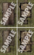
If this is modular enough, i can see myself buying 2-3 packs.Am i right with the assumtion that this shows the roofs or is it a roofless/interior version?
Thx for your regular feedback! :-)
| Stephen Radney-MacFarland Designer |
| 2 people marked this as a favorite. |
Stephen Radney-MacFarland wrote:Marco Massoudi wrote:It's already designed and 6 of those are in the pack.There needs to be a:
-blacksmith,
-well/central place
-townhall
-tavern
-farmhouse
-cottage (3-4)
-shop
-churchThanks Stephen, i,m looking forward to the sample images.
If this is modular enough, i can see myself buying 2-3 packs.Am i right with the assumtion that this shows the roofs or is it a roofless/interior version?
Thx for your regular feedback! :-)
It's mostly roofless, showing interiors. The cottages have both roofed and unroofed versions.
 Marco Massoudi
|
Marco Massoudi wrote:It's mostly roofless, showing interiors. The cottages have both roofed and unroofed versions.Stephen Radney-MacFarland wrote:Marco Massoudi wrote:It's already designed and 6 of those are in the pack.There needs to be a:
-blacksmith,
-well/central place
-townhall
-tavern
-farmhouse
-cottage (3-4)
-shop
-churchThanks Stephen, i,m looking forward to the sample images.
If this is modular enough, i can see myself buying 2-3 packs.Am i right with the assumtion that this shows the roofs or is it a roofless/interior version?
Thx for your regular feedback! :-)
That sounds very good, finally a map pack including both roofed and unroofed versions, something that has been requested for a long time.
Now i´m really looking forward to the sample images! :-)
 Marco Massoudi
|
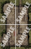
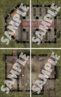
I noted that the four-tile "local pub" is the same building as in the "Village Ruins" set (june 2017), which is great!
The rest seem to be different buildings, which is a real missed opportunity in some cases.
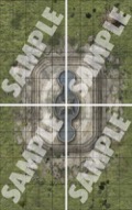
The roofed & un-roofed cottages are great, but four tiles just for "town fountain" seems 50% too many.
Why not use the same layout as in the "Village Ruins" set, where two tiles are used? otherwise a solid selection! :-)
| Brontoceratops |
Another tragic entry, alas!
Four tiles wasted on a gigantic fountain no "village" would have. One or two tiles of mud trampled around a village well could have been tiles someone would actually use.
Yet another colossal & outlandish tavern no local could afford, with gigantic (over five-foot diameter!) round tables, rather than normal plank affairs. This might be reasonable, if the tabletops were sections sawn from a mighty trunk, but from the grain, they are clearly not. And chairs, chairs, chairs, rather than normal tavern benches. Someone put a lot of money into serving these peasant yokels.
Attractive art of ludicrous content, so par for the course.
| Stephen Radney-MacFarland Designer |
| 6 people marked this as a favorite. |
Another tragic entry, alas!
Four tiles wasted on a gigantic fountain no "village" would have. One or two tiles of mud trampled around a village well could have been tiles someone would actually use.
Yet another colossal & outlandish tavern no local could afford, with gigantic (over five-foot diameter!) round tables, rather than normal plank affairs. This might be reasonable, if the tabletops were sections sawn from a mighty trunk, but from the grain, they are clearly not. And chairs, chairs, chairs, rather than normal tavern benches. Someone put a lot of money into serving these peasant yokels.
Attractive art of ludicrous content, so par for the course.
Sorry that, you don't like it. I often design spaces to be a little larger and over the top because instead of merely describing these areas, these are places where an entire party of adventurers will likely engage in a combat encounter of some type. I like to have a bit of room for those.
Maybe the next few will be to your liking.
Good gaming.
| bugleyman |
I agree on the fountain being atypical for a village, but maybe there's a good reason for it? If exploring that reason doesn't interest you, leave those particular tiles for another time.
As for the rest, I found the inn tiles perfectly fine (and a much better match of a village than a flip-mat-sized tavern).
In any event, "tragic" and "ludicrous" seem more than a little hyperbolic. Then again, that's the Internet. :-/
| Jhaeman |
I like taverns (and other interior rooms) to have sufficient space so that characters that take up a 5 ft square have room to maneuver.
If the spaces and furniture were realistic, my characters could never move. They'd all be blocked by the tables and chairs.
That shouldn't be a problem--just consider those spaces either difficult terrain or apply the squeezing rules.
 Rysky
Rysky
|
CrystalSeas wrote:That shouldn't be a problem--just consider those spaces either difficult terrain or apply the squeezing rules.I like taverns (and other interior rooms) to have sufficient space so that characters that take up a 5 ft square have room to maneuver.
If the spaces and furniture were realistic, my characters could never move. They'd all be blocked by the tables and chairs.
That is indeed a very a big problem.
| Steve Geddes |
I like taverns (and other interior rooms) to have sufficient space so that characters that take up a 5 ft square have room to maneuver.
If the spaces and furniture were realistic, my characters could never move. They'd all be blocked by the tables and chairs.
Fully agree. Usability is really important to me or they just sit in a folder. Realistic isn't on my list of things I look for (though "consistent with genre" is, which is kinda similar).


