| Steve Geddes |
| 1 person marked this as a favorite. |
I'm not a fan of smaller tiles than the map packs, personally (they're already smaller than my ideal size). The reason I've stopped getting the Dungeon tiles from WoTC is the impracticality of storing them once the collection becomes reasonably large. I think it's a useful format for this set specifically and if it's a rare thing, my issue isnt much of a concern.
However, if you started to release 'dungeon dressings' with one tile doors, thrones, tables, bookshelves and so forth, then I'd be disappointed. I like the concept of being able to customise flipmats and map packs, but the reality doesnt live up to the idea, in my view - too many fiddly bits and pieces on the table adds more hassle than enhancement.
 Chernobyl
|
I'm not a fan of smaller tiles than the map packs, personally (they're already smaller than my ideal size). The reason I've stopped getting the Dungeon tiles from WoTC is the impracticality of storing them once the collection becomes reasonably large. I think it's a useful format for this set specifically and if it's a rare thing, my issue isnt much of a concern.
However, if you started to release 'dungeon dressings' with one tile doors, thrones, tables, bookshelves and so forth, then I'd be disappointed. I like the concept of being able to customise flipmats and map packs, but the reality doesnt live up to the idea, in my view - too many fiddly bits and pieces on the table adds more hassle than enhancement.
agreed, all points.
 Perram
|
Since there are so many cuts to make on these... I'm going to say that this is the first time that the PDF of the product is probably the over all better product.
I love the art, and the idea, and will definitely be getting these. Mostly using the PDF, though, as the collector in me refuses to slice up the printed product. :)
 DigitalMage
|
However, if you started to release 'dungeon dressings' with one tile doors, thrones, tables, bookshelves and so forth, then I'd be disappointed.
Yes, I wouldn't want Paizo to go this route either, but more because I collect all WotC Dungeon Tiles for that, Paizo map packs and flip maps give me something different.
Want I do want to see more is designing map packs that are more modular and can be rearranged in more than one set up, and also can be combined into a full scene. So basically ensure no furniture etc goes over the cut in map pack sheets, and have doors and walls line up in common configurations. Stuff like Haunted Mansion isn't so useful because the rooms whilst interesting in themselves don't form a complete whole, ditto for Palace for example.
| MJinthePitt |
Since there are so many cuts to make on these... I'm going to say that this is the first time that the PDF of the product is probably the over all better product.
I love the art, and the idea, and will definitely be getting these. Mostly using the PDF, though, as the collector in me refuses to slice up the printed product. :)
Agreed. Definitely think the PDF is the way to go with this one. Print out just the items you need onto cardstock and then also use the images for MapTool or whatnot.
 Drogon
Owner - Enchanted Grounds, President/Owner - Enchanted Grounds
|
| 3 people marked this as a favorite. |
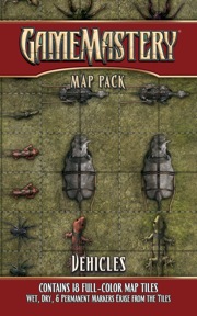
Considering the cut it up and use it nature of this set, a friend brought up a good idea that you should consider: Bridges. That item has to be the number one thing I need that I can't accomplish in many games. A batch of customized bridges of different width, length and type would be awesome.
Also, I like this set, though I'm on the fence on how often I'll actually use it. I tend to be more interested in actual 3D things if they are meant to be moved around and made part of a fight.
| Kevin Andrew Murphy Contributor |
Mosaic wrote:Love that you are experimenting with smaller cut outs.Please tell us what you all think about that!
My trouble with the smaller cut-outs is that I've played with too many gamers with cats, small children, or a tendency to just bump into the coffee table and scatter all the tiny little pieces just enough that it takes away from game play to get them back where they were.
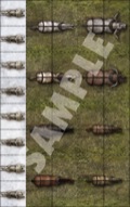
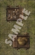
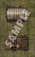
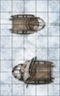
The worst case of this is the card with the eight sled dogs running abreast down the edge. Obviously they're meant to be cut out and used as eight separate sled dog chits, but if they'd just been rotated 90 degrees, they could have just been used as a team of sled dogs pre-assembled, either by cutting the strip out or just laying another scenery card over the section with the horses and oxen.
There's also a trouble where the dog sled is set up stradling two squares, but the sled dogs are placed in a single square. It makes the grid lines mis-align. A fair bit of this is going on with the horses and carts too.
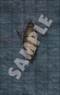
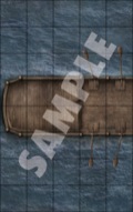
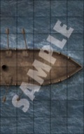
That said, there are some real gems in this set. I'll be using the card with the rowboat constantly and the two-card set with the small ship almost as often.
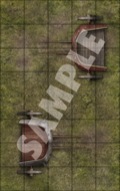
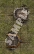
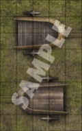
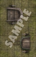
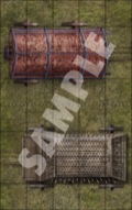
I like the chariots a lot. My only trouble is that I wish the three smallest chariots could have had the extra strip of lawn behind them instead of before them. That would have made it easier to just drop them down behind an existing team of mounts, such as from the Caravan pack, and left more room for fighting behind them.
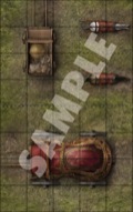
I'm also very pleased to see the Red Carriage from the Varian and Radovan stories making an appearance. Very pretty artwork on that.
| Steve Geddes |
I hope this doesnt come across as unreasonable, but my disappointment with this set made me revisit the Swallowed Whole thread (another disappointment for me, although not as bad as this set). One comment from Erik stuck out to me:
Guys, please don't misunderstand. We will continue to innovate and do interesting Map Packs. But I think it's important that they remain, you know, MAPS.
This one didn't really turn out that way. Future Map Packs will be MAPS.
For example, we won't do a Map Pack Conditions, with the word "Helpless" on one card and a bunch of spaces you can put you helpless miniatures off to the side of the battle area.
We won't do that because it would be a bad idea, and people would be right to be frustrated by it.
So don't worry that we're just going to do dungeon corridors and stuff. I mean, extradimensional spaces was an oddball idea, and very few people complained because, at the end of the day, it was still a MAP.
In my view this is kind of similar. I think I would have been less disappointed if these were a standalone Gamemastery product rather than a defacto map pack (the longboat and rowboat being the exceptions, I suppose).
.Having said that - I knew they were coming and still kept my double subscription despite my misgivings (I'm really glad you guys are taking risks and strangely that includes producing things I expect I'm going to dislike), so I dont see it as a disastrous choice.
I just feel like this one may also have wandered a little far from the core product.
| Lawdog |
Are these made of the same material as the other map packs? They may be a bit hard to cut. Perhaps stenciled for easy removal would be a good idea. For myself, I think the boat and ship ones are useful but I am loathe to cut my map pack up. Not sure whether to get this one or not. (Maybe I'll just get two, one to cut apart and one to save.)
| mabhatter |
Vic Wertz wrote:Mosaic wrote:Love that you are experimenting with smaller cut outs.Please tell us what you all think about that!My trouble with the smaller cut-outs is that I've played with too many gamers with cats, small children, or a tendency to just bump into the coffee table and scatter all the tiny little pieces just enough that it takes away from game play to get them back where they were.
The worst case of this is the card with the eight sled dogs running abreast down the edge. Obviously they're meant to be cut out and used as eight separate sled dog chits, but if they'd just been rotated 90 degrees, they could have just been used as a team of sled dogs pre-assembled, either by cutting the strip out or just laying another scenery card over the section with the horses and oxen.
There's also a trouble where the dog sled is set up stradling two squares, but the sled dogs are placed in a single square. It makes the grid lines mis-align. A fair bit of this is going on with the horses and carts too.
That said, there are some real gems in this set. I'll be using the card with the rowboat constantly and the two-card set with the small ship almost as often.
I like the chariots a lot. My only trouble is that I wish the three smallest chariots could have had the extra strip of lawn behind them instead of before them. That would have made it easier to just drop them down behind an existing team of mounts, such as from the Caravan pack, and left more room for fighting behind them.
I'm also very pleased to see the Red Carriage from the Varian and Radovan stories making an appearance. Very pretty artwork on that.
I'd agree, with some simple arrangement they could have removed "more" of the cutting. Like the sled dogs not being in "formation" (generally in two rows facing the same way). They should have matched the basic animals to carts so each was already paired up if you wanted to cut less... But still leave the grid line spacing so they stay mix-n-match.
These would almost work better as die-cut, close to the shapes, like the Beastiary tokens on heavier backing, without the background at all. It would make them "stand off" the board more too. Of course, they don't have the "up front" budget of that other company to do that for one-off sets.. Setup would cost Paizo all their margin pretty quickly.
 Mosaic
|
I have a big paper cutter at school that I used to chop the pieces out. Worker well. I actually cut inside the outer lines of each vehicle so the outer squares are a little small - that way they'll fit inside the squares of any maps I lay them onto. Office supply stores like Staples usually have a paper cutter out for public use.
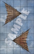
On the little bits, I like the big vehicles a lot - wagons, boats, even gliders. I'm not as thrilled with the creatures and mounts (too small, I tend to use minis for living things, etc.). I probably won't use them very often and agree that teams of animals with rigging would have been better. But in the end, I'm okay with the occasional experimental map pack. I actually pulled out Swallowed Whole recently for an encounter. Innovation is not a guarantee of success, but they've got to take risks and try new things once in a while.
One last thing - to me, the real catch with this set for me is the backgrounds on each card. What if my chariot is in the desert? Grass. If is want to sled through the forest like Radigast? Snow. I'd love to see a Traps pack or some larger dungeon dressings (fountains, labs, etc), but not unless they're on a clear background so I can lay them onto any background map without the ring of grass and snow.


