Developer's Diary: They Came From Beneath the Sea!

Thursday, April 1, 2010

As Wes mentioned a couple of weeks ago, our Open Design partnership project From Shore to Sea has had a few problems on its way through development and editing. But I'm happy to tell you that we are now in the final stages of getting this thing out the door and into your hands!

Senior Art Director Sarah Robinson found a great artist, Damien Mammoliti, to pick up where the last one left off, and once that art came in, she put everything together in record time. Finally, there are some faces to go with the names (some of them pretty creepy, but faces nonetheless!). Coupled with Andrew Hou's fantastic, action-packed chapter openers, this adventure is finally coming together. And once we had the art, editorial questions like what is the correct plural of octopus (octopi? octopuses? octopodes?) were easily resolved. Here's hoping that the ocean between here and China is safely free of giant cephalopods.

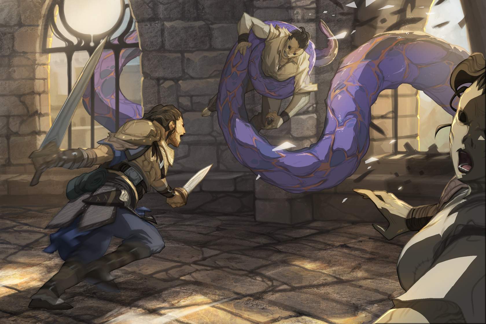
Illustration by Andrew Hou

For a final sneak peek at From Shore to Sea, take a look here at Valeros trying to save some hapless (and disturbingly fishy) villagers from more of those pesky giant tentacles. And be careful when you go swimming. You never know what might be lurking beneath the waves!

Rob McCreary
Assistant Editor

More Paizo Blog.
Tags: Andrew Hou Azlant Fighters Iconics Open Design Pathfinder Modules Valeros Wallpapers

Wow, cool!

It's far more animation looking than what Andrew Hou usually does for you guys. I love it, but I wonder how many people will "not want cartoons in the their D&D, grumble, grumble, get off the danged lawn?" :p

Dark Archive

it seems that Val is a magnet for tentacled monsters...


Nah, there's just a lot of them in this adventure.

Dark Archive

but he also got 'napped by some of those dog things in the core book


I like this style of art. Please keep the artist.


Wow... who knew? It was pretty elaborate, but now it is clear that From Shore to Sea is an April Fool's.

RPG Superstar 2009 Top 32

I am shocked that there was no April 1st gag this year.

(... I really wanted to know more about the d21 expansion.)

Sovereign Court

It's octopodes!

Dark Archive

Lord Fyre wrote:
I am shocked that there was no April 1st gag this year.

I thought that pic was was the gag !


My girlfriend works at the Marine Invertebrates Department of the Natural History Museum in Los Angeles, and I can tell you from personal experience that even within the scientific community there is a lively and snark-filled debate as to what the proper plural form of "octopus" is.


Adventure Path Charter Subscriber
Enpeze wrote:
I like this style of art. Please keep the artist.

Whereas I really don't like it in the slightest....I know art is subjective, etc. etc. but man....A. Hou is capable of such great art (Demogorgon and company on the cover of the late, lamented dead-tree magazines, etc. etc.) And some of his current work on Conceptart.org is still pretty tasty....but this soft-brush, Saturday morning cartoon stuff has got to go (yeah, somebody had to go there, so I did).

And by soft-brush, I mean there are very few hard, focused lines; it lacks definition and texture to the nth degree (and I see it far too often on fast, slap-dash, out-the-door stuff on the aforementioned CA website, but usually only by young, inexperienced artists...and Andrew Hou is certainly not that).

Come back to us, man; use a hard brush line and make something with visible textures (cloth, scales, even rubbery tentacles should look like they would feel), rather than blurry, soft-focus, sloppy water-colour-esque work that looks like it was put together in an afternoon....

Sorry, rant over (soft-brush Photoshop work is really, REALLY a pet-peeve of mine....and one of those subjective, I don't know why I hate it, I just do kinda things).

Cheers,
Colin

Sovereign Court

Green Left Eye wrote:
My girlfriend works at the Marine Invertebrates Department of the Natural History Museum in Los Angeles, and I can tell you from personal experience that even within the scientific community there is a lively and snark-filled debate as to what the proper plural form of "octopus" is.

OCTOPODES!


13garth13 wrote:
A. Hou is capable of such great art (Demogorgon and company on the cover of the late, lamented dead-tree magazines, etc. etc.)

Uh, that was Wayne Reynolds, the same guy who does most of the paizo hardback coversm and the first 12 APs.

A. Hou drew all of the dinos and the barghest in the Bestiary, he did the 7 virtues dungeons cover of the trumpet archon with the masks and many other pictures. He has a deviantart page. But I think you may be confused.

Silver Crusade

Pathfinder Adventure Path Subscriber
13garth13 wrote:

Come back to us, man; use a hard brush line and make something with visible textures (cloth, scales, even rubbery tentacles should look like they would feel), rather than blurry, soft-focus, sloppy water-colour-esque work that looks like it was put together in an afternoon....

Sorry, rant over (soft-brush Photoshop work is really, REALLY a pet-peeve of mine....and one of those subjective, I don't know why I hate it, I just do kinda things).

Cheers,
Colin

The fact that there was a major SNAFU with the initial artist for this module and Sarah had to make some emergency last minute arrangements to get things done on time might have something to do with your observations :-)


Adventure Path Charter Subscriber
vagrant-poet wrote:
13garth13 wrote:
A. Hou is capable of such great art (Demogorgon and company on the cover of the late, lamented dead-tree magazines, etc. etc.)

Uh, that was Wayne Reynolds, the same guy who does most of the paizo hardback coversm and the first 12 APs.

A. Hou drew all of the dinos and the barghest in the Bestiary, he did the 7 virtues dungeons cover of the trumpet archon with the masks and many other pictures. He has a deviantart page. But I think you may be confused.

Nope....you're thinking of Reynolds' cover to Dungeon...but there was a Dragon magazine with Demogorgon on the cover (a Demonomicon issue if I'm not mistaken), with art by Hou.

Linky

Cheers,
Colin


Adventure Path Charter Subscriber
Gorbacz wrote:


The fact that there was a major SNAFU with the initial artist for this module and Sarah had to make some emergency last minute arrangements to get things done on time might have something to do with your observations :-)

Yeah, but.....it's not exactly the first type Andrew Hou has submitted work like this to Pathfinder products. When I compare some of his submissions to the bestiary sections of some of the AP issues to his cover work/interior work for Dungeon and Dragon, I just don't understand why he's turning in such sub-par work.

*shrug*

However, I will grant that the circumstances surrounding this product may have led to the submission of an even less satisfactory piece of work than he has been turning in lately (all art criticisms are IMNSHO, of course, and also with the addendum that I personally can't draw my way out of a wet paperbag).

Cheers,
Colin

Paizo Employee Creative Director

We also had a Steve Prescott Demogoorgon grace Dungeon, back in the early 120s. He's the Demon Lord who's appeared on the most covers!

Paizo Employee Chief Technical Officer

Rob McCreary wrote:
octopus (octopi? octopuses? octopodes?)

Octomom?

Dark Archive

Vic Wertz wrote:
Octomom?

Tar and feather sir!

Tar and feather !


13garth13 wrote:
vagrant-poet wrote:
13garth13 wrote:
A. Hou is capable of such great art (Demogorgon and company on the cover of the late, lamented dead-tree magazines, etc. etc.)

Uh, that was Wayne Reynolds, the same guy who does most of the paizo hardback coversm and the first 12 APs.

A. Hou drew all of the dinos and the barghest in the Bestiary, he did the 7 virtues dungeons cover of the trumpet archon with the masks and many other pictures. He has a deviantart page. But I think you may be confused.

Nope....you're thinking of Reynolds' cover to Dungeon...but there was a Dragon magazine with Demogorgon on the cover (a Demonomicon issue if I'm not mistaken), with art by Hou.

Linky

Cheers,
Colin

Oh yeah, I thought by and company you were implying the old dungeon iconics! My bad!


baron arem heshvaun wrote:
I thought that pic was was the gag !

Ditto that ... I love Hou's art, but this just looks like it came straight out of some japanese cartoon. Please, not Paizo too. It's bad enough as it is with Blizzard japano-fying everything.

Silver Crusade

Pathfinder Adventure Path Subscriber

Down with the pseudo-realist western style ! Give us big eyes, small mouths ! Bring back the guy who drew Nualia in PF1 !!!


Gorbacz wrote:
Down with the pseudo-realist western style ! Give us big eyes, small mouths ! Bring back the guy who drew Nualia in PF1 !!!

Arnold Tsang! He's awesome, I actually really like his art.


Pathfinder Roleplaying Game Charter Superscriber

Ugh, please, no :)

Though I did like that Nualia pic, but mainly because its "anime" elements were toned down.

Gorbacz wrote:
Down with the pseudo-realist western style ! Give us big eyes, small mouths ! Bring back the guy who drew Nualia in PF1 !!!


13garth13 wrote:
And by soft-brush, I mean there are very few hard, focused lines; it lacks definition and texture to the nth degree

Err, what? The only blurry parts are Valeros's legs and right arm. Everything else is in sharp definition.

Lack of hard, focused lines? All the actors in the picture are outlined with solid black lines. How is that lacking hard, focused lines?

You just don't like it because it draws inspiration from non-traditional, non-western styles. It's fine not to like it, but at least give criticisms that make sense. Hell, there's far less contrast and sharp lines in the Demogorgon picture you linked (which is done in a more traditional western style, which coincidentally usually uses fewer sharp, hard lines and more blending and blurriness, because that style is more realistic and there are very few sharp lines in nature).


Adventure Path Charter Subscriber
Zurai wrote:
13garth13 wrote:
And by soft-brush, I mean there are very few hard, focused lines; it lacks definition and texture to the nth degree

Err, what? The only blurry parts are Valeros's legs and right arm. Everything else is in sharp definition.

Lack of hard, focused lines? All the actors in the picture are outlined with solid black lines. How is that lacking hard, focused lines?

You just don't like it because it draws inspiration from non-traditional, non-western styles. It's fine not to like it, but at least give criticisms that make sense. Hell, there's far less contrast and sharp lines in the Demogorgon picture you linked (which is done in a more traditional western style, which coincidentally usually uses fewer sharp, hard lines and more blending and blurriness, because that style is more realistic and there are very few sharp lines in nature).

I'm obviously not expressing myself clearly (or rather that what I said makes sense to me, but no-one else ;-).

Take a look at the picture...there's a difference between a "hard" black line and a "soft" black line, especially in digital artwork. Put another way that might make more sense, the whole scene appears washed out and lacking definition. To me, there's more than just Valeros (who is egregiously blurred due to stylized motion), but almost everything in that picture is....I dunno how to say it....faded? Lacking a sense of texture? Look at the window...sure it's all done with dark lines (note though that they're fuzzy grey, not sharp black), but they look faint/hazy/insubstantial.

Does that make more sense? Look at the face of the woman/fish-thing in the fore-ground...where's the detail? Everything is just sketched in (and in a soft-focus, lens smeared with Vaseline look, no less).

You can see the droplets of water in the splashing waves around Demogorgon in the aforementioned Dragon cover....the shapes are distinct and not hazy (realistic in nature or not, it happens to be a style I prefer) .

And yes, I freely admit a preference for Western-style art (which as a catch-all term probably makes as much sense as classifying an entire family of styles as "anime", i.e. not much at all), although I've seen plenty of Western-style artwork that has the same "problems" as I have with this picture. Take a look at the were-rat that Hou did in Pathfinder [url=http://fc02.deviantart.net/fs30/f/2008/140/3/4/Werebat_Rebel_by_nJoo.jpg}linky[/i], and we see the problem again; his hair is relatively untextured, it mostly just looks like smears of out-of focus brown paint.

Again, not everyone is going to see it my way (and that's okay...one man's Frazetta is another man's Boris ;-)), but I just wanted to clarify what I meant by a lack of hard lines.....in my opinion, washed-out, fuzzy gray doesn't equal a hard line, and produces a lack of definition rather than accentuating it.

Cheers,
Colin


Adventure Path Charter Subscriber
Zurai wrote:


Err, what? The only blurry parts are Valeros's legs and right arm. Everything else is in sharp definition.

Lack of hard, focused lines? All the actors in the picture are outlined with solid black lines. How is that lacking hard, focused lines?

Not sure why I'm writing again, but I just had another look at the picture with the blow-up jpeg, and I'm still a little amazed that someone could consider those as solid, hard, focused black lines....which I guess is why art is so subjective.

Given how different our reactions/interpretations are is it any wonder why people don't agree on art? ;-) :)

Cheers,
Colin

P.S. Dude, there's nothing wrong with disagreeing with my impressions, but don't impugn my motives and try to mind-read me as if I'm just some "anime" hater or whatever those who prefer more western styles are called. It's not cool to assume you know what someone else's reasons are. I meant what I said about the lines, etc. etc. You just look at it and don't perceive it the same way. No biggie....


I can't fathom how anyone can complain about that picture having no hard lines and then praise the Demogorgon picture. If you're not looking at Demogorgon with a magnifying glass, it's almost impossible to tell where the sky or sea ends and a creature begins. I can clearly make out all three humanoids and the entirety of the tentacle even from the tiny picture in the blog post for the tentacle picture.

/shrug

To each his own, I guess, although your complaints make absolutely no sense to me (aside from the "lack of texture", which is one of the hallmarks of the style used).

The Exchange

I <3 octopodes!

Liberty's Edge

I like some of Andrew Hou's stuff from other Paizo products, but I'm afraid I'm also pretty firmly in the Don't Like It camp.

I just do not like 'cartoony' anime style art, unless I'm actually watching anime I guess (something I do very little of, incidentaly)

I'm sure this module will be awesome - Wolfgang and Co do great work and being an Paizo module will make it even better.

I just really don't like the style of art.

Community / Forums / Pathfinder / Pathfinder Adventures / Paizo Blog: Developer's Diary: They Came From Beneath the Sea! All Messageboards

Want to post a reply? Sign in.
Recent threads in Pathfinder Adventures