


 John Laffan
RPG Superstar 2015 Top 32
,
Star Voter Season 6, Star Voter Season 7, Star Voter Season 8, Star Voter Season 9
aka Mozenrath6
John Laffan
RPG Superstar 2015 Top 32
,
Star Voter Season 6, Star Voter Season 7, Star Voter Season 8, Star Voter Season 9
aka Mozenrath6
|

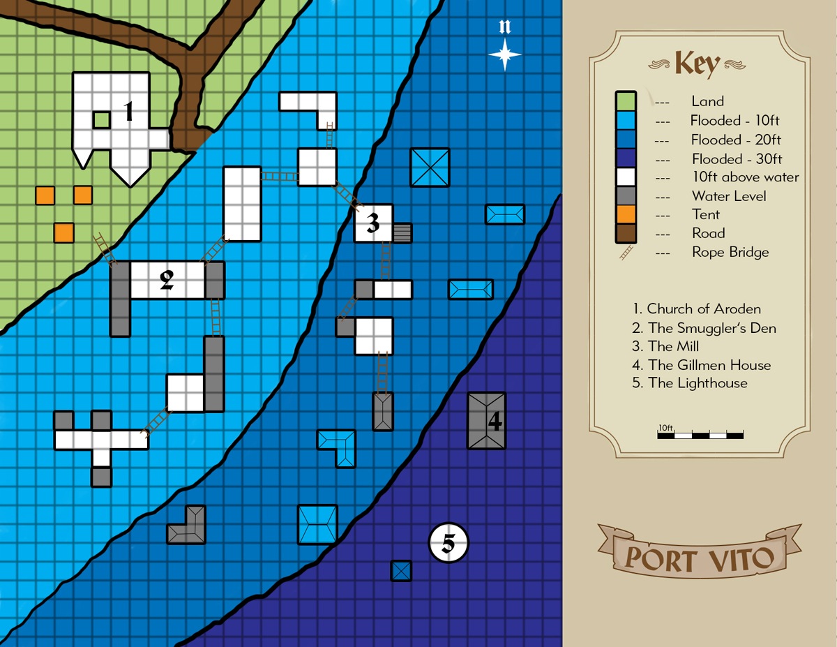
Port Vito, Sinking Town Turned Smuggler's Den
| Robert Lazzaretti Cartographer |

This is a decent looking map reference.
There is a compass rose and scale present on the map.
Ok use of page space, does the key need to be that big?
Decent enough reference everything is here needed to make this map.
I do recommend this map to progress to round 3
 Crystal Frasier
Contributor
Crystal Frasier
Contributor
|

The Good
It has a scale, compass, and key.
The concept is interesting.
This is labeled clearly enough that I could make a final map without further questions.
The Bad
The extra information beyond the town's name "sinking town turned smuggler's den" feels like it violates the rules of not including any additional information beyond the map's title.
The town's layout is incredibly simplistic, with everything set on a tight grid and no real rhyme or reason to where buildings are placed.
This feels like a half-page map, blown up to a full page. Huge waste of space.
My Judgement
An interesting idea, but very underdeveloped. I strongly recommend this entry not advance to the next round.
 Owen K. C. Stephens
Modules Overlord
Owen K. C. Stephens
Modules Overlord
|

Drawing from my blog on maps, and the rules for the round, I’ll judge the maps on a number of questions.
Is It a Full Page Map?
It's a slightly-bigger than half-page map with a huge legend it doesn’t need.
Does The Map Have A Compass Rose and Scale? Are They Used Well?
Compass rose yes. Scale exists, but is a bad choice. With 5-foot squares we could skip a few buildings, and actually show their doors and interiors. With much bigger squares, we could present a whole town rather than 19 buildings and 3 tents.
Is The Map A Place I Want To Adventure?
There's nothing here that suggest it would be particularly fun. To make the buildings-in-water idea more interesting there needs to be more variety (why all 90-degree angles?) and more different stuff (boats, reefs, beaches, currents, rocks!).
Is the Map Clear?
Yes.
Is the Map Detailed?
Not particularly. The most crucial stuff is given, but there are lots of details that could be added.
Is the Map Imaginative?
It's not imaginative enough to make up for how small and blank it is.
I do not recommend this for advancement to round 3.
| John Bennett RPG Superstar 2011 Top 8 , Dedicated Voter Season 6, Star Voter Season 7, Dedicated Voter Season 8 aka John Benbo |

I like what you were going for here- a flooded town can be a neat idea for a location. Beyond that idea, there, unfortunately, isn't much going on here. The buildings are rather blocky and rather typical. Make the pirates' den built atop a half-submerged ruins of some elder race with strange crystal tubes connecting them and it suddenly becomes a lot more exotic with adventure potential.

 James Casey
RPG Superstar 2014 Top 16
,
Marathon Voter Season 7, Marathon Voter Season 8
aka Jrcmarine
James Casey
RPG Superstar 2014 Top 16
,
Marathon Voter Season 7, Marathon Voter Season 8
aka Jrcmarine
|

Very boring map. Lots of straight angled buildings and some color. Imaginative idea with ho hum execution.
| Maurice de Mare RPG Superstar 2013 Top 16 , Marathon Voter Season 6, Marathon Voter Season 7, Marathon Voter Season 8, Dedicated Voter Season 9 aka Darkjoy |

17th map I have seen, your current rank is 13th.
| Template Fu |

Congratulations on completing and submitting your map on such a tight time-scale. Very well done, you should take pride in that achievement!
Disclaimer: The review of your entry that follows is from a non-official source, I have no formal part of RPG Superstar, and the review thoughts are mine alone and so should be considered carefully bearing this in mind. You can choose to digest or not each part as it seems of best value to yourself.
Note for all: I am spending at least an hour per map in order to be as extensive and thorough as I can, so with other time demands and the like, you will only be getting one or two reviews a day. Sorry, but real life and freelancing work does take precedence when they crop up.
I have already viewed all the maps and chosen my votes, so I am just typing up my notes in more human readable form - If voting closes before I get to your feedback, don't fret that you missed my vote :)
I am starting with map reviews this year while I brush up my knowledge of the different item types used for round 1. So let me begin...
Template
Yes, there is one, even for maps - it is the size, the compass rose, scale bars for each part of the map drawn at different scales, a key box describing the map elements, the map name on the map. The clarity of line and text also pays a part on this. Here is how you did...
Name: Present, but as a port that has sunken, I would have expected the fact it is sunken in the title. The title as is implies a functional port. Also, as a port, where are the jetties and wooden docking platforms?
Size: Proprotionally, this looks like it doesnt use the whole dimensions as requested by the round rules.
Compass Rose: Check - only one map with no inserts or expanded zones, so only one needed.
Scale Bar: Scale is present - only one map represented so only one scale needed.
Key: Present, with a nice cartouche surrond. This part is nice, it is probably using too much real estate though.
Golarion Tie-In
Everyone has their take on Golarion, guided by the products and supplements. This therefore is a scoring based on how I felt you had tied the Golarion world to your map, it's flavor, the feel of the map, is it generic or obviously. This is therefore a very personal view and evaluation of your entry and should be considered as such. Onwards my brave contestant...
Ok, Port Vito - doing a search I cannot find a reference to it, so it is probably on a map somewhere, one of those dot places with no bio maybe, the church of aroden however does provide a stronger golarion tie in. That's all there is though I think, I really wanted a bit more, the name of the lake would have helped towards this.
Possible Areas of Improvement
Again, this is a personal evaluation of what, if anything, I think would improve the map and suggestions on things you could have done differently or added to the map. These are totally personal suggestions, but you might find something useful to consider herein...
I would have preferred to see a small insert showing where in Golarion Port Vito is located, especially as it is not easy to find in the settings books and maps.
Some appreciation of how the land in port side towns and villages is rarely flat, they always have some wooden structure going out into the water for boats to dock at. Effectively we have 3 bands of depths (props for considering different water depths) - but - in a flood situation, it is likely that small pools and rivulets would be formed at high tide and it wouldn't be just a straight cut like it is shown here. There would also likely be some boats (small to large) under construction or repair in the shallows or even beached.
I like that the lighthouse is in the deeper water, allowing it to be both the original location or have been constructed after the sinking to warn of the submerged buildings. If it was the original lighthouse location, you could have added the original coast line and rocks submerged, showing the coastline that it originally protected.
The solid colour makes things seem flat and lifeless. Even the green land is uninspiring - consider muddy tracks, a mud area between the houses showing where the traffic used to run, are there any fields bounded by hedgerows, copses of trees, gardens, a path leading to the only church, and so on - all these little details would lift this submission.
I get the impression that you were just starting to feel out your entry, marking your development zones and simply run out of time before adding all of the detail. If I am right, that is a great shame as the bare bones are solid enough to build an engaging location from.
Some other things you might have considered include the submerged buildings are a good attraction to for sharks and other acquatic creatures looking for an underwater lair. Introducing acquatic hazards when so much of the map is water would have helped a lot.
You fell into the old trap of compass rose aligns with grid lines - it doesn't have to, it could have been drawn leaning slightly to the left or right - you also fell into the trap of builders only able to build walls along the compass rose axes. Everything is way too square on and very old school. Old school isn't a bad thing sometimes but even looking at real world maps, it is obvious that buildings follow the land contours and are no all square with each other.
Some smuggler detail could have helped with the hinted at smuggling den part of the name... where is the stash? has the church now becoming a leader's "mansion"? that sort of thing.
The biggest problem I have though is that because of the very simplistic design, there is little more I can say, I was left wanting more from your map, so much I felt went unanswered. Where it is sinking... is that a sea or a lake, or even a river delta? How long ago? Has the water stagnated and started becoming swamp like or are there dangerous currents and eddies around the submerged structures? How did it start sinking and why do all the submerged structures seem whole? Surely there would be some ruins/slum buildings that would have collapsed during the sinking?
Sorry that this review is so rough on your entry, but I hope you have found the suggestions constructive.
Summary
I summarise my reactions to your submission here, stating if you are a definite vote winner, a potential vote winner or not. I am not
"scoring" the entries this year as I always struggle to maintain consistency in scoring, so I am now trying a more "gut instinct" summary. Here goes...
I have a Golarion tie-in with the church, but it is very light on tie-in - you could have labelled the encroaching water placing the port geographically and making it easier to locate.
The name promised so much. I actually like the imagery you were going for, it just didn't quite get there though.
The buildings seem a little on the small side, 10 foot wide some of them. My front room is 14 feet by 18 feet and there is a back room, a kitchen and a second dining room in my standard three bedroom house, making my average size house around 25 feet by 40 feet give or take a foot or two.
On the whole, I liked the premise that the name promised a lot, but the map didn't deliver for me. I have no doubt that you will learn from the other entries and hopefully from this feedback. I am afraid that, for this submission, I will not be giving you one of my 8 precious votes. Sorry.
| frank gori RPG Superstar Season 9 Top 32 , Marathon Voter Season 6, Marathon Voter Season 7, Champion Voter Season 8, Marathon Voter Season 9 aka GM_Solspiral |

Challenge: Is this map difficult to execute? Does it in my opinion demonstrate the characteristics of a Superstar designer?
Technique: Did the designer show some skill and consideration in the choices made on the map. Are the words used in the key wise choices that add to the overall utility of the map?
Utility: Can a GM/cartographer make sense of the map and make immediate use of it?
Overall:[b] I'll rate the Map as an A for strong recommends B for weak recommends C on the bubble D for weak rejects F for Do not recommends
Challenge: Sinking town = challenging and cool concept
Technique: Color might have hur you and this doesn't look ahrd to pull off in paint. Copy drag...
Utility: I'm not going to lie I'll not be using this, I wouldn't use it and I don't think it's cartographer worthy.
Overall: F for me as in this is an easy reject compared to the competition.
| Jaragil Marathon Voter Season 8 |

Nice idea and I have a soft spot for these kinds of coastal cities with most of the huts build on top of the water, with creaky bridges and docks making up most of the streets and living space. Unfortunately I get the sense that you trusted the cartographer to do most of your work for you. The houses are nothing more than white squares, the docks don't go around them and the buildings are unnaturally aligned with one another.
The map also lacks anything to do in it. Well, okay, the lighthouse might be fun, and like that you have to cross some water to get there. Church of Aroden is also something we don't see every day, so that could be fun. And the gillmen are a logical addition. But are there taverns, shops, smithy on top of the water, local sheriff's office - probably not because of the smugglers, but if there was, it could be a source for an adventure - other temples, rotting houses ready to fall apart... Anything. With so few houses you could have named and identified them all.
It really seems that you either ran out of time or weren't clear on how much room you had to leave for the cartographer. And unfortunately that's not Superstar.
| Mark Griffin RPG Superstar Season 9 Top 8 , Dedicated Voter Season 7, Star Voter Season 8, Star Voter Season 9 aka Mark D Griffin |

My favorite thing: As and idea, it's not bad
Other things I like: Your elevation is easy to see
My least favorite thing(s): It doesn't feel like a full page map, and it's ultimately pretty boring. I see no reason, based on this map alone, to adventure here.
Will I vote for it: You started off with a good idea, but you fell down on the execution. I will not be voting for this map.
| Thunderfrog Marathon Voter Season 8, Marathon Voter Season 9 |

This is a good idea, I just wish it could have been fleshed out better. I have this map ranked in the bottom half.
I dont like the shortcut you took with all the tetris pieces for buildings, and even not all of those are labeled.
I know there wasn't a lot of time, but you have less than 20 structures here, and you are trying to sell this map on flavor.

| PFW1-K1 |
BEEP BOOP for more information PLEASE SEE:
Aroden, a dead god and Last Azlanti; Gillmen, also known as the Low Azlanti; the Azlanti, who sure stirred up a bunch of fuss am I right Sodden Lands BZZZZZTclunkDING!!
| Jacob W. Michaels RPG Superstar 2014 Top 16, RPG Superstar 2012 Top 16 , Marathon Voter Season 6, Marathon Voter Season 7, Marathon Voter Season 8, Dedicated Voter Season 9 aka motteditor |
I'm afraid I have to echo a lot of the other criticisms of this map.
I like the idea; sunken town can definitely be cool. Rope bridges make a neat terrain obstacles, a much shakier "road" than people are used to for when combat breaks out.
But beyond that, the execution just is a bit lacking. The buildings are mostly rectangular -- none seems to have even suffered any damage from being submerged -- and we have no idea what's there. I think the scope's a little too broad on this one.
I think I could make up some cool adventures to happen here, but I'm afraid I don't think it's really worth the trouble with what's been presented. It needs something more to really get me excited about sending PCs here.
I'm sorry, but I don't think I'll be voting for this one.
| Feros Champion Voter Season 6, Champion Voter Season 7, Champion Voter Season 8, Champion Voter Season 9 |

OK this is a mostly submerged port town. Some buildings are still above water enough to be of use while others are flooded. Really good use of colour to differentiate between the different elevations and depths, especially with the buildings.
Alright that all said there is nothing here that exciting. It has no features that seem worth investigating or images beyond "flooded town." Even Absalom has a flooded section. With smugglers. And gillmen. So sadly this isn't very original, especially in Golarion.
I will not be voting for this entry.
| Oceanshieldwolf Dedicated Voter Season 6, Dedicated Voter Season 7, Marathon Voter Season 8, Star Voter Season 9 |

I like the idea, but have to agree with the other comments.
For a really good version of a sunken town see the city of Cassadega in Kobold Press' Sunken Empires.
This map feels like one percent of Cassadega.
Still, something about this map makes me like it a lot. Clarity. And color. I like it.
| MasterOfWar Dedicated Voter Season 8 |
Everyone else has noted these things but..
The Good- Interesting concept. I do like the idea of tidal conditions being used in combat - perhaps in an area with very high/low tides that, for X magical reason, change much more frequently or rapidly than normal. That said, this is the town sinking and not about tides....
I do like the varied terrain with solid land, water of varying depths and stable platforms.
I would use a variation of this as a fun challenge for players who forget that most of the world is water. Seriously, swim is an important skill.
The Bad- It's simplistic compared to 8-bit NES games.
Nothing really dynamic about it. I got really excited thinking about tides but nope, just the town is sinking.
It's just boring I guess.
I'm sorry, but I am definitely not in favor of this map.
| Garrick Williams RPG Superstar Season 9 Top 16 , Star Voter Season 7, Star Voter Season 8 aka Cyrad |

I really like the use of color to show the varying levels and show which buildings are submerged. With a map this small, you could have shown building interiors so a GM could use this as a "dungeon" map where players explore the ruined town and raid the smugglers within. Unfortunately, all we got was squares. That's a shame, because I really liked the flavor behind the place.
|
Crystal Malarsky
RPG Superstar Season 9 Top 4
,
Star Voter Season 7, Dedicated Voter Season 8, Star Voter Season 9
aka Snowblossom
|

This is such a cool idea. I get the critiques above, but I personally love the concept so much! :)
| Kiel Howell RPG Superstar Season 9 Top 32 , Marathon Voter Season 6, Marathon Voter Season 7, Marathon Voter Season 8, Marathon Voter Season 9 aka theheadkase |

I am giving my critique without having looked at anyone else's comments first.
Simple drawing tools map. I won't hold artistic merit against (or for) anyone.
I like that you have different colors for deeper/shallower waters.
A church with some tents, althought I find it weird there's no graveyard attached to the church.
You call this Port Vito, but the area is described (in the key) as being a flooded region.
Smuggler's den, a mill?, oooo gillmen, and a lighthouse.
Overall, I'm not feeling a cohesive story from this map. The map itself isn't particularly inspired...The same thing is kind of already done to death.
| Koboldhammer Star Voter Season 8 |

I love the idea of a partially submerged town, but where are the challenges? Where is the pesky tree-top line blocking me from rowing my boat straight towards the lighthouse? Have they rotted long since? But then the roof should have caved in and some of the houses should have nests of sea animals or birds. You started out well, but it feels very unfinished.
| Erick Wilson Dedicated Voter Season 7, Star Voter Season 8, Star Voter Season 9 |

The critiques that have already been made notwithstanding, I'll vote for this for the temple of Aroden alone. Finally! The dead god Aroden is supposed to be the major conceit of Golarion, but he's almost never mentioned, never even alluded to. It has always seemed to me like a major failure of storytelling in the gameworld in general. What's more, the choice of gillmen here is then more interesting due to their connection to ancient Azlant.
So many things about this map seem to harken back to Golarion's past. I feel like it's supposed to evoke age and lost history, with the flood waters a sort of direct metaphor for time and faded remembrance. Maybe I'm reading into it, or maybe John was just being a bit too subtle. And that said, I suppose I'd prefer the gillmen to be cultists or something rather than smugglers, but...anyway, I like the way this map subtly honors Golarion's history. I can imagine a cool adventure here that ties past events (perhaps involving lost treasures of the church of Aroden? Is that what these gillmen are smuggling?) to those of the present, a la the modern day hackers hunting for Nazi gold in Neal Stephenson's Cryptonomicon.
|
Owen K. C. Stephens
Modules Overlord
|
Official Round 2 Note: On Map Resolution
We’ve had some comments on legibility of smaller type on the maps, and the contestants are (by the rules of the contest), not allowed to clarify anything, so I want to make a general statement about maps and resolution.
When we required all contestants to present maps at a specific dpi and size, we did so because in past years we’ve had some issues with maps (for the encounter round) being sent to us in different sizes, resolutions, and dpi, making it difficult to give them all a high-quality presentation for the contest. We found that asking for a higher dpi than we’ll use in the end allowed us to create a standard of presentation that kept all images crisp and clean. For encounter-round maps, this has worked well.
Unfortunately, since this round requires all text be provided on the maps themselves, many contestants used the dpi and size standards we required as the basis for making sure their text is clear, and otherwise tried to keep words as small as possible so as to not clutter their maps. This was done in the (reasonable) belief that the maps should look good at the size we asked for, rather than in any different size we might present on our website. When resized for smaller, high-quality images, this can result in words that aren’t clearly legible.
We’ve made a change to rescale everything to the higher end of maximum image size for uploaded images for all maps that were entered this round. This should allow for better legibility for voters when selecting their favorite maps to advance in the contest. It is our fault that this process was not properly communicated to our contestants, so consider this when adjusting or finalizing your selections.
Obviously, we’ll explain what is going to happen to the images of maps, and how to allow for it, more clearly in future rounds (and future contests). My apologies to any contestant with a map that has suffered as a result of how we handled scaling in this round.
| Browman Dedicated Voter Season 8, Dedicated Voter Season 9 |
This map doesn't feel superstar. 19 cookie cutter buildings, and rising water isn't an interesting location to adventure.
| Mark Nordheim RPG Superstar 2014 Top 16, RPG Superstar 2013 Top 32 , Marathon Voter Season 6, Dedicated Voter Season 7, Marathon Voter Season 8, Dedicated Voter Season 9 aka Morphemic |

Here are my ratings for this map:
First Look: C
The map is blocky and lacks detail.
Interest Level of Location: C
The concept is interesting enough, but the lack of detail keeps it from scoring well.
Tactical Depth: B
The rooftops and rope bridges work well enough for me as a site for a fun battle.
Adventure Potential: C
I could drop this into an adventure, but there isn't enough information to make me want to build an adventure around it.
Clarity: C
Are the rooftops flat? Can you get inside the buildings? What the map does show is clear, but important information is missing.
Logic: B
Nothing really wrong with it, but building placement is a little random.
Overall: C+
| Raynulf Star Voter Season 8 |

First off: Congratulations on making Round 2, and the best of luck in the votes!
Coolness: Do I look at this, and want to use it in a game? Does it provoke wonder or amazement? Does it hold potential for interesting encounters, adventures or roleplay? How much mileage does this map have in it?
Usability: How usable is this for me as a GM (being that GMs are actually the primary audience of most maps)? Is the legend clear and in logical order for play? Does it give me enough information to easily visualize the parts and wax poetic about the varied locations? Does it have the necessary details for me to run with it on the fly, or will it involve a lot of improvisation? Does it have any glaring oddities that stop me mid-breath to go "what the hell is that?!"?
Craftsmanship: Is it clear, legible and containing all the necessary bits and bobs? Does it make good use of the space? Is the scale appropriate for the detail (and visa versa)?
(I suppose you could also call them "Creativity, Functionality and Skill", but I like my terms better :P).
Coolness: D
- Positive: A flooded/sinking village offers great opportunities to mingle urban and underwater terrains and make for some fun encounters and challenges.
- Negative: Port Vito: Port not included. It's less than two dozen flooded or partially flooded buildings, which is barely a village (not town) unless this is merely a fraction of the original settlement… at which point for this level of detail I'd want the rest. The layout also is puzzling; Why is there a windmill amidst other buildings, and not at a higher elevation? Only five locations are given, but with no indication on how they interact… Are there still Aroden priests around? Do they work with the smugglers?
- Verdict: D. The map is a 'sketch' of what could be a cool location, but without seeing the full picture I can't get excited about it.
Usability: D
- Positive: The water levels and depths are clearly shown, the most important (I think?) buildings are labeled, and the interaction of water and building is mapped out.
- Negative: Grossly lacking in detail; There are buildings with rope ladders, but no hints as to why, or why people would hang out in the ruined buildings, or why the church is off by itself and thus the sole surviving building on dry land. I'd be having to create purposes, layouts and contents of all these buildings on the fly, because the map is incomplete.
- Verdict: D
Craftsmanship: C-
- Positive: Scale, key and compass are present, map is easy to read and what is present is very easy to work with.
- Negative: The key and fonts are vastly oversized, the map is sparsely detailed and makes very poor use of the page; This is at best a half-page map, if not a third. It works neither as an encounter map or town map, making the purpose unclear.
- Verdict: Weighing the good and bad, I'd peg it as a C-
Overall: D. I could use this location with a paragraph of descriptive text; The map doesn't justify itself.
| Grumpus RPG Superstar 2014 Top 32 , Marathon Voter Season 7, Marathon Voter Season 8, Marathon Voter Season 9 |

Decent idea, uninspiring execution.
good luck!
| Koboldhammer Star Voter Season 8 |
After reviewing all maps, I selected six winners. Now that I have two votes left, this one just makes the cut based on concept. My brain says there are six other maps that are Ok in concept and much more completely thought out, but I somehow have a soft spot for this one.
|
John Laffan
RPG Superstar 2015 Top 32
,
Star Voter Season 6, Star Voter Season 7, Star Voter Season 8, Star Voter Season 9
aka Mozenrath6
|
Thank you all so much for the critiques and comments. I know it's a bit late but I figured I'd clear up a few points about this map before the next round starts.
Yes the key was way too big, sorry about that. My original plan was to have a section that showed a side view of the town to clarify the depth of the water and show the building a little better, and that you could go into different levels of them. While this would have helped answer some of the criticism I received I wasn't pleased with how the drawing came out and felt it made it too confusing. I was more worried about being clear, so I felt it would be best to drop it. Regarding the lack of detail I had originally put in corals and many more wrecked buildings, but as more and more advice came up about being clear for cartographers I thought they would distract from the overall map, and should just be "background" pieces the cartographer would add. I certainly regret now playing it safe so I hope that my fellow competitors who have moved on can at least take a lesson from this to go all out, and not worry about internet advice.
I actually did plan out the whole town first and had a clear lay out of which building where washed away and which ones survived and why, so I'm disappointed that that didn't come through in the map. The location was actually supposed to be in Taldor along the Jagged Saw. Part of my inspiration was Venice after it had sunk, and that seemed the perfect place to put a treacherous forgotten port town. That's why the Lighthouse and Temple to Aroden where my main features. While ultimately I should have stuck with some of my initial ideas I do feel that this round was the most unclear in terms of requirements I have ever seen in RPG Superstar, so I hope if it's used in the future that can be fixed up a bit.
This has been a wonderful experience though and I'm glad to have made it this far, and I'm very grateful for all the support I have gotten. Hopefully I'll be back again, and I have some great monsters already made for it!