| Astral Wanderer |
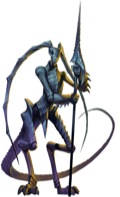
+100 to the new Gelugon. Now a little less bug and a little more Devil.
I am still wondering, though, why don't Salamanders ever look heated or burning, roughly like this (and why do they have nipples).
Also, my greatest hopes are for new art of Solar and Pit Fiend (the old ones were great, but I crave for more).
| bugleyman |
bugleyman wrote:I'm guessing the answer is no, but any chance the new art might find its way into the next printing of the Bestiary?We've contemplated it, and determined that we might *try* to replace some of them, but if that causes *any* text flow issues, we won't do it.
Well, here's hoping. Thank you for replying.
 Knight_Druid
|
Paizo keeps cranking out quality products, The Beginners Box and now this? The pawns are perfect for gaming and represent the friends and foes quite well. It reminds of the days when I used Paper Heroes at my gaming table; it made being the GM very affordable and fun. Good job, Paizo and keep up the good work!
 Cpt_kirstov
|
Oh, gallery with pictures from various blogs would be great - It would save the time seeking through all the blogs when one does not exactly remembers its name...
EDIT: It would be useful as a source of images for Paizo Game Space as well! :D
The wiki has you covered with the gallery portal it lets you serach by book, year, or subject, and includes all of the art released under the community use policy.
| Sincubus |
Of all creatures the WRAITH got new art? I hoped it was the shadow as the shadows art is strange... the wraith is one of the best art in Bestiary 1...
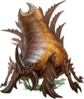
Unlike Ettin, Chimera, Barghest and some others, I like the Ankheg but need to get used to the new look of the Gelugon... the salamander is awesome and the giant frog too, but also didn't really needed new art over some others.
Of all the monsters the Ettin and Barghest are my hopes up for new art.
 Lukas Klausner
|
| 1 person marked this as a favorite. |
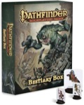
So any possibility of seeing a pawn and comic book subscription before GenCon?
Yeah, I'm waiting for those, too …
| Heaven's Agent |
Of all creatures the WRAITH got new art? I hoped it was the shadow as the shadows art is strange... the wraith is one of the best art in Bestiary 1...
I like the Bestiary Wraith as well (originally from an AP volume, I believe), but it's probably one of those that did not fit the pawn format. The original art is much more... square... than the pawns are.
 Lisa Stevens
CEO
|
Of all creatures the WRAITH got new art? I hoped it was the shadow as the shadows art is strange... the wraith is one of the best art in Bestiary 1...
Unlike Ettin, Chimera, Barghest and some others, I like the Ankheg but need to get used to the new look of the Gelugon... the salamander is awesome and the giant frog too, but also didn't really needed new art over some others.
Of all the monsters the Ettin and Barghest are my hopes up for new art.
One thing to think about when thinking about new art for this pawn set is that one of the main criteria for whether something got new art was not whether we thought the art was good, but rather, could the artwork fit on the pawn. In our Bestiaries, lots of times artists would draw a piece that used a lot of the three dimensions, with pieces flowing into the text and such. While that looks really cool on the page, when you have a finite area on the pawn, that artwork just doesn't work. You get images with weapons cut-off on the haft, or lower sections cut off. Also, sometimes the artwork made a little scene that just wouldn't make sense on a pawn. So for those pieces, we made new art. Not because the old was bad, but because it didn't work for the pawn shape.
-Lisa
 DigitalMage
|
I really do like the look of these pawns (not so hot on the name though :) as I am a fan of paper minis (I have printed out loads of paper minis from PIG's Disposable Heroes range). If I can justify the shell space I may just have to buy some.
I much prefer these stand up minis to the Pog type counters that came with my 4e Monster Vault (I bought it for the book not the counters) as these show the full monster rather than just the face, and are also easier to pick up and move!
| Anetra |
It's interesting to me how many people seem to like this new Gelugon. Although I was able to immediately recognize it for what it was, I did (and do) feel disappointment toward it, and when I then showed it to a friend his first response was "oh, so that's what that was supposed to be." He couldn't tell what creature it was meant to be.
However, redesigns of D&D creatures is a strange sort of subject. Many monsters, and especially fiends, go through redesigns between editions and books. The most vivid example (to me) being the Glabrezu, whose appearance changes dramatically every time we see him. I enjoy this about the Glab; he's a demon, and there's no reason to believe all Glabrezu look the same.
However, the Gelugon is a bit different, because -- oddly -- the Gelugon's appearance had been extremely consistent until now. I'd noticed and enjoyed the Gelugons consistency in the past, an attribute that, to me, contrasted him and his devilishness with the other constantly changing monsters.
I really loved the Planescape Gelugon art, and I'll always prefer that design, so it becomes difficult to talk about a redesign of this creature in an unbiased fashion. However, I believe that even if I could put that love aside, I would still find this new Gelugon a bit odd. His antennae have become giant tendrils, reminiscent of the head tails on a Twi'lek, and his entire appearance looks less insect than it does .. just .. alien.
He looks like a weird, innocent little alien that doesn't understand whatever it is that it's looking at.
It's beautiful artwork, and it's excellently rendered, but it's just so weird to look at it and think "Gelugon."
| J-Spee Lovecraft |
+100 to the new Gelugon. Now a little less bug and a little more Devil.
I am still wondering, though, why don't Salamanders ever look heated or burning, roughly like this (and why do they have nipples).
Also, my greatest hopes are for new art of Solar and Pit Fiend (the old ones were great, but I crave for more).
I was wondering that about the nipples too. I also saw a drawing of a tengu the other day that had nipples. WHAT'S WITH ALL THE NIPPLES?!?
| J-Spee Lovecraft |
Well, although I surely don't love it, I could accept male nipples. As long as they're on mammalian chests.
You know, various types of art often also feature reptilian (or other non-mammalian kind) female humanoids with breasts, which makes me wonder a little.
Exactly. Let's not turn it into a gender thing. It's a species thing. Actually, I was really happy to see some artwork (I don't remember in what book) of the sahuagin priestess who didn't have any nipples, breasts, or other typically feminine qualities you often see in fantasy art.
 JohnF
JohnF
|
Well the marilith in the original MM was fairly nipple-tastic 30 years plus ago
Not really. (That's a Type V demon, for those of you wanting to check). I'd say the preceding entry (the Type IV demon) has more pronounced nipples, and getting on for as much supporting tissue. But it's definitely got other strikes against it :-) For sexuality, it's not really surprising that the Succubus on the facing page has them both beat, even though there's not a bit of nipple in sight.


