|
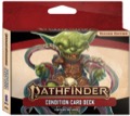
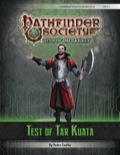
Sign in to create or edit a product review. Frankly, the cards are fine, and thats it, they are little better then a page with a glossary on it. The lack of goblin art was a massive lunch box letdown. I had the privilege of playing this scenario, and running it four times at GenCon 2016, and in spite of being able to now run it in my sleep, I would happily do so because it is so fun. Chocked full of opportunities to take on characters and voices, the GM can have a lot of fun leading PCs on this unique journey. PCs have the opportunity to test their metal in battle, their skills in a number of implicit and explicit challenges, and the players their own minds as they tease out the secrets of this mountain temple ruin. With the PCs actions strongly impacting not just the outcome of the scenario, but the shape of the final encounter. I think what was surprising to me, in running it so many times, was that experienced players had the hardest time setting aside their preconceived notions and murder hobo habits, while new players fell more readily into the story and the tone the module sets. Can't wait for new scenarios from Mikko in the future! Played through this tonight, as a non-physical character, I was incapable of most of the challenges the monks use to judge perfection. I tried to social my way out of participating but I managed to not insult them and that was about it. By failing the challenges I was denied access to an item to let me participate more fully in the final challenge, and spent that combat slinging save or suck will save spells at a monk. Which was my specialty, but still statistically not in my favour. Time stress didn't give us a fair shot and experiencing the second act, but the fights were fun and my abilities had a chance to shine. I will grant that the role playing opportunities in the first half were enjoyable. Cubie hangs out in my gaming room, usually under the poster art that was the original inspiration for him (not withstanding the long and dignified history of Gelatinous Cubes.) The poster is done in the style of a children's book with a little text bubble saying "Blub" and is a part of a series (Beholder Says "Zorch", Owlbear says "Woot", Displacer Beast says "Meow" and Umberhulk says "Click" I think.) When not endearingly being hugged by my children, who have jealously attached on to this simple but delightful plush, he serves as shelf guardian, and periodic stand in for a colossal gelatinous cube on the actual gaming table. Basically, Cubie is awesome, giving personality and charm to that classic dungeon sweeping monster. If only I could get him to clean more then the occasional dust patch on the shelf. 
Visions of WAR: The Art of Wayne Reynolds Hardcover—Limited EditionPaizo Inc.Our Price: $44.99 Unavailable Catalog of WAR: An Index of Where to Find the Art of Wayne ReynoldsI am surprised and disappointed by this book, it isn't the content, which is what I expected, it was how the content was laid out. Wayne's art as always, is spectacular, that is why I ponied up the extra for the LE. In the end the book does not deliver on its promise, which should have been a showcase for Wayne's art. So whats wrong with this book? The images are poor reproductions, they are grainy or blurry, considering most if not all of these images have had high quality reproductions in other physical media this seems not an issue with the martial but how it was captured for use in this book. Whitespace, holy cow is there white space, and it doesn't serve to frame the art, art which historically is printed edge to edge in mind blowing detail, all it does is consume space that the art could have occupied. Layout: Too much of the art has been condensed to share with other art, perhaps a bigger book was required, or perhaps strong editorial control on what went in, but when the amazing wide format art is compressed and stacked, it loses detail and focus. The art would have been better served rotated 90˚ and given a dedicated page. The overall impression is that this is a well manufactured art catalog, not an art book, I have a convenient place to skim the art and then find a product reference to go look at it properly in. Purchased a brick from my FLGS, and really pleased. As others have reported you will get 3 of each common and 1 of each rare in a brick. The detail on the new figs is great, and the paint on the repaints marks them distinctly enough to merit the reproduction. Packaging wise, with the foil packs vs cardboard there was less throw away then my previous purchases. Now less of it was recycle, but it is REDUCE, reuse, recycle, so emphasis is in the right place. So really a great dollar value here, especially for GMs, and for players who have a goblin PC throw a few bucks are your FLGS and get one or two for your amusement. Ran this module tonight and I enjoyed running it, and I the players expressed equal enjoyment. It was a module where I level set some expectations, and the wall of box text at the beginning does that a bit as well. Just very clearly and upfront I said, this is not a hack and slash adventure, your going to need to role play, and be a little more subtle. It was refreshing to have a module like this, and because of the make up of the table, (Ranger, Monk, Ninja, Cleric) we had a good breadth of characters with a balance of skills. The module would not have been as fun if it had been say a table of primary melee characters. So the good stuff:
The Bad Stuff:
Overall great module for the right table, if you have a more fluid group worth having this and a more typical module prepared and pull this if the group is right. While there are probably a dozen minis in this set who I feel could vie for the title, this one truly stands out for brilliance and novelty. The creature behind the fig probably has an awesome piece of art, and a box text that may do it justice, but when this figure steps out on to the battle field the players will know they are in for trouble. What really stands out (not including the obviously cool skeleton floating in a crystal bottle (the plastic is molded to look faceted, not just a tube) it is the little details, all the joints, claws, decorations, runes, and other fine details, that make it almost at the same time alien and ancient. Honestly short of more fine brush work on that detail (which the dedicated folk will probably add at home) there is very little separating this mini from quality you would expect from a high end non-prepainted resin or pewter. Paizo and Wizkids out did themselves, and deserve a pat on the back. This is up there with the Book of Drakes as my favorite third party product. The quality of the writing, and the creativity of the content are both amazing. What seals the fifth star for me is the effort that went into presentation, art, lay out, background graphics, etc. All the treatments you would expect from a primary publisher lovingly applied to some macabre magic items. As a GM getting ready to run Carrion Crown this accessory is a must have. The iCrit certainly looks nice, and its well developed and without error. It is also not overly functional. It replaces drawing from a deck of cards, but actually manages to offer less functionality because you can draw multiple cards from a deck and see them all, where as the iCrit restricts you to one draw visible at a time. The addition of a history feature, or to be honest a more "deck like" draw interface, would be better. My other complaint is that the separation of the two decks into two apps, I realize the product is sold like that, but it would be nice to not task back and forth. Especially on the iPad having a more "Pathfinder App" whose in app purchases are features like the crit deck would be more in line with how I would want to consume this content. One platform, customize your components. Seriously, I don't have a use for this yet, but this is becoming a permanent fixture in my dice bag. As I unpack my fiendish DMing dice, I can line up my most sinister mini's to inspire fear in my players. Edit:
|


