


| frank gori RPG Superstar Season 9 Top 32 , Marathon Voter Season 6, Marathon Voter Season 7, Champion Voter Season 8, Marathon Voter Season 9 aka GM_Solspiral |

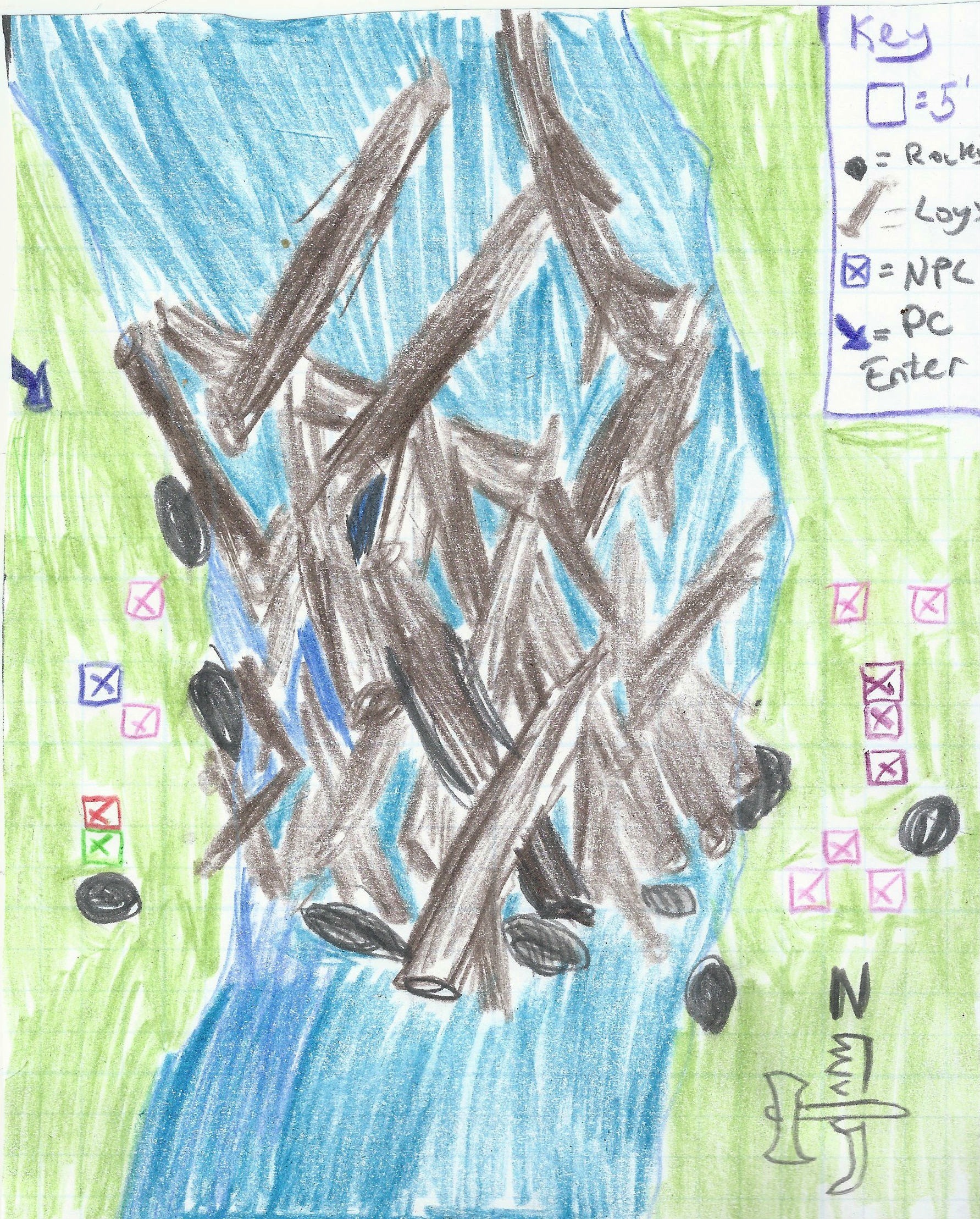
Logjam is navigable but is difficult terrain and takes Acrobatics checks. Eastern side is a group of Lumber consortium toughs. Western side is a Nixie and Satyr using charm spells to entice loggers across treacherous ground. 2 have crossed, one in water, dryad is dying next to Satyr.
| Neil Spicer RPG Superstar 2009, RPG Superstar Judgernaut, Contributor |

Frank! Welcome to the mapping round! It's everybody's favorite skill to put to the test, right? I can hear groaning from somewhere, I'm sure. Before I get into assessing your work this round, I'm making it a point to highlight for the voting public what they should be looking for in these map submissions. While some competitors will likely have access to snazzy computer software to produce a map that's almost ready for publication from the get-go, this isn't Cartography Superstar (though it'd be cool if that was ever thing, too, right?). Instead, the goal here is for a designer (someone usually more focused on writing) to pair his vision for adventure and encounter design with the rendering of a map which an actual cartographer can turn into a final map for publication.
That means, the designer needs to get enough into his or her map turnover that the cartographer can make sweet, sweet magic with it. And, believe me, there's nothing more amazing than envisioning a cool encounter in your head, writing it up, and then seeing a cartographer produce an amazing piece of mapping art to go alongside it. To make sure the cartographer can do that, you have to be clear with what you've drawn so they can interpret it correctly. If you're not clear, that makes your developer's job harder, as they have to go back in and correct things...consult with you on what those squiggles are meant to represent so they can inform the cartographer...or, in the worst of cases, completely redraw something if what you've given them is unusable or uninspired.
So, voters! Listen up! Please assess the maps these designers have provided as "first drafts" which a cartographer would then turn into a final map. Look for whether or not all the information is there to inform the encounter or location the designer has given us. Determine if the location would make for cool play at the game table. Rate the creativity behind it all. And, lastly, consider how well the designer used his or her 50 words of additional text to inspire or refine what they've given us. That's what I'll be trying to do in the feedback that follows.
Does the map provide enough information?
Somewhat, but not completely (at least for me). Because of the way you colored and scanned this map, the grid is almost completely washed out and lost. I can extrapolate based on the size of the X's and the 5-foot square designation in the map key, but this is sloppy, unpolished work. You normally see a title on Paizo maps. I don't think it was mandatory for this round, and you left enough room in the upper right hand quadrant to probably drop in "Standoff at River Logjam" or some other title, if necessary. The real problem is that there's a whole bunch of different colored X's on the map with no indication of what they mean (other than they're presumably NPCs). The accompanying text eventually gives better insight into it, but you should have either not indicated starting positions of the NPCs at all (as the purpose this round wasn't to design a complete encounter), or if you really felt you needed them (elevate and explain the piece) you should have used the legend to list what each colored X represents. Yes, that would have taken up more real estate, which is why I'd advocate removing the X's altogether. Of course, you do that, and suddenly the map loses a tremendous amount of "features" and that's because it's really rather lacking in overall features to make it anything more than a river, banks on either side, and then some rocks in the middle with a bunch of logs caught on them. And, when described that way, it doesn't really sound like what you'd expect Superstar map to contain.
Does the map provide a cool setup for a fun encounter?
Actually, yes. It could. I can see the core idea you were going for...i.e., dynamic river encounter with unique terrain features as a result of the logjam and the immediate dilemma of PCs faced with stopping the nixie and satyr from luring more loggers to their deaths. I get it. But at least half or more of that situation depends more on the NPCs and monsters in the encounter details to elevate the situation, and the map is really just the backdrop where it plays out. Now, if it plays out the way your accompanying text suggest, it could certainly be memorable, but I'm also missing elements like how swift and deep the river is...or what's the DC for crossing the logjam with Acrobatics checks so you don't fall in? There's also a lack of other features like elevated hills, trees, marshy undergrowth, and so on, to provide more for the PCs to interact with. There's even an absence of roads or trails to give an indication of where else you can go from this map, or how the PCs arrive, or where the loggers came from. More elements like that could at least create more insight into how to setup and run the encounter using this map.
Is the map creative and interesting?
Yes and no. The logjam idea is creative and interesting. But that's primarily it. Other than that, we've got two riverbanks on either side. Everything else relies on the NPCs, not the map. So, there's not enough character to the locale here. Things that could have punched it up would be a raft or canoe that got caught up in the logjam trying to get downriver. Or a nearby animal cave or bird's nest or the beginnings of a beaver dam (or maybe an old one repurposed by the nixie?). Or a cabin or a lumberjack camp or a loaded down wagon that brought the loggers to clear the logjam. Or a fey treehouse. Or any number of other things. This map needs more to make it Superstar creative and interesting.
Is the designer's extra 50-word commentary inspiring and useful?
Useful, yes. In the sense that it's actually quite vital to help with interpreting the map, because I initially had no idea what all those different colored X's were supposed to be. According to the legend, the blue one is an NPC...but it's apparently meant to reflect that all X's are NPCs without ever distinguishing what the individual colors are for. The text clears that up a bit more, but still a very sloppy way of handling it. Marking NPC (or monster) positions on maps isn't Paizo's typical style anyway. It happens occasionally, but not often enough that every different colored X needed to be indicated on the map.
Final verdict, a lackluster piece that cuts a lot of corners and has an uphill battle to win me over on concept and execution. There's not enough here and the focus is more on the NPCs and the encounter situation than the mapped location, so I have to say I DO NOT RECOMMEND this map to advance. Regardless, good luck in the voting if you're pulled up as an alternate, and hopefully you can bring us something more inspired and polished in Round 3.
But that's just my two cents,
--Neil
| Liz Courts Community Manager , Star Voter Season 6, Star Voter Season 7, Star Voter Season 8 |

Hello there! I'll be one of the judges for this round, and I'll be looking at a couple of key points for your map: readability, usability, and how fun this would be to run as GM. For some background, I helped found the Wayfinder fanzine before I started working for Paizo, and have done work as a freelance cartographer.
Readability
The location of creatures are rarely indicated on Paizo's maps (if ever), which also follows their standard of not describing creatures in the room in read-aloud text. Creatures that have a chance of getting up and walking about (however slim) do not need to be depicted on your turnover. The map's details are not clearly indicated, and are not inspiring.
Usability
A logjam is a pretty common event to have on a river, but I don't really recall seeing it fully illustrated very often. This could fit in well as an actual Flip-Mat location, but as an adventure module site, it's not a good choice.
Fun Factor
The fun seems to be mostly in the situation between the NPCs, not the map. While that's not necessarily a bad thing, this is the map round.
Final Thoughts
This map does not excite me to take a closer look at it, and its execution is lacking. I do not recommend this map for advancement.
| RonarsCorruption Star Voter Season 6, Star Voter Season 9 |

Frank, I have to be honest. That is not a pretty map. I had to even do a double check that it had a grid at all, and I mostly had to assume so, based on the evenly sized xs.
The encounter you've described is okay, though not particularly superstar, but the bigger problem is that the round is supposed to be focused around the encounter map, and that's not incredibly inspiring. Sure, its a neat place that could use a map in play, but not the sort that would last more than a few minutes.
| Neil Spicer RPG Superstar 2009, RPG Superstar Judgernaut, Contributor |
No text on the map other than the key/legend. Of course there's the accompanying 50 words in the first post.
 The Raven Black
Star Voter Season 8, Dedicated Voter Season 9
The Raven Black
Star Voter Season 8, Dedicated Voter Season 9
|

I am disappointed. The encounter could be okay for a little game time I guess. But after that is done, what can I do with this map ?
| Garrett Guillotte Star Voter Season 6, Dedicated Voter Season 7, Star Voter Season 8 |
Since he's a prolific 3PP and big part of the Superstar community, I was hoping to see Frank's map one way or another. Unfortunately, I have to agree with the judges that the map is by far the weakest part of this map entry.
Considering the grid isn't visible on more than a third of the map, and as best as I can gather from measuring 72-pixel squares and the parts of the grid that bleed through, this map is just shy of 25x31 squares. The key and easternmost rock use the extra space. (If the scan didn't cut off the key, it would be 25 full squares wide.)
That's a bit past the rules' requirements of a 24x30 grid, but it's in the competition, so that's probably not enough to disqualify it. It's still an oversight to knock, however, considering this year's emphasis on the letter of the round's rules.
| RJGrady |

If I were the cartographer, I would be throwing up my hands trying to figure out how to map those logs. Like, how exact are those positions, in the designer's eye? do they need to mostly fill a grid square, or are they more like a terrain type?
| frank gori RPG Superstar Season 9 Top 32 , Marathon Voter Season 6, Marathon Voter Season 7, Champion Voter Season 8, Marathon Voter Season 9 aka GM_Solspiral |
Hate to get in because someone else got DQed, but I do want to thank the judges for their feedback.
I'll refrain from further comments or discussion until after the round closes.
 Dieben
Star Voter Season 7, Star Voter Season 8, Marathon Voter Season 9
Dieben
Star Voter Season 7, Star Voter Season 8, Marathon Voter Season 9
|

On one hand, I want to vote for you because I've enjoyed your prior work. However, this map is nearly unusable. I don't know if you will make it through this bump in the road. If not, good luck next year.
| RonarsCorruption Star Voter Season 6, Star Voter Season 9 |
Garret, I'd bet the reason the map appears to be bigger than the listed area is because he colored in a template, which included a border that simply got colored over.
You do raise a good point, though, in that by doing so he actually made the map a full square bigger in each dimension, even if it's only a half square on every side. That's really sloppy work.
| Garrett Guillotte Star Voter Season 6, Dedicated Voter Season 7, Star Voter Season 8 |
I tried to overlay the 24 x 30 grid provided in the rules at 72 ppi to see if it helped make more sense of the map.
It shows Frank's grid is larger than the provided template's. While the image metadata is 72 ppi, the image itself is not, so I tried scaling the grid to fit. Without visible vertical grid lines to effectively measure against on most of the page, I calibrated it off the visible grid lines in the key and the NPC icons.
If I assume a square grid scaled up past 72 dpi, which is likely, this results in a grid slightly smaller than 23 x 30 squares. This still goes against the letter of the rules ("Entry must be on a 24 x 30 grid"), but it's not advantageous to Frank to use less space than allowed.
Hopefully the visible guidelines help with making more sense of the map. It doesn't change my opinion, but it does make the ranges and general scope of the map easier to discern.
 Owen K. C. Stephens
Developer
Owen K. C. Stephens
Developer
|

I could conceivably claim this isn't on a grid at all and DQ it, but it pretty clearly was made on a grid so this doesn't look to be violating that part of the rules.
I can't say for certainly the exact size of the grid, but there's no evidence it's bigger than the map parameters, and if it seems smaller it's certainly possible it is the correct number of inches, but that the grid itself is inconsistent, or the listed 5' scale is off.
Those are quality issues, rather than requirements issues. There's no clear violation here, even using my normal unforgiving standard of what leads to a DQ.
| R D Ramsey Marathon Voter Season 6, Dedicated Voter Season 7, Marathon Voter Season 8, Star Voter Season 9 aka Clouds Without Water |

I zoomed in, played with the contrast, counted really faint blue lines. My best guess is that it really is 24x30. I feel good about the 30, but it could conceivably be 23 instead of 24.
In any case, the difficulty of counting the squares points to a lack of clarity on the map.
I was excited to see this, based on Frank's other work, but I can't help but think he got rushed on this one.
There's a really cool map to be made for a logjam battle. A couple more passes and this might have gotten there.
| Nickolas Floyd RPG Superstar 2013 Top 32 , Marathon Voter Season 6, Dedicated Voter Season 7, Dedicated Voter Season 8, Star Voter Season 9 aka Phloid |

The map I was working on in case I made the top 32 was also centered around a log jam (with a waterwheel saw mill and piles of logs on the hills waiting to be loosed to the river, as well as a desecrated druid or fey shrine and a barricaded lair of an angry animal companion). I've always thought that a log jam would be a great location for an encounter or likely a running fight across the logs, but I've never done it in a game. Good idea there. The execution was on the weak side, but it is hard to be motivated to give your best work as an alternate not knowing if you have a shot of being moved up. That has gotta be the worst place to be. I know Frank's got the stuff, but I'm not sure this map will be enough to move him on. I wish you luck though.
| Brian J. Fruzen RPG Superstar 2015 Top 4, RPG Superstar 2014 Top 16 , Star Voter Season 6, Star Voter Season 7, Star Voter Season 8 |

I’ll start by telling you what I think a good map does. It sparks the imagination of the viewer. It whispers stories of events yet to come and invites a GM to spread their toes in a sandbox of creativity. It presents mysteries that need to be solved and beckons players to open every door, delivering on each area’s promise that more adventure awaits ahead. There are some technical elements that can help.
Is it readable? The lines are not well defined, and you rely on the separation of colors to do the work of a good marker. This map isn’t pleasant to look at and a cartographer might have trouble making it any better.
Are there multiple choices for the PCs to make? If not, does the map present a path for the action to flow in? The only choice is whether to cross the river or not, and how.
Does the map utilize the space well? Rivers are difficult to incorporate on the area of a flip-mat because to make them wide enough to be a believable river, you need to have them stretching across almost the entire play surface. This means the river itself ends up looking a little boring.
Are the elements presented well thought out and make sense for the environment? You added some logs and some rocks, as well as some colorful x’s. It appears that a few rocks started the jam up, so you did include some cause-effect. I want more than this though. The river banks are very plain.
Is this a map I would like to use more than once? Maybe.
So, back to the initial question: does this map spark the imagination? A fight over floating logs isn’t unappealing, but this map doesn’t work very hard to convince me that the area is much more than that. I suppose I could populate it with giant, mutant beavers.
| Curaigh Star Voter Season 6, Dedicated Voter Season 7, Marathon Voter Season 8, Marathon Voter Season 9 |

My first and probably last day to look at maps before voting closes. So here be the short version critique.
++ is awesome, +- good with a few shortcomings, -+ icky but some cool parts, and -- not a fan.
Initial reaction: meh
understandability: +-
visuals: -+
adventurous: +-
inspired: difficult terrain not much else, I wish there was a level indicated from water to land as the river should be able to flow over the land once a lamb starts. Oooh... I did get inspired: anyone standing on the W bank in 1d8 rounds must save or get washed away.
Vote: middle of the road, leaning to not
| frank gori RPG Superstar Season 9 Top 32 , Marathon Voter Season 6, Marathon Voter Season 7, Champion Voter Season 8, Marathon Voter Season 9 aka GM_Solspiral |
Okay didn't make top 16 and in all honesty did not expect to... Congrats to those that advanced.
This is a mediocre effort at best and while the core concept is neat I absolutely did not deserve to advance. I had hoped to anyway but I had no expectation of it and it has absolutely nothing to do with my being an alternate. In all honesty I expected at least 1 person to DQ themselves and was fully intending to put my best foot forward here, I got dealt a different set of cards.
I was in fact quite ill (I've been on antibiotics for about 8 days now) and the two days of knowing I for sure had to do a map and produce one were the absolute worst 2 days of it.
I drew 3-4 versions of this and this was one of the first drafts. The other drafts were missing keys and scales because while I produced this hot mess on a deluxe sheet of graph paper (counting out the squares) I was going to finish it with gimp re-adding the squares, coloring it graphically, and adding DCs and a better key... from my work computer where I normally do anything where I need Gimp because I use a Chromebook at home.
This one the only map I made that I could scan in and still meet all the requirements thus it made it despite being a somewhat embarrassing effort.
Other drafts had the log jam going higher up the river, different acrobatic DCs depending on where you crossed, and there were going to be a few NPCs in the water already actually adding a potential skill challenge to the map.
I take away a few lessons from this:
1) Assume advancement earlier and be prepared in case something goes wrong.
2) Get better at all elements of Cartography because it's not going away no matter how much I dislike it.
3) Investigate other image editors that are compatible with Chromebooks... I tried 2 they both sucked.