


| Robert Lazzaretti Cartographer |

Decent looking map reference here at first glance.
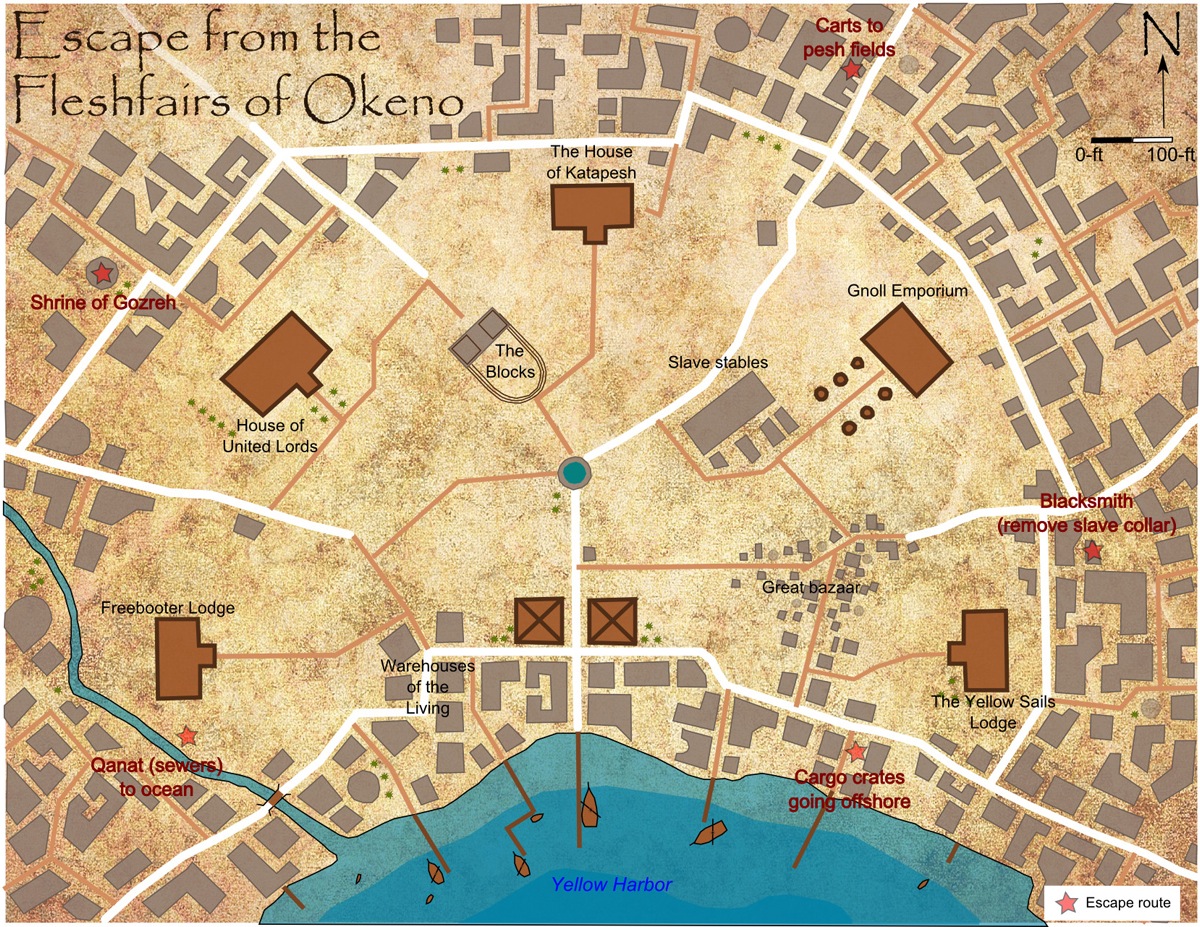
There is a compass rose and scale present on the map.
Good use of page space.
minimal details but efficient and useful for completing a city map.
I do recommend this map to progress to round 3
 Crystal Frasier
Contributor
Crystal Frasier
Contributor
|

The Good
This is a well-labelled map that I could turn into a finished map with no additional information.
It has a compass, scale, and enough labels to make out the details.
A lot of variety in the building shapes and density keeps the relatively simple map from looking dull.
The Bad
This looks like a half-page map at most, for one to three encounters (since I doubt players need to hit all the escape routes), and feels like wasted space as a full-page map. It doesn't even really feel like a map would be necessary for this encounter.
My Judgement
I'm on the fence with this one, but since this doesn't seem like an encounter that really needs a map, I'm going to go with a weak do not recommend.
 Owen K. C. Stephens
Modules Overlord
Owen K. C. Stephens
Modules Overlord
|

Drawing from my blog on maps, and the rules for the round, I’ll judge the maps on a number of questions.
Is It a Full Page Map?
Definitely.
Does The Map Have A Compass Rose and Scale? Are They Used Well?
It has them, but they cause some issues.
There's no reason not to orient this map in portrait format. The simple fix if there's no background reason not to, is to just change which way is north when you reorient it. Even if you have some continuity reason why the yellow harbor has to be to the south of the city, no rule says you must put north to the top of a map. As a region map it might be reasonable to think this will be printed on an inside cover, and Paizo sometimes does those as landscape maps. But this is clearly for a set of tightly-linked encounter, and a GM is likely to want to reference those when playing. Since the rest of the adventure is going to be easiest to read when the book is held portrait, that's the best way to orient this map.
The scale also causes some issue. According to this scale, there a huge area between the city proper, and the docks and warehouses. Why to the gnolls haul their goods across 600 feet of empty space to their emporium/ Why has no one built anything in the huge empty dirty fields between those two points/ Even the great bazaar is only about 200 feet long, but some of the unmarked buildings are 100 feet long.
Is The Map A Place I Want To Adventure?
Yes, if the above issues are fixed. It seems like a lively urban setting with lots of buildings that aren't all just squares and rectangles, with temples, and sewers, and bazaars, and freebooters. It's the kind of map that encourages players and GMs to pick an unmarked building to serve as their adventuring party safehouse, or a magic item shop, and so on.
Is the Map Clear?
Yes. In a few places it has info you don't need for a map (we don't need to know the blacksmith is an escape route because he can remove slave collars), but the buildings, water, dirt, and ships are all clearly indicated.
Is the Map Detailed?
Detailed enough. Some street names would be nice, and most cities have things like parks, or pools, or wells. Also, if the blue dot in the center is the only well, it should be marked. (And is should have buildings around it - it's the water source after all).
Is the Map Imaginative?
The many different building types, several of which clearly have interior "courtyards" common in many real-world older cities, puts this a level above a lot of towns and cities, and earns this points.
While I'd need to make revisions before sending this off to cartographers, it's a good start for a nice-looking city. It's not perfect, but I think with some feedback I'd get better city maps in future turnovers. I'm not in love with it, but I do recommend it to move on to round 3.
| Jacob W. Michaels RPG Superstar 2014 Top 16, RPG Superstar 2012 Top 16 , Marathon Voter Season 6, Marathon Voter Season 7, Marathon Voter Season 8, Dedicated Voter Season 9 aka motteditor |
I think you've done something really clever by making us see the encounter in this map. The title is of course a big part of that, but even the escape route indications add to that. That's a great way to get me excited about the potential of the map.
I really like your building indications on the exterior part of the map. Nice different shapes, and it's populated enough that I feel it could be a city.
But that brings us to the centerpiece of the map, which just kind of feels like a lot of empty space. I was thinking it was maybe intended to have a bunch of tent markets, but you even have a great bazaar indicated bottom right, so that doesn't seem likely.
As for the location, I think it's definitely a place in Golarion, but I feel like it's one you just took from the setting instead of giving us a place of your own. I can certainly see why you felt that might be part of the challenge, but I don't think it gives us insight into what you would do as a designer.
I haven't made any decisions yet, but I think I probably am not going to vote for this map. (Sorry, Newton, I always feel bad when I say that, since I know it sucks. Good luck with the other voters, though.)
 James Casey
RPG Superstar 2014 Top 16
,
Marathon Voter Season 7, Marathon Voter Season 8
aka Jrcmarine
James Casey
RPG Superstar 2014 Top 16
,
Marathon Voter Season 7, Marathon Voter Season 8
aka Jrcmarine
|

This is a nice looking map and has some great creativity behind it. Like Jacob, I have some issues with it. I am on the fence but I do want to let you know this is a very good entry, I just don't know if it is good enough.
| John Bennett RPG Superstar 2011 Top 8 , Dedicated Voter Season 6, Star Voter Season 7, Dedicated Voter Season 8 aka John Benbo |

This map took me a little while to get into. I like the buildings, but the wide empty space caused me to miss the escape points which are on the edges.
| Maurice de Mare RPG Superstar 2013 Top 16 , Marathon Voter Season 6, Marathon Voter Season 7, Marathon Voter Season 8, Dedicated Voter Season 9 aka Darkjoy |

23rd map I have seen, your current rank is 10th.
| frank gori RPG Superstar Season 9 Top 32 , Marathon Voter Season 6, Marathon Voter Season 7, Champion Voter Season 8, Marathon Voter Season 9 aka GM_Solspiral |

Challenge: Is this map difficult to execute? Does it in my opinion demonstrate the characteristics of a Superstar designer?
Technique: Did the designer show some skill and consideration in the choices made on the map. Are the words used in the key wise choices that add to the overall utility of the map?
Utility: Can a GM/cartographer make sense of the map and make immediate use of it?
Overall:[b] I'll rate the Map as an A for strong recommends B for weak recommends C on the bubble D for weak rejects F for Do not recommends
Challenge: City spaces aren't that hard IMHO.
Technique: This is visually very appealing which helps the overall design a great deal and you are trying to tell a story with the map which I applaud.
Utility: It's essentially an oval with a harbor ans some building shapes. I have every confidence I could make use as could a cartographer.
Overall: -B if I weakly recommend this as I feel this ranks somewhere in the 9-12th overall
| Jaragil Marathon Voter Season 8 |

I really like the story this map is trying to tell. The PCs get captured and somehow they have to get out of the city without being detected or stopped. That's definitely an adventure I'd want to be part of and the map serves the purposes of that story very well. All the essentials of a slave harbor are there, down to the gnolls and the masters.
I also like the look of this map and the fact the buildings differ greatly from one another. The scale makes no sense, making most of these buildings appear to be rather large in size - is this a city for giants or something - but that's a minor tweak to make. I like all the names for the places that have them and although the huge empty space is a bit odd, I get that it is meant as a huge parade and training ground for the slaves. The map just doesn't convey that very well, if that's the case.
This is a maybe map for me. I love the story behind it, but the story is conveyed through the extra info you give me through text. If I removed the text, this would be rather boring, though with a few interesting details.
| Mark Nordheim RPG Superstar 2014 Top 16, RPG Superstar 2013 Top 32 , Marathon Voter Season 6, Dedicated Voter Season 7, Marathon Voter Season 8, Dedicated Voter Season 9 aka Morphemic |

Here are my ratings for this map:
First Look: B
This is a nice looking city map, but it's missing any wow factor.
Interest Level of Location: C
It's a slave market. Nothing particularly exotic here, and no truly exciting features. But the map is well designed and several of the building names sound interesting.
Tactical Depth: NA
I am not rating this category for maps that are not of a tactical scale.
Adventure Potential: A
This map tells you exactly how it could be used in an adventure. The PCs could be freeing slaves, or they could be escaping themselves.
Clarity: A
Very easy to interpret.
Logic: A
I'm no expert on how a market like this should look, but this seems logical to me.
Overall: B+
| PFW1-K1 |
BEEP BOOP for more information PLEASE SEE
Okeno, the Katapeshi city of 1,000 slavers; its Fleshfairs, as featured in this map; the Okeno Slavers, the cabal of slave traders who run the city, and whose slave galleys' yellow sails likely inspire the Yellow Sails Lodge's name; pesh, a popular and addictive plant-derived narcotic; gnolls, who are customers and merchants in Okeno rather than threats; and Gozreh, the nature deity whose shrine is in the map's northwest.
| Feros Champion Voter Season 6, Champion Voter Season 7, Champion Voter Season 8, Champion Voter Season 9 |

This is a very clear map, easily understood, with a nice use of textured colour to make it somewhat attractive to the eye. This has been set up for an adventure with various points delineated for an escape rout marked. However there is no formal key and a lot of open space that seems to serve no real purpose.
Also by placing various points for an escape route, this map has limited the options that the PCs could use to escape. In good adventure design, the PCs are presented with a problem and have to figure out how to overcome that problem on their own. Some possibilities should be planned out, but the PCs should be able to ignore them all and come up with their own inventive way through.
From lack of any visual image here that is exciting to limited actions allowed for the PCs, I will not be voting for this entry.
| Oceanshieldwolf Dedicated Voter Season 6, Dedicated Voter Season 7, Marathon Voter Season 8, Star Voter Season 9 |

I like this - the big empty areas make a lot of sense if you need to move and corral monumental amounts of humanoid chattel, and to keep everyone aware of just how bleak and awe inspiring a city of 100 slavers might be.
The title is dynamic, and the locations build on that. You have all the needed participles, even down to the gnoll and pesh references.
I like the typography, though that is a small thing.
I agree the slave collar reference is unnecessary, unless there were more of these notes added - by itself it feels out of place.
I like that the empty space did not make the designer seek to feel it - as I said, it has all the necessary parts for the encounter it is illustrating. Nice work.
| Mark Griffin RPG Superstar Season 9 Top 8 , Dedicated Voter Season 7, Star Voter Season 8, Star Voter Season 9 aka Mark D Griffin |

My favorite thing: Gnoll City! I feel like we don't see enough gnolls.
Other things I like: Your irregularly shaped buildings with courtyards are nice. I also like your sandy texture.
My least favorite thing(s): There is way too much empty space here for me, I see no reason for there to be no buildings there. Also I am not a fan of your escape route markers. I feel like it will lead to a railroad for the PCs. There is only one way in this city to get my collar off? Only a blacksmith? What about bribing or threatening someone who has a key? How about a crazy alchemist or wizard? Weirdo with a pet rust monster?
Will I vote for it: This map is in my 16th or 17th spot, so in my opinion you could go either way this round, but I will not be voting for this map.
| Browman Dedicated Voter Season 8, Dedicated Voter Season 9 |
I love the idea behind this map, but the huge open spaces leave me at a maybe. I don't think the identifiers of ways to escape are a bad thing and nothing is preventing people from thinking outside those ways, it just gives the GM some ideas for hints to drop or plans other slaves have.
|
Owen K. C. Stephens
Modules Overlord
|
Official Round 2 Note: On Map Resolution
We’ve had some comments on legibility of smaller type on the maps, and the contestants are (by the rules of the contest), not allowed to clarify anything, so I want to make a general statement about maps and resolution.
When we required all contestants to present maps at a specific dpi and size, we did so because in past years we’ve had some issues with maps (for the encounter round) being sent to us in different sizes, resolutions, and dpi, making it difficult to give them all a high-quality presentation for the contest. We found that asking for a higher dpi than we’ll use in the end allowed us to create a standard of presentation that kept all images crisp and clean. For encounter-round maps, this has worked well.
Unfortunately, since this round requires all text be provided on the maps themselves, many contestants used the dpi and size standards we required as the basis for making sure their text is clear, and otherwise tried to keep words as small as possible so as to not clutter their maps. This was done in the (reasonable) belief that the maps should look good at the size we asked for, rather than in any different size we might present on our website. When resized for smaller, high-quality images, this can result in words that aren’t clearly legible.
We’ve made a change to rescale everything to the higher end of maximum image size for uploaded images for all maps that were entered this round. This should allow for better legibility for voters when selecting their favorite maps to advance in the contest. It is our fault that this process was not properly communicated to our contestants, so consider this when adjusting or finalizing your selections.
Obviously, we’ll explain what is going to happen to the images of maps, and how to allow for it, more clearly in future rounds (and future contests). My apologies to any contestant with a map that has suffered as a result of how we handled scaling in this round.
 James Raine
RPG Superstar 2012 Top 16
,
Star Voter Season 6, Dedicated Voter Season 7, Dedicated Voter Season 8
aka FaxCelestis
James Raine
RPG Superstar 2012 Top 16
,
Star Voter Season 6, Dedicated Voter Season 7, Dedicated Voter Season 8
aka FaxCelestis
|

http://i.imgur.com/xIIamMM.jpg
Here is how your map appears to a colorblind end user. Your use of color is practically unchanged, but since roughly 10% of the populace is colorblind, this is something you need to keep in mind.
| Kiel Howell RPG Superstar Season 9 Top 32 , Marathon Voter Season 6, Marathon Voter Season 7, Marathon Voter Season 8, Marathon Voter Season 9 aka theheadkase |

I am critiquing this without having read others' first:
Very professional looking background.
Lots of buildings around the main area, but I have no idea what they are. The city layout feels organic but there's not enough streets on the extraneous areas.
Your key has only 1 entry, and it denotes an escape route. That really narrows down what you are trying to tell me as a story...but I don't like it. I would rather have seen some labeling on the various circles in front of buildings.
Overall, I want to like this map, and it is serviceable, but I think you should have zoomed in to your main area, and only suggested at the extraneous parts. As it is this is pretty uninspired and blah.
| Jeff Lee |

I like the overall layout of this map. The idea of starting an adventure with a group of slaves needing to escape their masters is appealing. It gives the players opportunities for improvisation, working outside the traditional framework of powers and equipment. Also, it builds teamwork. The map provides several options towards accomplishing this task, which I appreciate, because it accommodates multiple approaches.
The interior section of the map has a lot of open ground. Seems like that would make the initial escape extraordinarily difficult, given the clear view that any guards would have of any suspicious groups trying to sneak around. The escaped slaves could keep to the outskirts of the map, of course, taking cover from buildings, but then that leaves one of the most detailed sections of the map completely unused, which seems counter to the purposes of detailing it in the first place.
| Grumpus RPG Superstar 2014 Top 32 , Marathon Voter Season 7, Marathon Voter Season 8, Marathon Voter Season 9 |

I liked this map, there certainly could be a fun adventure played out here.
Sorry to say you just missed out on my top-16, best of luck!
| Koboldhammer Star Voter Season 8 |

You almost made my top eight, as there is clearly an adventure here, but the map does not convince me on a few points. Why zig-zag roads if there are no buildings in the way? Then they should be straight, with little driveways veering off towards the buildings. Also, cities only have open spaces in the center if these have a purpose: market square, militia drill ground, park, loading areas where sea goods are transfered onto caravans...your map is leaving too much to my imagination.
Still, I hope you make it to the next round. I have a feeling you know how to tell a story.
| Raynulf Star Voter Season 8 |

First off: Congratulations on making Round 2, and the best of luck in the votes!
Coolness: Do I look at this, and want to use it in a game? Does it provoke wonder or amazement? Does it hold potential for interesting encounters, adventures or roleplay? How much mileage does this map have in it?
Usability: How usable is this for me as a GM (being that GMs are actually the primary audience of most maps)? Is the legend clear and in logical order for play? Does it give me enough information to easily visualize the parts and wax poetic about the varied locations? Does it have the necessary details for me to run with it on the fly, or will it involve a lot of improvisation? Does it have any glaring oddities that stop me mid-breath to go "what the hell is that?!"?
Craftsmanship: Is it clear, legible and containing all the necessary bits and bobs? Does it make good use of the space? Is the scale appropriate for the detail (and visa versa)?
(I suppose you could also call them "Creativity, Functionality and Skill", but I like my terms better :P).
Coolness: D+
- Positive: The fleshfairs of a hive of scum and villainy, with narrow alleys winding amid the ramshackle buildings… nice. What brings the adventurers to this place? What dangers await?
- Negative: It's a single scenario, and one that focuses on leaving the place rather than exploring it – not something I'd normally use a map for, personally. There isn't enough detail to use it for any other purpose or really get across the feel of the place. The rest of the city is then just filler space around the encounter, and it deserves to be more than that – what are those buildings and streets? Are those actually buildings? Who lives there and why did they build houses that are 50 and 100 feet long and with random angles? Why are four of the buildings with labels virtually identical in shape, when so much of the city is comprised of unique (and odd) shapes?
- Verdict: D+. Okeno is a fascinating (and horrible) place, and thus an excellent choice, but the map lacks the detail to bring this place to life.
Usability: C
- Positive: With the scale, labels and encounter notes, I could definitely use the map to run the scenario, and the labeled buildings in the square do allow for some flexibility and extra roleplay options.
- Negative: Most of the city is an unknown, and I have to play guessing games with what certain things mean, such as what the blue thing in the square is (well? point? fountain? death-by-drowning execution spot?) and what exactly the white and brown lines represent (and why they go where they go).
- Verdict: C . It's fit for the limited application it was intended, and can be made to work in the broader context of players wanting to see more of the city, with significant effort on the part of the GM.
Craftsmanship: C-
- Positive: An interesting design that is clear, easily read and bears a scale.
- Negative: There is little reason for the vast open spaces in the center of the fair, and although the building shapes are interesting, without the context they are simply shapes, and big ones at that, by the scale. This map is sorely in need of labels and a key to make it function as a city map, even if intended as a single escape scenario (which debatably doesn't need a map).
- Verdict: C- .
Overall: C-. I was torn on this one, as there is serious potential here, but by focusing on just the escape scenario and not providing material for when players inevitably want to explore, the map fails to live up to it as much as it could.
| Newton Philis RPG Superstar 2015 Top 32 aka Banesfinger |

Thank you everyone, for your consideration.
The intent of this map is indeed an 'escape' scene. The extent of the map reflects that (an entire city would be too large, but a few individual streets would be too small).
The idea came to me with the thought of using Pathfinder's "Chase Card Decks". Larger streets (in white) would get you to an escape route faster, but have more encounters/cards, while less used streets (brown) would be slower/less cards.
I was tempted to paste a cover picture of the Chase Card deck in the legend but wasn't sure if that would disqualify me?
As many have speculated, the large open are is indeed on-purpose: I imagined herds of human chattel and task-master crowding this open-air flesh market. Parade lines of slaves await in chains for their new owners. Etc.
| Koboldhammer Star Voter Season 8 |
Blast! I changed my vote to include this one at the last moment as I was sure my number eight would make it anyway. My gut feeling was right, that this was ending up top 16 but never 8 with everyone. Well, next year be a bit more specific on how your map is filled ( I thought the rules were very sketchy as to what hints were allowed, which probably didn't help) and you will get through. Thank you for showing us your map.
| Feros Champion Voter Season 6, Champion Voter Season 7, Champion Voter Season 8, Champion Voter Season 9 |
Congratulations on being promoted to the Top 16! :D
| Lady Firedove Star Voter Season 6 |

Congrats on the promotion!
I think this map could lead to some fun encounters. :)
As a side note, they misspelled your map name on the main RPG Superstar page. ("Fleshlairs" instead of "Fleshfairs")
Who do we need to mention that to to get it corrected?