Core Principles: Varying the Challenge in the Pathfinder ACG
Wednesday, November 20, 2018
Last week I got to proof the new rulebook for Core and it made me excited to talk more about the design principles for the Pathfinder Adventure Card Game Core Set. As Mike explained in a previous blog, we really wanted to give players the ability to control the game's challenge level, as well as the ability to speed the game up when desired.
I'm a big fan of giving players control knobs in games. We've all tinkered with house rules to increase the fun for our table. The problem with house rules is that they vary pretty wildly from house to house, which can occasionally be tough. They also tend to have less rigorous testing and development. Official options for changing the game are better, since they provide a common language of well-tested options.
We've all tried to control the difficulty level in our games, too. It's easy and obvious in video games (like picking Legendary difficulty in Obsidian's Pathfinder Adventures), but in the RPG, the adventure you choose, the GM, the characters, and the people playing them all have a pretty profound effect on difficulty, too. When people discuss PACG sets they often talk about difficulty as a primary reason to choose one set over another. It's good to have variety, but it's a shame to rule out a set because it's too easy or hard!
The amount of time available to play can change session to session, as can the number of players, and more players usually means more time required. We really wanted to present options that would let you look at the number of players and the amount of time you have so you can say "let's play one long scenario" or "let's knock out two quick scenarios."
Ideally, you can alter the difficulty on the fly to suit the particular players that night, or to match the scenario. You like a hard game, but you just failed the scenario? Drop the difficulty a notch before replaying it!
Change Things Up... Or Down
The first thing we decided to do was create small, medium, and large locations. Medium locations are what you're used to. Small locations usually have 3 fewer cards, which speeds up the game while making it easier. Large locations usually have 3 more cards, giving you a longer, more challenging scenario.
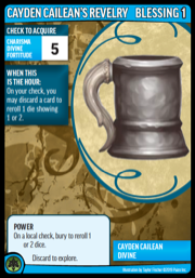
Bigger locations have more banes, but also more boons. Everyone likes boons!Next, we gave you some freedom to change the number of cards in the blessings deck—which, since it often contains things that aren't blessings, has been renamed the hourglass. While the hourglass defaults to 30 blessings, we heartily encourage you to play with fewer or more blessings. Fewer cards in the hourglass speeds up the game while making it harder, and more cards gives you more time to win, making the game easier.
Because location size and hourglass size can be changed independently, you can dial in length and challenge level to your liking. If you combine small locations (faster + easier) and fewer cards in the hourglass (faster + harder), you get a faster game that's close to normal difficulty. Some of our testers prefer a version of the game that uses small locations and just 12 blessings + 2 per character because they can play twice as many scenarios in the same amount of time. Some of our testers with larger groups like large locations and extra blessings to give them an epic, satisfying scenario where everyone gets several turns.
(There's another reason for the name hourglass: The top card of the hourglass discards is now called the "hour," and new blessings have powers that happen when they are the hour. This ends the disconnect that new players had after flipping over a blessing at the start of their first turn:
New player: Ok, what do I do with this?
Experienced player: Nothing.
New player: It has all these words, but I don't do anything with it?
Experienced player: No. It's just a timer.
New player: …Oh. Um, okay.
Also, I can unofficially refer to each turn as "flipping the hourglass," which reminds me to actually flip the card, and feels thematic. And when you've got that one friend who can't make any decisions but still wants to explore five times per turn you can remind them they're not supposed to take a literal hour.)
When the hour can change your turn, especially for the better, you get used to looking at it.
(Oh, and we redesigned all the card faces. Surprise! We'll talk more about that later.)Let's Get Wild
We've also been playing around with some ideas for changing up scenarios for quite some time. They started out as "templates" similar to ones used in the RPG, but Obsidian's Pathfinder Adventures app helped crystallize the concept into "wildcards." Core and Curse each include a number of different options that increase the difficulty of the game and make it less predictable. You can use any number of them, either chosen or random, depending on the desires of the group.
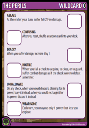
Hate long turns? Just add Wearisome. Want to die in a fire? Try an Ablaze, Deadly, and Hostile game!
(And did I mention that the card images show work in progress?)If you're looking to adjust the difficulty in a more straightforward manner, you can treat your adventure as 1 higher or lower in difficulty. This increases or decreases the difficulty of Veteran banes. You can also add banes of a higher adventure number to your box to encounter earlier, which can be an exciting and unexpected change, especially for replay.
Speaking of replay, we've also offered the option to play the scenarios on Heroic and Legendary difficulty, which incorporate a few of the above options. In addition to bragging rights and a more entertaining game for those who seek a challenge, you get a reward for completing adventures on higher difficulties: you get to erase a feat, then take a feat of the same type. It doesn't increase your power level at all, but it does make you more flexible and lets you address any regrets you might have in an officially sanctioned and fun way.
I hope folks are looking forward to customizing their play experience, as well as all of the new cards, characters, and scenarios!
Keith Richmond
Adventure Card Game Designer


We have updated our Privacy Policy.
Paizo.com uses cookies. You can block paizo.com from using cookies within your browser settings, but doing so will hinder site functionality.
More information can be found in our Privacy Policy.