Iconic Evolution: Seoni

Thursday, May 9, 2019

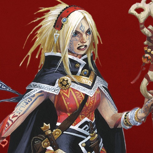
We had some exciting news that dominated this space on Tuesday, and that meant that we had to push our next entry in the Iconic Evolution series back. Luckily, this week's featured iconic is incredibly accommodating. It's that patience and performance under pressure that makes her the de facto leader of the iconic heroes in the Pathfinder comics, after all! In this weekly video series, artist Wayne Reynolds takes Paizo's publisher and chief creative officer, Erik Mona, through his creative process in updating Pathfinder's iconic characters for the game's Second Edition, coming out this August. Check out this short video of their conversation for a glimpse into the mind of Pathfinder's most iconic visual artist and the first official look at the new version of Seoni, the iconic sorcerer!

Artist's rendering of a bald tan man dressed in blue, white, and gold weilding a temple sword.

Each week, we'll take a look at a different updated iconic with Erik and Wayne, so stay tuned. Plus, look out for Seoni's Iconic Encounter tomorrow!

Mark Moreland
Franchise Manager

More Paizo Blog.
Tags: Iconic Evolutions Iconics Pathfinder Roleplaying Game Pathfinder Second Edition Seoni Sorcerers Wayne Reynolds
1 to 50 of 112 << first < prev | 1 | 2 | 3 | next > last >>

1 person marked this as a favorite.
Pathfinder Roleplaying Game Superscriber

Love it!

Liberty's Edge

5 people marked this as a favorite.

As I noted in the other post on this, I love the new look.

I'm quite pleased that the outfit change is mostly just the addition of a cloak (well, and less cleavage on the base outfit, I suppose). Radical outfit changes might have been hard to justify, but this isn't at all, which I appreciate.

Scarab Sages

1 person marked this as a favorite.
Pathfinder Battles Case Subscriber; Pathfinder Maps, Pathfinder Accessories Subscriber; Pathfinder Roleplaying Game Superscriber

Do her tattoos change to match elemental colors?


Pathfinder Rulebook Subscriber

paste from the other thread.

really like this one. The new colour tone fits seoni really nicely, especially the contrast between her skin and tattoo. The clothing colour is super nice as well, very striking but also warm. Like the new clothing especially in combination with the pose that shows off those leg tattoos.


11 people marked this as a favorite.

Bam! Pow! Elegantly tasteful, highly functional, and nicely tailored. Red is definitely your color, and it helps hide those "stabby-the-mage" stains. You've successfully brought haute couture to the murderhobo class! Bravo!

...But dahlink, what did I tell you about capes? ;)

Dark Archive

1 person marked this as a favorite.

Finally one who's look I actually prefer to the origonal.


4 people marked this as a favorite.
Pathfinder Adventure Path, Lost Omens, Starfinder Adventure Path, Starfinder Roleplaying Game Subscriber

As I often find myself saying, what really jumps out about this new version is her face- that is someone you don;t mess with.

Also:

Like that she's carrying her staff, instead of awkwardly balancing it across her butt.

Cape is the same color her little ribbon details always were, which explains why I don't find it more jarring.

Pose is more stable- but also more intent. Old Seoni looked like she was just sort of walking along waiting for the swimsuit issue photographer to tell her he was done.

With the (tattoo-free) cleavage covered up, the focus really IS more on the tattoos than the skin they're on.


1 person marked this as a favorite.
Pathfinder Roleplaying Game Superscriber

Stunning, beautiful and mystical.

I love the new design so much.

Of the Core Classes, the Sorcerer is my favorite. And Seoni is absolutely beautiful in this evolution art by Wayne Reynolds. I can't wait to see her encounter and read the full stats for the class in August.


2 people marked this as a favorite.
Pathfinder Roleplaying Game Superscriber

Ooh, the high resolution image looks even better. So much detail! Seoni might be my favorite of the new iconics. Although she is competing with Merisiel and Hugh Jackman Lem.


5 people marked this as a favorite.

Just going to leave this here for anyone who prefers the original design.

Buy a statue for great justice.


My second favorite Iconic, second only to Lini. Loved the new design and I certainly didn't notice the way she is holding her staff before watching the video.


Pathfinder Adventure, Lost Omens, Rulebook, Starfinder Roleplaying Game Subscriber

She looks really great. This art emphasizes her being a bad-ass. I also like the bleach blonde hair, for Seoni specifically, better than the muddy-snow colored hair she had before.

Lantern Lodge Customer Service & Community Manager

16 people marked this as a favorite.

Removed a post. Let's move on from using words like "stripperific" to describe characters and their art.


While I do have to admit that I like Seelah’s new look the most, Seoni does get my vote for the most improved look from 1e to 2e.

Silver Crusade Contributor

7 people marked this as a favorite.

I kinda miss the old look, for very personal reasons, but the new look is excellent. I like the use of color, and the cloak is awesome.

I will miss the white hair, though. u_u


1 person marked this as a favorite.

Well, the cloak makes it easy to imagine shoulders so that's a plus and this dress is nicer than... whatever she was wearing prior.

That said, her legs are oddly far apart and she's wearing a weird grimace for some reason (maybe she got lunch at the same place as Amiri and it ain't sitting right?)


5 people marked this as a favorite.

well... I like the cloak. But pardon me if I liked her old look better.
just me though
oh and Kalindlara. it was said somewhere along the road to 2e, that her hair was a very light blonde.....


6 people marked this as a favorite.
Steelfiredragon wrote:

well... I like the cloak. But pardon me if I liked her old look better.

just me though
oh and Kalindlara. it was said somewhere along the road to 2e, that her hair was a very light blonde.....

Not just you. I very much prefer her old look and happily backed the kickstarter of her statue which will be displayed in my home.

Having said that though, I don't hate this new look. As an alternate universe Seoni, she still looks great. But I feel that she (and nearly all the other iconics for that matter) looks better in her original artwork.


1 person marked this as a favorite.

I'm not usually a fan of Reynolds' art, but I'm a big fan of the new Seoni both as a rework of the old concept and in a vacuum. Excellent job on this one.


7 people marked this as a favorite.

Eh, I liked her old look a lot better. She looked much more confident.


Pathfinder Adventure Path Subscriber

I think the hair specifically doesn't look great against the white background but I'm sure it'll look better in print. Other than that nice work. I'm surprised the cape actually works since it's such a contrasting color but it definitely does.

Scarab Sages

Did she eat Meligaster and steal his cloak? Does that mean that mesmerists are being rolled into sorcerer class features?


8 people marked this as a favorite.
Terraneaux wrote:
Eh, I liked her old look a lot better. She looked much more confident.

I really don't get what you mean. The expression on her old art just looks like she's modeling. It's that vacant, meaningless expression you see in fashion magazines. New Seoni looks like someone's about to catch these hands (these burning hands, that is).

Shadow Lodge

She looks so much better, especially her face. I just hope that her extremely long braids are still a part of her character, and that they just can't be seen because of the angle (Seoni 2.0 had them, at least!).

Lantern Lodge Customer Service & Community Manager

32 people marked this as a favorite.

Over the years discussions regarding our iconic sorcerer Seoni's body and clothing have contained language and sentiments that do not contribute to our forums being a welcoming environment, particularly for the women who are part of the roleplaying game and paizo.com communities. Yes, these are fictional characters, but the context in which they are discussed still needs to be respectful towards women and women's bodies. This isn't about shying away from nudity, this is about hosting comments which reduce the value of women to how successfully their physical appearance might appeal to the male gaze. These forums are a publicly viewable space. We're done discussing Seoni as a sex object here. We're done discussing if Amiri's physique meets your approval for a strong woman here. Move on from it.

Scarab Sages

1 person marked this as a favorite.
Pathfinder Maps, Pathfinder Accessories, PF Special Edition Subscriber; Pathfinder Roleplaying Game Charter Superscriber; Starfinder Superscriber

Did she keep her familiar? I didn't see a lizard on the flashed gear images in the interview.


Dire Ursus wrote:
I think the hair specifically doesn't look great against the white background but I'm sure it'll look better in print. Other than that nice work. I'm surprised the cape actually works since it's such a contrasting color but it definitely does.

It does look much better against the brownish background used at the end of the video.


1 person marked this as a favorite.

Absolutely stunning. Awesome job, Wayne!

RPG Superstar Season 9 Top 16

2 people marked this as a favorite.

I prefer the old design.

The cape dominates her silhouette and hides the super long braids that were one of my favorite parts of her design. The cape also doesn't
seem very Varisian to me. Hiding her neck makes her look less confident with the cloak suggesting that she's trying to hide something. While the staff is really cool, it doesn't feel "sorcerous" to me. It looks like the type of staff a priest or monk would use.

While it's a great piece of work and I love Wayne Reynolds, I am a little disappointed in this design. Especially when Seoni is my favorite character from the comics. I do agree that the outfit needed change as it did not fit her backstory and personality.


2 people marked this as a favorite.
Edna Mode wrote:

{. . .}

...But dahlink, what did I tell you about capes? ;)

No jet engine intakes to worry about . . . yet.


8 people marked this as a favorite.

This is an amazing change. Every time I've gone over the classes with a female gamer, I've cringed when we got to the sorcerer. This is very good.


logic_poet wrote:
Did she keep her familiar? I didn't see a lizard on the flashed gear images in the interview.

It wasn't in most of her PF1 images either. There was the bit showing that it turned into a tattoo when not out and about, so maybe that's the default state. Also Playtest familiars were pretty bad, if they haven't improved it might be a good reason to ditch it.


This is probably the most changed iconic, and with good reason. She's always been the most controversial. I think this addresses the complaints against her being too sexualized while still staying true to the character. It also looks a bit more practical, she doesn't need Sovereign Glue to avoid wardrobe malfunctions or to cast endure elements every day, even in mild climates. She's got two daggers now, must be taking "fashion" tips from Merisiel now, although she has fewer daggers these days, so maybe Seoni just borrowed one. The one thing I'm not sold on is the hair. I actually liked the idea of it being white, blonde is fine though. But more than that, you can't see those long braids at all, I would assume they were just behind her back, but the back view of her on the playtest book cover shows no signs of the braids either. The Doomsday Dawn cover shows one though. They might not have been practical, but they were cool, I hope they're still around.

Silver Crusade

3 people marked this as a favorite.

Already said in the other thread but to restate, I love the influx of the blue on her and the others.

One of my favourite parts of pics involving Seoni has always been the inherent movement in them (like the sketch in the video), so I'm glad her cloak has the little scarves on them, I hope she still has her braids but if not I adore her new headpiece.

RPG Superstar 2012 Top 32

Finally one I don't think is outright worse than the old version... but I don't approve of the hair color. Not that my approval is necessary, of course.


The background sketch at the start of the Evolution video does have the braids and that seems to have the rest of the details that got changed between the initial 2E sketches and the final version.

Would be nice if they made it into the main image, since that'll be the reference other artists focus on.


While she's still flashing a lot of skin on her legs, the changes to the top/chest area makes the total impression not as "in your face" as in the previous edition. I approve of these changes!

(Although I do wish that a different artist had been chosen for the iconics in general. *shrugs* Artistic tastes can vary a lot.)


3 people marked this as a favorite.
Pathfinder Adventure Path Subscriber

I like this design overall. There is nothing wrong with it. However, I will miss the old design. It's obvious this was done for a pretty specific reason, which is sad to me. She also looks far younger in her 2E look compared to her 1E face. That and the overall design of most of the 2E iconics are extremely "busy," especially in this case. There are so many things strapped to her and such it's hard to focus in or be drawn to anything in particular. Sometimes less is more in my honest opinion. But to each their own. Seoni will always be my favorite and not just because of her visual appeal. Great job Wayne!


3 people marked this as a favorite.
Pathfinder Rulebook Subscriber
Sara Marie wrote:
Over the years discussions regarding our iconic sorcerer Seoni's body and clothing have contained language and sentiments that do not contribute to our forums being a welcoming environment, particularly for the women who are part of the roleplaying game and paizo.com communities. Yes, these are fictional characters, but the context in which they are discussed still needs to be respectful towards women and women's bodies. This isn't about shying away from nudity, this is about hosting comments which reduce the value of women to how successfully their physical appearance might appeal to the male gaze. These forums are a publicly viewable space. We're done discussing Seoni as a sex object here. We're done discussing if Amiri's physique meets your approval for a strong woman here. Move on from it.

Here Here.

Liberty's Edge

1 person marked this as a favorite.

This is the one where I much preferred the older head (face and hair). The change in outfit is well done and was really necessary, but I think the "real person" look that IMO characterizes the new art of all iconic actually does a disservice to the Sorcerer.

I think her original face and hair gave an impression of mystic grace that I do not find here.

Lantern Lodge Customer Service & Community Manager

24 people marked this as a favorite.

Just also wanted to pop in with a reminder that the artist, Wayne Reynolds, is an active member of the paizo.com forum community. As you determine what your comments on these blogs are going to be, please keep in mind that paizo.com isn't a forum where anonymous comments are thrown out into the void or are kept between a small social circle. The creators, authors, artists, developers, editors and operations staff are frequently here as both participants and readers. Paizo and many other tabletop RPG companies are, from my perspective, very unique businesses in that there is substantial and meaningful opportunities for customers and fans to interact directly with the people involved in pretty much every aspect of production and operations. I'd like to foster and encourage that special feature.


Overall, this is an interesting redesign. I prefer her with braids and a bit more white to her hair, but the blonde isn't off-putting. The cloak just has two minor issues to me: 1) The way it attaches around her neck. That stands out to me. A simple clasp or two I think would've worked better, I keep thinking she's hiding something under there on the order of a neck brace. 2) Not completely sold on the color; a golden color would work well with her reds and pale hair I think. That's just my 2 cp worth.


Overall, I think this version of the sorceress is an improvement over the original, though her face looks a bit too young.


If I may have a bit of a critique, I'm not a fan of the leggings/footwear blending in with her… skirt? They're somewhat difficult to make out and makes it a bit weird details-wise.

Otherwise, I really like the new look. Lower legs area aside, the design is easy to read and has a lot of nice detail to it.


Cydeth wrote:
Finally one I don't think is outright worse than the old version... but I don't approve of the hair color. Not that my approval is necessary, of course.

Maybe Seoni got tired of bleaching her hair?


Seoni's hair has always been blonde.


3 people marked this as a favorite.

I'm a little disappointed by this redesign. Paizo has already filled the design space of "cloaked, staff-wielding Mage" with their Iconic Wizard, Oracle, Arcanist, and Summoner, so I liked that Seoni's design took a separate approach; given Paizo's efforts to establish clear differences between the mechanics and flavor of the Sorcerer and Wizard classes, it was nice to see that the Iconic Sorcerer was also significantly different from the Wizard on an aesthetic level. Moreover, I preferred Seoni's old hair color and style, as the long braids helped further distinguish Seoni's silhouette from those of other spellcasting Iconics.

I do like the idea of Seoni's tattoos changing color when she casts a spell, though. It further emphasizes a salient aspect of her design by linking it to the Sorcerer's most important class feature, which is a cool touch.

1 to 50 of 112 << first < prev | 1 | 2 | 3 | next > last >>
Community / Forums / Pathfinder / Pathfinder Second Edition / General Discussion / Paizo Blog: Iconic Evolution: Seoni All Messageboards

Want to post a reply? Sign in.