Represent Your Cause!

Monday, April 6, 2015

At the beginning of the Year of the Sky Key (Season 6), most of the factions underwent significant changes as their philosophies evolved and those with national ties distanced themselves from their homelands. New faction symbols followed, and in anticipation of the upcoming Faction Journal Cards, the Pathfinder Society team commissioned new symbols for each of the seven current factions. It is my pleasure to share the new art with you today.

To give you a sense of the changes, I first want to show you the two "unchanged" faction symbols, tied to the Grand Lodge and Silver Crusade. I call these symbols "unchanged" largely because their symbols' shape, concept, and coloration stayed largely the same; however, if we were going to update the five other factions' art, why not make them all even better?


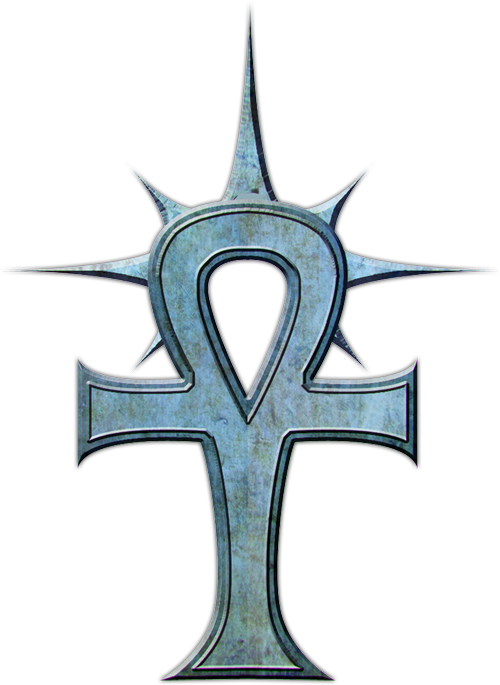
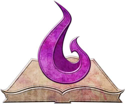
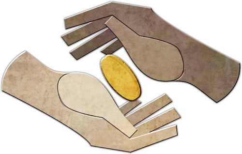
Both the original Grand Lodge and Silver Crusade symbols were simple but elegant, and the updated art has taken two great designs and made them a little bolder. The other five symbols are equally exciting, with colors, interior details, and other elements that make each an icon worth rallying around.

We've also updated your Pathfinder Society ID cards with the new faction artwork, the faction pages and updated the Community Use Package so you can use these new images right away!

John Compton
Developer

Faction Symbols Illustrated by Taylor Fischer.

More Paizo Blog.
Tags: Factions Pathfinder Society Taylor Fischer
1 to 50 of 69 << first < prev | 1 | 2 | next > last >>
Shadow Lodge 4/5 *** Venture-Captain, Michigan—Mt. Pleasant

They look awesome!

So... the new symbols link to the old symbols... Just FYI.

Shadow Lodge 4/5 5/55/55/55/5 ****

Oh wow

Community & Digital Content Manager

2 people marked this as a favorite.
Eric Clingenpeel wrote:

They look awesome!

So... the new symbols link to the old symbols... Just FYI.

Sigh, a caching error. We're on it!

Dark Archive 4/5

I like!

Shadow Lodge 4/5 *** Venture-Captain, Michigan—Mt. Pleasant

Chris Lambertz wrote:
Eric Clingenpeel wrote:

They look awesome!

So... the new symbols link to the old symbols... Just FYI.

Sigh, a caching error. We're on it!

We've gotta make you work for those new teeth, Chris!

Silver Crusade

1 person marked this as a favorite.

The Liberty's Edge one is sooooo much better. It might actually be my new favorite.

Scarab Sages 4/5

Thank you, these look so much better. Glad to be rid of those garish LE and SS colors. These are much more appealing to look at.

4/5 *

Pathfinder Adventure, Adventure Path, Lost Omens Subscriber

Very nice!

Community & Digital Content Manager

1 person marked this as a favorite.

Alright, those bigger sized images should be coming through now! Sorry for that, guys!

Scarab Sages 5/5 5/5 *** Venture-Captain, Washington—Spokane

These are awesome!!! Great job to the designers!!! I know this is probably low on the totem pole but is there any ETA on or even if they are going to be put into the Community Use package?

Community & Digital Content Manager

2 people marked this as a favorite.
Preston Hudson wrote:
These are awesome!!! Great job to the designers!!! I know this is probably low on the totem pole but is there any ETA on or even if they are going to be put into the Community Use package?

Already done ;)

Liberty's Edge 4/5 5/5

Awesome

4/5 5/5 ***

Pathfinder Maps, Pathfinder Accessories, Starfinder Maps, Starfinder Society Subscriber; Pathfinder Roleplaying Game Superscriber

Woot, love the new symbols.

Sovereign Court 4/5 5/5 ** RPG Superstar 2014 Top 32

Much improved.

Scarab Sages 5/5 5/5 *** Venture-Captain, Washington—Spokane

Chris Lambertz wrote:
Preston Hudson wrote:
These are awesome!!! Great job to the designers!!! I know this is probably low on the totem pole but is there any ETA on or even if they are going to be put into the Community Use package?
Already done ;)

Just got the E-Mail. Chris, you are awesome. Thanks.

Grand Lodge

Very nice! Now I need to print off a new PFS card.

Grand Lodge 4/5

Nice!

Sczarni 3/5 RPG Superstar 2012 Top 32

Awesome! Big improvement.

Sovereign Court 5/5 RPG Superstar 2009 Top 32, 2010 Top 8

I can picture the exchange logo as a cloak clasp.

Edit, would make for a fun way to identify each other.

Silver Crusade 2/5

Very nice. Looking forward to the faction cards! :-)

Shadow Lodge 4/5 5/55/55/55/5 ****

So I was looking and marvelling at these when my dad commented that the Liberty's Edge one looked like "an old WWI patch or insignia". He did some looking online and found this. Sometimes my dad's memory impresses even me!

Needless to say, my dad likes these too, and he doesn't even play Pathfinder!

Silver Crusade

That's really excellent and a nice update. Love the new symbols.

Scarab Sages 4/5 5/55/5 *

These symbols are very beautiful. I want to join all factions at the same time. Make shirts of them and take my money.

Shadow Lodge 4/5

Naturally, my PFS ID card needs no update. But these look much improved.

Silver Crusade 5/5 5/55/5 **** Venture-Captain, Germany—Bavaria

They look awesome, and this seems like a perfect chance to get some new shirts ^^

... the Dark Archive symbol looks even more sinister, I thoroughly approve.

Grand Lodge 5/5 * Venture-Captain, New Zealand—Dunedin

5 people marked this as a favorite.

Thank YOU! They will look great on some new Faction Tshirts.

*hint hint*

Silver Crusade 5/5 5/55/5 **** Venture-Captain, Germany—Bavaria

Paul Trani wrote:

Thank YOU! They will look great on some new Faction Tshirts.

*hint hint*

I would be quite game for hoodies or sweatshirts.

Silver Crusade 5/5

I would definitely back a kickstarter, if need be to get shirts.

Shadow Lodge

Pathfinder Lost Omens, Rulebook, Starfinder Adventure Path, Starfinder Roleplaying Game Subscriber

SWEET

Shadow Lodge 4/5

So much better. I'm wondering if it would be possible to flip the sword for Andoran, making it a tad more aesthetically pleasing and kind of playing more into the idea of bringing down freedom and the idea of the avariel's patronage?

Shadow Lodge 4/5

Mike Bramnik wrote:

So I was looking and marvelling at these when my dad commented that the Liberty's Edge one looked like "an old WWI patch or insignia". He did some looking online and found this. Sometimes my dad's memory impresses even me!

Needless to say, my dad likes these too, and he doesn't even play Pathfinder!

Cool, cool. It's a US Army Aviation Insignia. Still used today, actually, despite it originally breaking off to what would become the Air Force and mostly moving into fixed wing and satellite warfare.

TOZ wrote:
Naturally, my PFS ID card needs no update.

Same here. :)

Liberty's Edge 4/5

T shirts? !?

5/5 5/55/55/5

2 people marked this as a favorite.

I don't see the shadow lodge one on here...

Shadow lodge for life!

Grand Lodge 4/5 ** Venture-Agent, Colorado—Denver

Is that a golden egg between the two hands?

Grand Lodge 4/5 ** Venture-Agent, Colorado—Denver

Ugh. A coin. The Exchange faction. Took me a minute.

Silver Crusade 3/5

Very Nice job!

Sovereign Court 4/5

1 person marked this as a favorite.

I too am in the 'Take my money for a shirt' camp.

Sczarni 5/5 5/55/5 ***

Stickers would be awesome, too.

5/5 5/55/55/5

1 person marked this as a favorite.

Damn tiny shirts.. need to be a bag or something too.

Sovereign Court 1/5

Sovereign Court looks fantastic!

4/5

1 person marked this as a favorite.

Overall, a marked improvement from the previous renditions.

Silver Crusade 1/5

I love em. Because I'm never satiesfied I whished there was a simple version of the new Exchange and Liberty's Edge logo too, but I love em nevertheless.

Shadow Lodge 4/5

DM Beckett wrote:
So much better. I'm wondering if it would be possible to flip the sword for Andoran, making it a tad more aesthetically pleasing and kind of playing more into the idea of bringing down freedom and the idea of the avariel's patronage?

Check out the SAS special forces insignia. Flipping the sword would make the two even more similar.

Silver Crusade 1/5

Oh, one minor complaint: These new icons look less clean and more like something engraved in stone or something. Which is pretty cool.
But it makes them look extremly muddy when displayed next to a forum name. I think a more clean version for the forum would be nice.

Sovereign Court 4/5 5/5 ** Venture-Lieutenant, Netherlands—Leiden

Scarab sages isn't garish anymore. Liberty's Edge and Exchange aren't ugly anymore. And Sovereign Court is even more glorious :D

Silver Crusade

An updated PFS Field Guide/Primer/Guide would be most welcomed, to reflect the new status quo of the Society.

Also some of the vanities need updating, Dark Archive membership shouldnt definately give access to hellkight membership (i would say both are incompatible given the new status of the Para-Contess, which was the main reason my char, which had a strong desire to join a Hellkight order, quickly changed alliances to the Sovereign Court faction and looks with contempt members of the Dark Archives - already made for some interesting roleplaying).

Liberty's Edge 4/5 5/55/5 **

Pathfinder Rulebook, Starfinder Roleplaying Game Subscriber

These are amazing! I also love the unexpected refresh of the older symbols.

4/5 5/55/55/5 *** Venture-Lieutenant, Minnesota—Minneapolis

Very nice.

I especially like the Sages and Court ones. Too bad I don't have a character in either of those factions.

Dark Archive

1 person marked this as a favorite.

Darkive forever!!!

Sigh now the Librarianatrixness will want all new stationary and business cards. The curtains will have to be redone, all the statuary, the planters, the metalworkers, but wait...maybe I can sell our stock as Darkive "classic" to defray the costs.

1/5

3 people marked this as a favorite.

still not going to use the poop shingle
because it still looks like a poop shingle

51 to 69 of 69 << first < prev | 1 | 2 | next > last >>
Community / Forums / Organized Play / Pathfinder Society / Paizo Blog: Represent Your Cause! All Messageboards

Want to post a reply? Sign in.