


 Taylor Hubler
RPG Superstar Season 9 Top 32, RPG Superstar 2015 Top 32
,
Star Voter Season 6, Star Voter Season 7, Star Voter Season 8, Star Voter Season 9
aka CalebTGordan
Taylor Hubler
RPG Superstar Season 9 Top 32, RPG Superstar 2015 Top 32
,
Star Voter Season 6, Star Voter Season 7, Star Voter Season 8, Star Voter Season 9
aka CalebTGordan
|
| 7 people marked this as a favorite. |

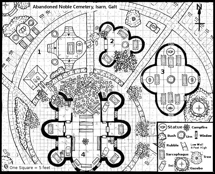
Abandoned long ago and now neglected to ruins, this cemetery once served the proud noble and royal citizens of Galt. Only the unwanted rest here.
Area Key: 1 – The Competing Monuments. 2 – House Tarne mausoleum. 3 – House Morgayne mausoleum. 4 – Old chapel and rebel hideout.
| Neil Spicer RPG Superstar 2009, RPG Superstar Judgernaut, Contributor |

Taylor! Welcome back to the mapping round! It's everybody's favorite skill to put to the test, right? I can hear groaning from somewhere, I'm sure. Before I get into assessing your work this round, I'm making it a point to highlight for the voting public what they should be looking for in these map submissions. While some competitors will likely have access to snazzy computer software to produce a map that's almost ready for publication from the get-go, this isn't Cartography Superstar (though it'd be cool if that was ever thing, too, right?). Instead, the goal here is for a designer (someone usually more focused on writing) to pair his vision for adventure and encounter design with the rendering of a map which an actual cartographer can turn into a final map for publication.
That means, the designer needs to get enough into his or her map turnover that the cartographer can make sweet, sweet magic with it. And, believe me, there's nothing more amazing than envisioning a cool encounter in your head, writing it up, and then seeing a cartographer produce an amazing piece of mapping art to go alongside it. To make sure the cartographer can do that, you have to be clear with what you've drawn so they can interpret it correctly. If you're not clear, that makes your developer's job harder, as they have to go back in and correct things...consult with you on what those squiggles are meant to represent so they can inform the cartographer...or, in the worst of cases, completely redraw something if what you've given them is unusable or uninspired.
So, voters! Listen up! Please assess the maps these designers have provided as "first drafts" which a cartographer would then turn into a final map. Look for whether or not all the information is there to inform the encounter or location the designer has given us. Determine if the location would make for cool play at the game table. Rate the creativity behind it all. And, lastly, consider how well the designer used his or her 50 words of additional text to inspire or refine what they've given us. That's what I'll be trying to do in the feedback that follows.
Does the map provide enough information?
Yes. We've got a compass rose, a scale, and even a legend to consult. You've given a lot more professional considerations to varying the wall thickness for buildings, common symbols used in cartography, and an intricate eye for detail to give enough character to everything that the cartographer will be able to adequately extrapolate and intuit the map's purpose. One thing which I think could be problematic, however, is the detail for the paving stones(?) on the walkways and courtyards. The "squares" are smaller in scale there and clash with the larger squares composing the actual map grid. When I first saw this, I was worried you may have DQ'ed yourself by using a non-standard grid. But, in looking closer, I can see the larger grid squares intended for actual use at the table. Still, it's confusing and cluttered to do it the way you have. Shading the different areas could have helped tremendously to offset it. In addition, your eye for detail also included a handful of symbols which don't appear in the legend. They're clear enough that I can get a sense for what you intended, but just be careful.
Does the map provide a cool setup for a fun encounter?
Potentially, yes. We've got multiple monuments (some collapsed), mausoleums (also partially collapsed), and even a large chapel now converted into a rebel hideout. You can envision lots of skulking about, climbing over obstacles and rubble, searching through various tombs and coffins, etc. And, you've given us a large enough area in which to play out all of that.
Is the map creative and interesting?
A lot of effort certainly went into this piece. I like the decorative arcs of both the cemetery and the structures within it. The fallen monuments also create an interesting commentary on what Galt must have looked like in its hey-day. Obviously, it's fallen on much harder times, as there are rebels using an old chapel as a hideout. So, yeah, I find it visually interesting and there's a lot of creativity on display in how you brought an area of Golarion to life.
Is the designer's extra 50-word commentary inspiring and useful?
Yes. It's kind of vital to make sense of what all those structures are meant to be. It's also inspiring because we get titles like "The Competing Monuments," a couple of named houses of Galt so we can wonder whose noble remains might rest there, and the old chapel has a very gothic/noble feel to it overlain by the campfire, rubble, and implied ruin the rebels have chosen as both their hideout and possible inspiration.
Final verdict, I like the style and detail of this map quite a lot, but some of it gets away from you and has the potential for confusing the cartographer if you don't add some shading in there. The idea behind it also works with lots of options and different directions a GM could go with it, so I'm going to say I DO RECOMMEND this map to advance. Good luck with the voters and let's see what you've got for Round 3.
But that's just my two cents,
--Neil
| Liz Courts Community Manager , Star Voter Season 6, Star Voter Season 7, Star Voter Season 8 |

Hello there! I'll be one of the judges for this round, and I'll be looking at a couple of key points for your map: readability, usability, and how fun this would be to run as GM. For some background, I helped found the Wayfinder fanzine before I started working for Paizo, and have done work as a freelance cartographer.
Readability
This is very well depicted and clear. It's interesting without being overly cluttered, and the asymmetrical design is very welcome.
Usability
Most graveyards we see are a mix of crypts and graves—it's nice to see one that's restricted to nobility. Extra bonus points for tying it into Galtan history: past and present.
Fun Factor
There's a lot of fun elements going on here, and I could see ambushes, straight up chases, or barricading against the undead could all easily be run at this location.
Final Thoughts
A clearly designed map that takes advantage of the world setting. I do recommend this map for advancement.
| R D Ramsey Marathon Voter Season 6, Dedicated Voter Season 7, Marathon Voter Season 8, Star Voter Season 9 aka Clouds Without Water |
| 5 people marked this as a favorite. |

I attack the Gazebo.
| Scott LaBarge RPG Superstar 2015 Top 8 , Star Voter Season 7, Star Voter Season 8 |
| 2 people marked this as a favorite. |

The gazebo does nothing.
And it would be great if the Paizo folks could get "cemetery" spelled correctly in this map's link on the main Map round page. :-)
| RonarsCorruption Star Voter Season 6, Star Voter Season 9 |
| 1 person marked this as a favorite. |

Taylor, this map is beautiful. It really likens me back to older dnd modules, with the solid black and white lines. I think that really helps make it clear, too, which makes a big difference.
The surrounding areas are interesting and varied, and I really appreciate that not everything is square. I also appreciate how the buildings feel realistic, yet still fantastic. It really hits my sweet spot of suspending disbelief.
I really look forward to seeing what you do in future rounds.
 Owen K. C. Stephens
Developer
Owen K. C. Stephens
Developer
|
| 3 people marked this as a favorite. |

I am often asked how a Superstar contestant makes a map that is clear, interesting, and evocative.
This is now one of the maps I'll point to. Beautiful job.
| Zombieneighbours Marathon Voter Season 9 |

Hands down the best of the maps. One of a handful of maps that was genuinely clear as to what it depicted. One of only a small handful of maps that was interesting in and of itself.
While it isn't a voting criteria, this is also one of only a very small number of maps in the competition that was in anyway aesthetically pleasing to look at.
 Mikko Kallio
RPG Superstar 2014 Top 4, RPG Superstar 2012 Top 32
,
Dedicated Voter Season 6, Marathon Voter Season 7, Dedicated Voter Season 8, Star Voter Season 9
Mikko Kallio
RPG Superstar 2014 Top 4, RPG Superstar 2012 Top 32
,
Dedicated Voter Season 6, Marathon Voter Season 7, Dedicated Voter Season 8, Star Voter Season 9
|

VERY nice line work!
 JPSTOD
Star Voter Season 9
JPSTOD
Star Voter Season 9
|

Love the simplicity
I feel the Map was very Understandable without the Legend. Therefore the legend is wasted space
Can Easily recreate this Map without the Legend.
Two Thumbs up
| Lucus Palosaari Star Voter Season 6, Star Voter Season 7, Star Voter Season 8, Star Voter Season 9 |

I was fortunate enough to workshop a little with Taylor on this map, so I am going to recuse myself from my normal comments and links to things.
| Jezebelle Organized Play Developer , Star Voter Season 9 |

First of all, congratulations! You made it to round 2! I commend you for being part of this contest. You worked hard and took the risk of putting your ideas out there on display for all to see and critique. I salute you.
I'm no map expert, but I have played and run a few games, and when I look at a map I can tell if it is interesting, if it will be useful/functional in the type of game I'd like to play, and if it's readable. I will judge your entry on those criteria.
Beautiful, professional quality map. I doubt that much cartography mojo would be needed to make this into a finished product.
That being said, cemeteries are fairly generic subject matter. That doesn't mean I don't like the map, or wouldn't use a cemetery in a game, I just can't get as excited about the idea behind it as I am about some of the truly wild ones in this round.
I think you did an excellent job creating this map and it looks like something I'd find in a published adventure. You have my vote.
 Alanya
|

This is a great map, brimming with possibilities! It's clear and well defined, and I can see the entire layout being used for various encounters. I love your description - not only do you give us a glimpse at the past of this Galtan location, you also explain how it ties-in to today's Golarion. You have my vote, and I wish you luck!

| TotalAnarchy Marathon Voter Season 8, Dedicated Voter Season 9 |

What I like about this map:
- There's an entrance to the chapel via the fallen statue.
- There are living trees in this cemetery.
- The cemetery follows a circular plan, which is novel, more so when the graves actually respect this circle and are aligned accordingly. It would suggest that the chapel was the very first building in this compound, historically. Well, never mind that, imagine how bizarre it would be in real life to look at that row of gravestones.
 GM Lari
|

Two things I like about this in particular:
-With the text as presented, there's definitely more than one way I could see an adventure unfolding here. Maybe you're the rebels, maybe you have to stop the rebels. Maybe you're there to investigate one of the other tombs, and stumble upon the rebel hideout. I think that's a big advantage over something like a monster lair or evil base, where there's one very obvious encounter (kill the bad guy(s)).
-Even though this map has curves that would be a real pain to recreate properly, it's interesting enough, both in concept and execution, that I would be willing to put in the effort.
| Grumpus RPG Superstar 2014 Top 32 , Marathon Voter Season 7, Marathon Voter Season 8, Marathon Voter Season 9 |

Good Job, I like that it isn't just rectangular buildings. The broken statues make for an interesting terrain feature.
Hope to see you in the next round!
| RJGrady |
| 1 person marked this as a favorite. |

This map is just crying out to be inhabited by Ray Harryhausen's creatures.
| Brian J. Fruzen RPG Superstar 2015 Top 4, RPG Superstar 2014 Top 16 , Star Voter Season 6, Star Voter Season 7, Star Voter Season 8 |

I’ll start by telling you what I think a good map does. It sparks the imagination of the viewer. It whispers stories of events yet to come and invites a GM to spread their toes in a sandbox of creativity. It presents mysteries that need to be solved and beckons players to open every door, delivering on each area’s promise that more adventure awaits ahead. There are some technical elements that can help.
Is it readable? Yes. There’s a lot going on, but it remains readable. Nice work.
Are there multiple choices for the PCs to make? If not, does the map present a path for the action to flow in? So many options for adventure! PCs will be fighting over which area to investigate first.
Does the map utilize the space well? Yes. You even have elements of the map continuing under the text, and I wish the text wasn’t there so I could see all of it.
Are the elements presented well thought out and make sense for the environment? I’ve walked over paths on college campuses that looked very similar to this. Concentric rings have an unmistakable visual appeal, and you place them masterfully here. I might argue that a real location like this would be spread out over a wider area so that the buildings weren’t pushing in on one another. The architecture is beautiful and designers would want each building to be visible from many angles. That said, I could see the outlining buildings as being shorter, with the larger building being a tower of some kind. I’d have to add stairs somewhere.
Is this a map I would like to use more than once? It could double as a deserted and crumbling cemetery in more than one urban location.
So, back to the initial question: does this map spark the imagination? Absolutely! Disaster of some kind struck this place, be it a roaming kaiju or the ravages of time, which not all of its occupants are so deterred by. I’m jealous of the person that gets to finalize this map, and of the person that gets to write something for it. I’ve been hesitant to say what I’m going to vote for because there’s many strong contenders in the map round this year, but I know this map is getting one of those votes.
| Jason Rice |

I'm torn on this one. Visually, this is very appealing. Even in black and white, its stunning to look at. Part of that is due to the actual design of the map itself. As Liz said, the asymmetrical design is appreciated.
Where I'm torn is that cemeteries have been done, a lot. It's right up there with "forest" and "sewer" as being just about cliché for a fantasy RPG battle. I was looking for an original idea.
You may get one of my votes, but it will be for your map design, rather than your map idea.
| Jeff Lee |

Excellent map. While cemeteries may be overly original, the map is visually appealing and has a lot of attention-grabbing details. There's a lot here to work with--fallen statues and rubble that provide rough terrain and cover options, elevated areas for high ground bonuses, and both exterior and interior areas. Well done!
|
The Raven Black
Star Voter Season 8, Dedicated Voter Season 9
|

This looks good. This sounds good. And still I feel that there is a little something missing. That it is a bit too empty for my taste. Thus this map will be on my alternate list :-)
| Browman Dedicated Voter Season 8, Dedicated Voter Season 9 |

Like last year there are too many awesome maps and not enough votes. I like how you made a superstar map that can very easily be re-used.
| R D Ramsey Marathon Voter Season 6, Dedicated Voter Season 7, Marathon Voter Season 8, Star Voter Season 9 aka Clouds Without Water |
I really like this map. It really shows a sense of visual design as well as thoughtful world and game mapping. It uses the grid without being bound by it.
It feels like there's a bit of a story being told here. Old noble houses, fallen into ruin. Even their mausoleums are crumbling and forgotten. Statues have been toppled, chapels broken into.
Cemeteries are fantasy rpg classic locations, and it's great to see an example showing us they don't have to be the same ol' same ol'.
To the extent I have any complaint, it would be wanting a bit more of an adventure hook. whatever's going on here probably isn't as straight-forward as 'slay the vampire', and that's fitting for Galt, but it wouldn't hurt to give us a little more of the vision.
| Curaigh Star Voter Season 6, Dedicated Voter Season 7, Marathon Voter Season 8, Marathon Voter Season 9 |

My first and probably last day to look at maps before voting closes. So here be the short version critique.
++ is awesome, +- good with a few shortcomings, -+ icky but some cool parts, and -- not a fan.
Initial reaction: cool!
understandability: ++
visuals: ++
adventurous: +-
inspired: a lot going on here and much to see & do, well done with simplicity putting encounter over artistic means.
Vote: Definitely
|
Taylor Hubler
RPG Superstar Season 9 Top 32, RPG Superstar 2015 Top 32
,
Star Voter Season 6, Star Voter Season 7, Star Voter Season 8, Star Voter Season 9
aka CalebTGordan
|
| 1 person marked this as a favorite. |
I want to thank everyone who has commented, and give an even more heartfelt thank you for anyone who voted.
Thank you especially to the judges for their comments. Both Neil and Liz have been influential in my decisions to enter this contest and to try to work in this industry. While they may not remember me from the times I introduced myself at conventions, they each gave advice and encouragement that gave me confidence and helped me learn how to be better in writing, design, and professionalism. To receive praise from both of them on something I worked hard on lifted my spirits and further encouraged me to do my best.
Once I know if I made it into top 16 or not I will return and give an in depth explanation of my map, my process, and my decisions.
|
Taylor Hubler
RPG Superstar Season 9 Top 16, RPG Superstar 2015 Top 32
,
Star Voter Season 6, Star Voter Season 7, Star Voter Season 8, Star Voter Season 9
aka CalebTGordan
|
| 2 people marked this as a favorite. |
Yay I made it!
Response to comments
Neil: (confusing texture and pattern around the chappel) Yeah, on the physical map the pattern is much more noticable. There were slight issues in scanning and some of the finer details don't show as well. I made sure that when I inked that area the actual grid was noticably thicker. Oh well.
R D Ramsey: It eats you. Roll a new character.
JPSTOD: I find myself disagreeing with some of your assessments and assumptions throughout this contests, and one of those was your comments about map keys. I think maps in this round need a key, even if someone drew a map where the symbols were clearly understood without one. Having a key protects you in case you were unclear in what something was, and a good key shows that you know how to put one together. Never assume people know what you mean with a map.
Old-School Look Comments: Thank you! It wasn't my intention to have such a look, but I am flattered to hear people say that. The reason there isn't color and everything is done in black ink is because I wanted to stick to basics, use only skills I knew how to use, and focus more on the important details in the time that I had.
Cemeterys are over-done: I agree, which is why I focused not on crypts and tombstones but on large buildings that could be there and monuments, as well as the state of disrepair of those structures. I wanted something that could be familiar but still cool. I did explore other options for maps, a couple somewhat gonzo in nature, but in the end I decided to stick with something I knew would show off my best skills and which I could draw in the time that I had.
Everyone else: Thank you so much. I had dinner with my father while voting was going on and he told me how he had read your comments. He was very proud of me and explained how he was starting to understand my career goals and the talent that I was striving to improve.
My Process
I learned some great lessons from last year. Don't try to learn new skills in three days. Be prepared. Do what is familiar. When I made it past the last cull I started working on maps.
I busted out my large sketch pad and did several general sketches to get an overall look for the map. It started out as several rings with a squarish building in the middle. Then I decided to off-set everything and shift the circles around and came to general layout of what I ended up with. When I transfered this to grid paper the first time I didn't like the scale but used the transfer to play around with different ideas for each area. It was at this point that I finalized the chapel shape and layout, and began creating the other buildings. I also blocked out where I wanted the key to be so I didn't accidently create anything in that area only be coved up later.
When I felt I could work on a final version I created my own grid paper with a 32x26 square grid on a 8-1/2 x 11 peice of paper. I then marked out and gave a thick black ink border for a 30x24 area. I printed three of these sheets, one for a final version, one for experimentation, and one for practicing patterns and details.
I used a mechanical pencil, a compass, and lots of erasors to draw out the area and the general details. I then borrowed some great art pens of various thickness and inked the map. Once that was done I practiced with the pens to find the patterns and finer details that I wanted for the different areas. Once I was done experimenting and practicing I finished up the inking and let the map sit for twenty minutes so that all the ink was dry. Then I ran erasors over it to remove any pencil (except fo a couple spots where I wanted really faint details) and did a visual pass to make sure I didn't miss any thing.
I scanned my map, making the mistake of scanning it in at 72 dpi instead of a higher dpi. This made the map smaller than I wanted, and some details were lost. I also had much less room for the name, scale, and key than I wanted. However, the map was large enough to be understandable and readable, and I no longer had access to the scanner when I realized my mistake. If I could have done it differently I would have scanned it in at 300 dpi, or more, worked the key and text in, and then readjusted everything to 72 dpi with a larger image size.
Once the key, name, and scale was finished I looked it over and compared it to the rules. I actually had forgotten the key the first time I did this and had to go back and add it in. Once I knew the map was following all the rules, and that I was happy with it, I submitted it. I spent about a half-hour on the 50 words, also tripple checking it against the rules, spelling, and proper grammar before submitting.
Are there parts of it that I am unhappy with? Yep. I wish I knew how to color map in a pleasing way but the contest doesn't require color and I knew it would look worse for it if I had added it in. I also added too much rubble into the chapel area.
I do not believe that a map needs to be super detailed, colored, and of high artistic quality to be a winner in this round. Look at Monica's map from her map round and you will see how a map can be beautiful, simple, and well designed without all the bells and whistles a professional cartographer can put into it. I have seen maps other designers turn over for their adventures and there are some pretty amazing maps that are only black ink on a white backgorund. I think that experienced freelancers and designers that have to turn over maps probably stick to a style I used for the simple reason that they need to turn over maps quickly. If you can do a simple but clearly understandable map quickly you can do more maps in the limited amount of time.
Thank you to everone once again. I look forward to the cool monsters mine will be competing against in the next round.
| R Pickard RPG Superstar 2015 Top 8 , Star Voter Season 6, Star Voter Season 7, Star Voter Season 8 aka DeathQuaker |
| 1 person marked this as a favorite. |

I didn't have a chance till after the top 16 was announced to comment on these, but I remember last year really appreciating any constructive feedback I got, so I am trying to return the favor.
Congrats on getting into the top 16 with this amazing cemetery map.
What's amazing about it? That we see cemeteries all the time in fantasy games. Common place to fight undead, good place for low level adventures, etc. And yet this place does not look uncommon. You do a lot with building shapes, overall design, terrain, so what could have been quite ordinary stand out as unique. It is challenging to come up with a location no one's ever made before. It is even more challenging to take something typical and elevate it to something special, and you did that. I love all the circles and arcs that give the sense that an architect designed this place--something you'd see in a cemetery for nobility--not just a place where people dump their dead wherever they can.
Your map is very easy to understand and I know pretty much what everything is without having to consult your legend or text at all. This is especially a feat since you chose not to use color and is an excellent example that a well designed map does not require color or complicated software to convey the right details.
I actually disagree with you on "too much rubble" -- I see a lot of maps where people put "difficult terrain" in places that is all too easily avoidable by the PCs, making its presence pointless. I like that you have lots of rubble.
Your text is a good supplement to your map and in two words, "rebel hideout," you add a whole other level of potential in what kind of adventures may be had here. Even aside from standard undead hunts, there are a lot of different kinds of adventure to be had here, and it looks like a great start, even, to a whole story, potentially.
The only suggestions I can think of is to put your labels (rather than numbered references) on the map itself so that you could have used more of your 50 words to set up even more encounter possibilities (haunts? desecration? etc.).
Congratulations again and well done.