


 Anthony Pennington
RPG Superstar 2015 Top 32
,
Star Voter Season 8
aka Grimlight
Anthony Pennington
RPG Superstar 2015 Top 32
,
Star Voter Season 8
aka Grimlight
|

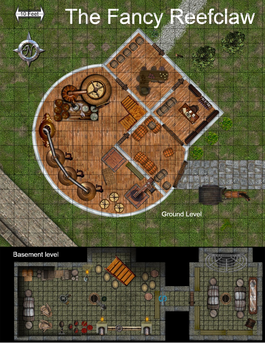
The Fancy Reefclaw Brewery
| Robert Lazzaretti Cartographer |

This is a decent looking map reference.
There is a compass rose and a scale present on the map.
The rooms are filled with plenty of details and furnishings, no key to explain anything is needed.
Good use of the page space, and some exterior details are there.
The only problem I see is that the floor texture in the basement is a bit too busy and does make the grid a bit harder to see, not horrible just slight.
Wall thickness is good, no windows?
Nice map
I do recommend this map to progress to round 3
 Crystal Frasier
Contributor
Crystal Frasier
Contributor
|

The Good
A very clear map that would benefit greatly from some labels. I could turn this into a final map without asking additional questions.
There is a scale and a compass.
The Bad
A full-page map dedicated to such a small building feels like a huge waste of space.
The building seems turned at a 45-degree angle for no reason when it otherwise uses 90-degree angles. It would be easier on GMs to set the building at a 90-degree angle and simple turn the compass 45 degrees
The building layout is dull, using rectangular rooms. It's not a terrible design, but it's not superstar material.
My Judgement
It's clear enough, but uninspired. I do not recommend this entry for advancement to the next round.
 Owen K. C. Stephens
Modules Overlord
Owen K. C. Stephens
Modules Overlord
|

Drawing from my blog on maps, and the rules for the round, I’ll judge the maps on a number of questions.
Is It a Full Page Map?
Yes.
Does The Map Have A Compass Rose and Scale? Are They Used Well?
Yes, and well enough.
Is The Map A Place I Want To Adventure?
No. There doesn’t seem much to do here.
Is the Map Clear?
It has a few serious clarity issues. For example, there appears to be a trapdoor in the upper level’s main room, against the interior wall. There’s no suggestion of where it opens up. If it goes to the absement, we should see some hint of that somewhere.
Similarly, in the basement a single flight of steps seems to go from the southwest (the bottom) to the northeast (the top). A corresponding flight appears in the main level, which is great. But… there are two flights on the main level. There’s no combination of those two, even if the brown square is a landing (and we don’t know if it is or not) that connects to what appears to be the orientation in the basement.
Is the Map Detailed?
I’d prefer more words describing things, and less dependence on art. For example, does the basement have a sewer pipe with a grill over it in the north end of the eastern room? A spiderweb over a cave? A fireplace? A giant grill?
Also, our maps normally only include things that are at least semi-permanent. A horse does not qualify.
Is the Map Imaginative?
No.
This is clearly an encounter-scale map, and there’s nothing wrong with that. But it has serious issues of clarity, and the idea isn’t innovative. This is a case where the visuals look nice, but that’s not enough to actually convey all the information needed. In fact it may be worse for the good visuals, because a viewer may feel he knows what everything is, but several other guesses are just as likely. A map that comes back from the cartographer done and wrong causes more problems than one that the cartographer has to ask questions about.
I strongly do not recommend this map for advancement to Round 3.
| John Bennett RPG Superstar 2011 Top 8 , Dedicated Voter Season 6, Star Voter Season 7, Dedicated Voter Season 8 aka John Benbo |

This map is very nice looking and I would pay money for it if it was part of a map pack. However, like a few other maps, there is no hook, nothing that draws me in and makes me want to run an encounter here.

 James Casey
RPG Superstar 2014 Top 16
,
Marathon Voter Season 7, Marathon Voter Season 8
aka Jrcmarine
James Casey
RPG Superstar 2014 Top 16
,
Marathon Voter Season 7, Marathon Voter Season 8
aka Jrcmarine
|

This is uninspired. It could be any building that houses a permanent horse... ;)
There is no key? I know most things appear to be what they are but I like to have a key. The real problem is that there is nothing on this map that requires a key. That means the map is boring in my opinion.
| Maurice de Mare RPG Superstar 2013 Top 16 , Marathon Voter Season 6, Marathon Voter Season 7, Marathon Voter Season 8, Dedicated Voter Season 9 aka Darkjoy |

22nd map I have seem, great visuals, your current rank is 12th.
| frank gori RPG Superstar Season 9 Top 32 , Marathon Voter Season 6, Marathon Voter Season 7, Champion Voter Season 8, Marathon Voter Season 9 aka GM_Solspiral |

Challenge: Is this map difficult to execute? Does it in my opinion demonstrate the characteristics of a Superstar designer?
Technique: Did the designer show some skill and consideration in the choices made on the map. Are the words used in the key wise choices that add to the overall utility of the map?
Utility: Can a GM/cartographer make sense of the map and make immediate use of it?
Overall: I'll rate the Map as an A for strong recommends B for weak recommends C on the bubble D for weak rejects F for Do not recommends
Challenge: A basic building is not a superstar idea
Technique: Holy crap is that ever pretty. I'd consider you for cartography work based on how polished it looks.
Utility: But I don't need it to make the encounter work, the map is gorgeous but has no more utility that a crudely drawn building would.
Overall: C for me as the execution is +A and the idea was an F. Could go either way but if that's what you can do in 3 days I know plenty of 3PPs that would line up to hire you
| Jacob W. Michaels RPG Superstar 2014 Top 16, RPG Superstar 2012 Top 16 , Marathon Voter Season 6, Marathon Voter Season 7, Marathon Voter Season 8, Dedicated Voter Season 9 aka motteditor |
Artistically, this is a really beautiful map, though that's in part due to whatever software you're using.
Design-wise, though, it seems pretty basic. Four of the six rooms are rectangular. I like the main keg room itself -- it's got a different shape and the machinery could make an interesting additional obstacle in a fight -- but I don't know if that's enough.
I think in the end, there's just not enough here for me to want to make this an encounter in an adventure, I'm afraid.
I don't think I'll be voting for this one.
| Mark Griffin RPG Superstar Season 9 Top 8 , Dedicated Voter Season 7, Star Voter Season 8, Star Voter Season 9 aka Mark D Griffin |

My favorite thing: The name probably.
Other things I like: I want to adventure in an amazing fantasy brewery.
My least favorite thing(s): I feel like you missed the mark here, spending your effort on making the map look nice without making a location worth mapping. I assume you didn't actually create these images (if you did then you're a good artist, but still not a great map maker), and all the icons come from some sort of map making program. Nice (probably canned) art isn't a shortcut to superstardom.
Will I vote for it: I will not be voting for this map.
| Browman Dedicated Voter Season 8, Dedicated Voter Season 9 |
I feel like the best part of this map is based on the fancy software it was made on. Like most people who have commented on this map I find the location boring. Plenty of maps of inns exist and there is nothing here that makes it stand out from any other. If it was fortified or had a smuggling operation running out of a cave underneath or something else different it could have been in the running for a vote, but as is, this inn is too bland to be superstar.
| RufusStoppable |

I would only vote for this map if the PCs all to hits in perception, due to beer goggles. D.
| PFW1-K1 |

BEEP BOOP for more information PLEASE SEE
Reefclaws, which are delicious with butter and many of the alcoholic beverages of Golarion.
| frank gori RPG Superstar Season 9 Top 32 , Marathon Voter Season 6, Marathon Voter Season 7, Champion Voter Season 8, Marathon Voter Season 9 aka GM_Solspiral |
I believe this was done in photoshop as that is what Pedro used and it reminds me of Pedro's map a couple years ago. I actually think it took talent to make the map look this good and taking that away from the designer I think is a disservice. I do however stand by my review
| Feros Champion Voter Season 6, Champion Voter Season 7, Champion Voter Season 8, Champion Voter Season 9 |

This is quite possibly the most beautiful map ever entered in to RPG Superstar. Seriously, that is a amazing work. You could easily get a job using your software skills and artistic talent to convert any of the maps presented here into gold. Personally I would love to see what you could do with Firebrand's Redoubt: Stronghold of Lady Delbera Axebringer. It might make me cry.
All that said, there is nothing here BUT beautiful artwork. I could print this out with a one square=one inch scale and use it as a glorious encounter map, but it is not evocative of an adventure.
In spite of glorious map making skills, I will not be voting for this entry as there is nothing here for adventure design.
| Oceanshieldwolf Dedicated Voter Season 6, Dedicated Voter Season 7, Marathon Voter Season 8, Star Voter Season 9 |

Fancy. But that is about it.
Technically that is some good work there!!!!
 increddibelly
|

I think it's a good map, but not a great map. Where does the hatch in the floor go? some labels would've been nice. Why would anyone put a brewery in a place like this - nearby water source? wind powered? I'm not seeing it.
| Garrick Williams RPG Superstar Season 9 Top 16 , Star Voter Season 7, Star Voter Season 8 aka Cyrad |

You'd make a decent cartographer for a 3pp, but this doesn't strike me as a location that needs mapped. What encounters could happen here? The rooms are either too small or lack features to have interesting combat encounters. Where's the big warehouse filled with barrels to hide inside or behind? Where's the catwalks suspended over giant vats of booze that you risk falling into? All the machinary is safely tucked against the wall rather than in the middle of the room where people can use it for cover and where a stray arrow could blow it up and cover everyone with ale. No underground tunnels or secret lairs? That one hole in the basement looks like it could lead to someplace. Speaking of which, how DO you get into the basement?
Overall, rather disappointing. There's nothing to do here. Remember that taverns are mapped to make for great bar fight locations. If the location isn't really a place to explore or have encounters in, it probably doesn't need to be mapped.
| Isaac Volynskiy RPG Superstar Season 9 Top 16 , Dedicated Voter Season 8, Marathon Voter Season 9 aka Petty Alchemy |

Looks like it was made in Maptools, but that doesn't make it any easier.
I appreciate the work put in, but have to echo that it's not a Superstar locale.
| Jaragil Marathon Voter Season 8 |

Once again very familiar looking textures. Do we all have the same map elements package?
Anyway, yeah, it's a bit utilitarian. Definitely something I could see myself using, but there's no hook to it, aside from the fact that we usually don't adventure in breweries - although we should. It's also very small for a brewery, even though it doesn't have to be, you would have had room for much more. There's plenty of grass to expand over.
I do like there's more than one way to enter the building, although it needs windows and that the basement seems suitably creepy. Though once again a bit odd that the basement seems to have barrels in it, but there seems to be no winch to lower them in or haul them up. Or is that just for empty barrels?
All in all nice photoshop skills, but your imagination is lacking.
|
Owen K. C. Stephens
Modules Overlord
|
Official Round 2 Note: On Map Resolution
We’ve had some comments on legibility of smaller type on the maps, and the contestants are (by the rules of the contest), not allowed to clarify anything, so I want to make a general statement about maps and resolution.
When we required all contestants to present maps at a specific dpi and size, we did so because in past years we’ve had some issues with maps (for the encounter round) being sent to us in different sizes, resolutions, and dpi, making it difficult to give them all a high-quality presentation for the contest. We found that asking for a higher dpi than we’ll use in the end allowed us to create a standard of presentation that kept all images crisp and clean. For encounter-round maps, this has worked well.
Unfortunately, since this round requires all text be provided on the maps themselves, many contestants used the dpi and size standards we required as the basis for making sure their text is clear, and otherwise tried to keep words as small as possible so as to not clutter their maps. This was done in the (reasonable) belief that the maps should look good at the size we asked for, rather than in any different size we might present on our website. When resized for smaller, high-quality images, this can result in words that aren’t clearly legible.
We’ve made a change to rescale everything to the higher end of maximum image size for uploaded images for all maps that were entered this round. This should allow for better legibility for voters when selecting their favorite maps to advance in the contest. It is our fault that this process was not properly communicated to our contestants, so consider this when adjusting or finalizing your selections.
Obviously, we’ll explain what is going to happen to the images of maps, and how to allow for it, more clearly in future rounds (and future contests). My apologies to any contestant with a map that has suffered as a result of how we handled scaling in this round.
|
James Raine
RPG Superstar 2012 Top 16
,
Star Voter Season 6, Dedicated Voter Season 7, Dedicated Voter Season 8
aka FaxCelestis
|

http://i.imgur.com/yqDzEfq.jpg
Here is how your map appears to a colorblind end user. Your use of color (especially on the exterior map) is largely outside the visible spectrum for a deuteranope, which makes your map less visually appealing: practically the entire map is brown. Since roughly 10% of the populace is colorblind, this is something you need to keep in mind.
| Kiel Howell RPG Superstar Season 9 Top 32 , Marathon Voter Season 6, Marathon Voter Season 7, Marathon Voter Season 8, Marathon Voter Season 9 aka theheadkase |

I am critiquing this without having read others':
This is a very professional looking map at first glance. Not your own assets likely but still.
Unfortunately I don't know what any of the things are (except for really obvious things like tables and barrels). Is that a bunch of boilers? Is that a still? Is that a mill? What ARE these things.
Also, this is pretty unimaginitive. There's not much story here without little labels or a key and it is generic.
Overall, I don't like this despite the professional look of it. You really misstepped leaving out the key and not labeling. The 10 foot squares fon't serve much purpose and if you apply the same size to the lower level then the basement is HUGE! I think you tried a little too hard to make a professional looking map and skipped out some of the creativity.
| Mark Nordheim RPG Superstar 2014 Top 16, RPG Superstar 2013 Top 32 , Marathon Voter Season 6, Dedicated Voter Season 7, Marathon Voter Season 8, Dedicated Voter Season 9 aka Morphemic |

Here are my ratings for this map:
First Look: B
Very pretty, but it's a pretty standard looking building.
Interest Level of Location: D
This brewery has interesting looking equipment. But there is nothing that would obviously be interesting in a game.
Tactical Depth: D
Standard rectangular rooms with some furniture to serve as obstacles. That's all there is.
Adventure Potential: D
I could place this in an adventure, but the map does nothing to suggest one to me.
Clarity: B
Most things were easy to figure out. But the lack of a key left me guessing on a few.
Logic: A
I could come up with a few nitpicks. But for the most part, the brewery makes sense.
Overall: C
| Jeff Lee |

This map is one of the more visually appealing of the group. It's pretty easy to make out what's what on the majority of the page. However, without a key, things get murky, especially concerning what's on the other side of that secret door, which is where we'd find the reason to be adventuring here in the first place, I'd wager.
Is it the exit for a smuggling route? An alchemist's lab? What's in that glass-topped case? There are no answers to be had, and that's frustrating.
| Grumpus RPG Superstar 2014 Top 32 , Marathon Voter Season 7, Marathon Voter Season 8, Marathon Voter Season 9 |

This one looks great, but isn't that exciting.
Good Luck
| Raynulf Star Voter Season 8 |

First off: Congratulations on making Round 2, and the best of luck in the votes!
Coolness: Do I look at this, and want to use it in a game? Does it provoke wonder or amazement? Does it hold potential for interesting encounters, adventures or roleplay? How much mileage does this map have in it?
Usability: How usable is this for me as a GM (being that GMs are actually the primary audience of most maps)? Is the legend clear and in logical order for play? Does it give me enough information to easily visualize the parts and wax poetic about the varied locations? Does it have the necessary details for me to run with it on the fly, or will it involve a lot of improvisation? Does it have any glaring oddities that stop me mid-breath to go "what the hell is that?!"?
Craftsmanship: Is it clear, legible and containing all the necessary bits and bobs? Does it make good use of the space? Is the scale appropriate for the detail (and visa versa)?
(I suppose you could also call them "Creativity, Functionality and Skill", but I like my terms better :P).
Coolness: D
- Positive: It's a brewery! Sort of.
- Negative: Why am I here? What is special about this brewery, other than the apparent copper vessels and pipes, rather than kettles, lauter tuns and fermenters? What is getting brewed here? Is it actually a distillery? It's hard to be inspired if it's unclear what I'm looking at.
- Verdict: D. It's a gorgeous use of Dunjinni, but it lacks information and attention to detail.
Usability: C-
- Positive: Everything is fairly clear and easy to use for a combat map, with symbology being reasonably self evident.
- Negative: The basement doesn't connect to the ground level, and why is the ground level at 45 degrees except to make it harder (but not impossible) to use? Why would this be a combat map? It lacks information to be anything else.
- Verdict: C- . If I needed a distillery, the ground floor kinda works for that with a lot of improvisation.
Craftsmanship: D+
- Positive: For the most part it's clear and easy to read, and most of the icons are self-evident.
- Negative: It's not really a brewery that belongs in Golarion (research is important), it lacks connection between the two floors which are at different angles and it is missing a lot information, such as what the rooms are – the map needs a key. It makes very poor use of the page space (which is a common problem with using Dunjinni), and leads not only a lot of space as bare grass, but not very much 'map' for the space occupied.
- Verdict: D+ This demonstrates proficient use of the software, but unfortunately not a product that warrants purchase.
Overall: D+
| Jeff Heikkinen RPG Superstar 2015 Top 16 aka jeffh |

Looks like it was made in Maptools, but that doesn't make it any easier.
To me it kind of screams Dundjinni, actually.