


 Monica Marlowe
RPG Superstar 2015 Top 32
,
Marathon Voter Season 6, Marathon Voter Season 7, Marathon Voter Season 8, Star Voter Season 9
aka mamaursula
Monica Marlowe
RPG Superstar 2015 Top 32
,
Marathon Voter Season 6, Marathon Voter Season 7, Marathon Voter Season 8, Star Voter Season 9
aka mamaursula
|
| 10 people marked this as a favorite. |

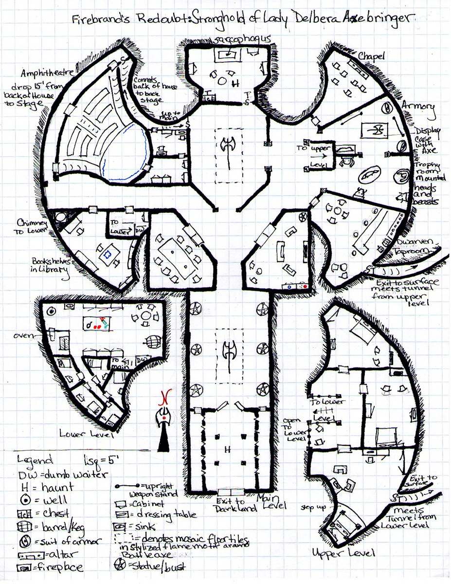
Firebrand's Redoubt: Stronghold of Lady Delbera Axebringer
 Crystal Frasier
Contributor
Crystal Frasier
Contributor
|
| 2 people marked this as a favorite. |

The Good
Dang! Now this is an evocative map! Great shape, varied room layouts, a variety of encounter spaces, and clearly more than one path through!
Very clearly depicted and labelled. The exterior hatching tells me at a glance we're underground. The sketches for furniture are obviously what they're supposed to be, and anything I have questions about is labelled in the key. I could easily make a final map from this.
Page real-estate is well used.
Has a compass, key, and scale all clearly labelled.
The Bad
The title is a bit of a mouthful, and barely fits on the page.
My Judgement
Greta entry, very creative, and well-communicated. I strongly recommend this entry more forward to the next round!
| Robert Lazzaretti Cartographer |
| 2 people marked this as a favorite. |

Nice eloping map reference upon first glance.
A compass rose and scale is present on the map.
Good use of page space here.
Well drawn easy to read details, and nice to see a unique take of room shapes and the overall layout of this location, very cool.
Looks great nice map, i like it
I do recommend this map to progress to round 3
 Owen K. C. Stephens
Modules Overlord
Owen K. C. Stephens
Modules Overlord
|
| 2 people marked this as a favorite. |

Drawing from my blog on maps, and the rules for the round, I’ll judge the maps on a number of questions.
Is It a Full Page Map?
Absolutely. The three levels are well arranged to use the real estate of the map smartly.
Does The Map Have A Compass Rose and Scale? Are They Used Well?
Yes, and yes.
Is The Map A Place I Want To Adventure?
Definitely. This has the look of an important lady's base, and it may be assaulted, defended, visited for political purposes, or the site of social intrigue. That's a lot of possibilities. A small adventure could easily take place in this one location, and that's neat.
Is the Map Clear?
Mostly. There are lots of great notes (like the fact the axes and symbols in tilework, and the oven, and the notes about stairways). I'd like the function of rooms to be labeled, but that's a minor fix.
Is the Map Detailed?
Yes. It has items as appropriate for a 5-foot square scale, and everything Pcs are likely to ask about. It includes a lot of different kinds of places, as keeping with a powerful lady's redoubt, which is a different kind of detail and one that is often overlooked.
Is the Map Imaginative?
Heck yeah. And here's a crucial reason why. It looks like an axe, but that doesn’t prevent it from being a believable layout. Buildings that look like symbols are often hokey or stupid, and by keeping the shape simple this map avoids that. It also avoids having the two sides be perfectly symmetrical, which I like. And since it's underground it has no need for everything to be the same level, so one side and a lower level, and the other a (bigger) upper level.
I strongly recommend this map to advance to round 3.
|
Monica Marlowe
RPG Superstar 2015 Top 32
,
Marathon Voter Season 6, Marathon Voter Season 7, Marathon Voter Season 8, Star Voter Season 9
aka mamaursula
|
Thank you judges for your kind words.
|
Andrew Marlowe
RPG Superstar 2014 Top 16, RPG Superstar 2012 Top 16
,
Marathon Voter Season 6, Marathon Voter Season 7, Marathon Voter Season 8, Star Voter Season 9
aka Locke1520
|
| 1 person marked this as a favorite. |

Thank you judges for your kind words.
Yea!!!
| Jacob Trier RPG Superstar 2012 Top 16 , Marathon Voter Season 6, Marathon Voter Season 7, Dedicated Voter Season 8 |
| 1 person marked this as a favorite. |
A well deserved trifecta of judge recommendations. This is a killer map, and one of my sure votes.
| Andrew Black RPG Superstar 2008 Top 16 , Marathon Voter Season 6, Marathon Voter Season 7, Marathon Voter Season 8, Star Voter Season 9 aka MythrilDragon |

WOOT!
| Isaac Volynskiy RPG Superstar Season 9 Top 16 , Dedicated Voter Season 8, Marathon Voter Season 9 aka Petty Alchemy |
| 1 person marked this as a favorite. |

*sound of my mind being blown by how awesome this is*
|
Richard D Webb
|
| 1 person marked this as a favorite. |

That is a very pretty map I would love to explore
| RJGrady |
| 1 person marked this as a favorite. |

It's not hard to picture myself walking around in that location.
| Jacob W. Michaels RPG Superstar 2014 Top 16, RPG Superstar 2012 Top 16 , Marathon Voter Season 6, Marathon Voter Season 7, Marathon Voter Season 8, Dedicated Voter Season 9 aka motteditor |
Congrats, Monica.
I provided some feedback on this map, so I won't comment too much. That said, I really love on the unusually shaped rooms. This is somewhere I could see running a fun adventure.
| Garrick Williams RPG Superstar Season 9 Top 16 , Star Voter Season 7, Star Voter Season 8 aka Cyrad |

Well done, Monica.
I know I gave some coaching early in the process, but I really like the map's symmetry (or rather lack thereof). Despite looking like a symmetrical axe, the room layout varies. Even the shape of the upper floors aren't the same.
| John Bennett RPG Superstar 2011 Top 8 , Dedicated Voter Season 6, Star Voter Season 7, Dedicated Voter Season 8 aka John Benbo |

Well-detailed and interesting, I also like how you (unlike a few of the other maps) actually drew in the thickness of the walls.
| Lucus Palosaari Star Voter Season 6, Star Voter Season 7, Star Voter Season 8, Star Voter Season 9 |

This Map, Brian Fruzen's "Salvation's End", and Charlie Bells' "Smokemount Hold" I all pushed into my 6th/7th/8th spots in my mind.
Your maps each have their aspects done better than the others, while others include things that might have helped the other out...
But I see them as all being really, really good turnover maps for decent versions of fairly standard locations. Now, that isn't that the idea of the location isn't "different", it's that "stronghold of Lord Something" isn't exactly a new idea. The decision to make it LADY Axebringer makes it "more" interesting but it's still not "Oh my gods, how totally different from everything else before it!?!"
The Axe-Shaped stronghold though, at least at first, is a bit of a drawback for me, at least at first. It seems... kitschy, and reminds me of something a 12 year old would do doodle during class for their character.
But I say that only at first...
When I thought more about it, look at your design, really thought about it, and realized it was underground (which took me a bit for some reason to realize) I figured "yeah actually dwarves especially would do this kind of thing, just cuz" And really, it's not a "bad" design for an underground hold, etc.
The Axe thing aside, your map is actually really well detailed and thought out. I might want to ask where everyone goes to the bathroom/bathes but that seems to be something everyone misses on this kinds of maps (that and I may just not be looking closely enough/not realizing that some symbol is exactly that)
 James Casey
RPG Superstar 2014 Top 16
,
Marathon Voter Season 7, Marathon Voter Season 8
aka Jrcmarine
James Casey
RPG Superstar 2014 Top 16
,
Marathon Voter Season 7, Marathon Voter Season 8
aka Jrcmarine
|

I was really hoping your submission would be a good one, Mama, and you didn't disappoint. Great execution on the map. My only nitpick is legibility. I had a little bit of trouble reading some of the hand written identifications. You could have easily scanned this in after drawing and inserted text to make it cleaner, but that is being a bit nit picky.
I am not a fan of the name either but it is serviceable. The rest of the map is awesome! Good luck!
| Rite Publishing |
| 1 person marked this as a favorite. |

Use of the rooms shape was inspired, then making it multilevel, like everyone else I think the name was the weak point, but I have always been one to say a place should have multiple names what the official name is , what the local name is, what the folks who use it name it, and what the enemy names it.
Great work monica you should be proud and you did all that with line art and some graph paper. I would have been interested to see what you could do with colored pencil but you did not need it.
| Maurice de Mare RPG Superstar 2013 Top 16 , Marathon Voter Season 6, Marathon Voter Season 7, Marathon Voter Season 8, Dedicated Voter Season 9 aka Darkjoy |

18th map I have seen, another genius map, your current rank is 4th.
|
Steven Helt
RPG Superstar 2013
,
Dedicated Voter Season 6, Dedicated Voter Season 7, Dedicated Voter Season 8, Star Voter Season 9
aka Steven T. Helt
|
| 2 people marked this as a favorite. |

This is definitely a Top 3 map in this round. It's all the more impressive because it looks like a seasoned designer's map. Since I know that not to be the case, I also look forward to what might be your Very First Monster, your Very First Encounter, and your Very First Adventure Pitch! : )
This map is a great example of making good, competent choices. You took risks: the axe shape could have been received as kitchy or a bad gimmick, but the bold wall lines, details, multiple levels, and asymmetrical room design make it look like mature, intentional design. People who see it immediately think "yep. that's a dwarven tomb."
A little critical feedback: the map would only be improved by adding a little more color. Some soft yellow gold, some browns to color in the mosaic axes, etc. It's a cartographer's job to finish the artistic portion of the map, but every but of help to capture the feel is helpful.
Also, if you want to make it an adventuring location and get GMs and players salivating from the map alone (it happens), draw in a small drow base, add some spider webs, maybe a group of orcs eating in the kitchen. Whatever direction you take, offer us this pristine, beautiful tomb, and then defile it with monsters. It'd be a natural fit them to bring the monsters to life by descrinbing how they've suffered at the hand of the dwarven haunts, and therefore don't pursue PCs into those areas.
Just a really great job, Monica. I posted before that I thought this round was hard and that I was impressed by the number of entrants who got it. You are top of the heap for this competition until I see otherwise.
(It looks like Rite Publishing and I are gonna have to duke it out over this old school icon thing)
| BigBad Star Voter Season 7, Star Voter Season 8 |

This is a cracking job and definitely gets my vote. Despite a mostly symmetrical layout, you avoided interior symmetry, which makes the whole thing very appealing to look at. Your little interior details are brilliant, and would really aid play at the table. There are some problems - some rooms feel squashed, and I confess I have no idea what's going on with the amphitheater section (despite the two written notes) - but overall it's great!
| frank gori RPG Superstar Season 9 Top 32 , Marathon Voter Season 6, Marathon Voter Season 7, Champion Voter Season 8, Marathon Voter Season 9 aka GM_Solspiral |

Challenge: Is this map difficult to execute? Does it in my opinion demonstrate the characteristics of a Superstar designer?
Technique: Did the designer show some skill and consideration in the choices made on the map. Are the words used in the key wise choices that add to the overall utility of the map?
Utility: Can a GM/cartographer make sense of the map and make immediate use of it?
Overall:[b] I'll rate the Map as an A for strong recommends B for weak recommends C on the bubble D for weak rejects F for Do not recommends
Challenge: My stronghold is a giant axe. Seriously tough to do and soooo METAL
Technique: So many good details like the compass.
Utility: I'm totally stealing this so hard.
Overall: -A Seriously strongly recommending this for R3.
 Sporge
|

There are some details added in that I can't quite identify... Mostly the random and few colored things that feel more important when they might not be at all.
Otherwise in decent shape, a bit cluttered for this pass I think, but I guess some people want that sort of thing.
|
Monica Marlowe
RPG Superstar 2015 Top 32
,
Marathon Voter Season 6, Marathon Voter Season 7, Marathon Voter Season 8, Star Voter Season 9
aka mamaursula
|
Thank you all for your comments. Please post any questions you have and after voting ends I will be back to address them.
| Mark Griffin RPG Superstar Season 9 Top 8 , Dedicated Voter Season 7, Star Voter Season 8, Star Voter Season 9 aka Mark D Griffin |

My favorite thing: It's shaped like an axe, and I don't hate that. If someone told me they were planning to make a dwarven stronghold shaped like an axe, I would think to myself "I'm going to hate that." Against all odds, I don't hate this at all, I like it quite a bit.
Other things I like: The rooms have lots of cool shapes and varying uses. Also your art style makes me feel warm and fuzzy just looking at it, though I think your handwriting was hard to make out a times.
My least favorite thing(s): Oh wow, that name is not a good name.
Will I vote for it: I will most definitely be voting for this, it takes my #2 spot. Congrats on a great effort.
| Cthulhudrew Star Voter Season 6, Marathon Voter Season 7, Marathon Voter Season 8, Star Voter Season 9 |

My first thought on looking at this was: What the heck am I looking at?
Then I read the name, looked again- very cool design. I like that it is very a very non-standard room (and frankly, I think in a fantasy world this wouldn't even be all that place above-ground. Sort of a fantasy dwarven room as designed by Gehry.)
I also like how you added a couple of levels to it, and kept them symmetrical with their lower portions. The legend has almost a little too much going on, and bleeds a bit into the design, but that's really the only criticism I have. Well, that, and I'd really love to see this in full-color! :D
Great job!
| PFW1-K1 |
BEEP BOOP for more information PLEASE SEE
The Darklands, Golarion's massive underground continent; dwarves, who often wield maulaxes, of which I imagine at least one is in the lady's collection; and Angradd, the only major dwarven deity who favors an axe.
| Anne Sullivan Marathon Voter Season 8 |

I agree with what Mark said, that if someone had said "check out this axe shaped map" I would have readied myself for overly themey thematicness. However, this is really solidly done, and the axe shape is not the first thing you see which is why I think it works so well.
It does get a little cluttered (especially in the armory area) so visually it's difficult to differentiate spaces (although color would undoubtedly help with that), but I love that you've given so much thought to how the space would actually be used.
The multi-levels just ties it up for me. I can't imagine this not carrying you to round 3.
| Feros Champion Voter Season 6, Champion Voter Season 7, Champion Voter Season 8, Champion Voter Season 9 |

This is great! I love the fact that it both is and isn't symmetrical. Far too many designers get caught up in the idea of a dungeon shape and then get lazy and make both sides of the design the exact same. This dungeon breaks up the symmetry in the uses of each space. The chambers of this underground fortress can be readily determined just by looking at how they are laid out.
The symbols used are clear and easy to see. They are drawn well enough that it is fairly obvious what they are. If I have any complaints about this map it would be the following: The hand written comments and key, though fairly clear, could have been more carefully written out or replaced by computer generated text. Although colour is used, it is barely noticeable and could have been used to stronger effect. Finally the name is massive; because we don't have the full back story only the "Stronghold of Lady Delbera Axebringer" was really necessary.
My second favorite map of the entire selection is most definitely getting my vote.
| Oceanshieldwolf Dedicated Voter Season 6, Dedicated Voter Season 7, Marathon Voter Season 8, Star Voter Season 9 |

Not liking this at all. The axe-map is gimmicky for me, and although you have given lots of thought to the material needs of the inhabitant (I'm sure if I look hard enough I'll find the jericho) it doesn't look like an exciting adventure local or encounter area.
It's a nob's folly, without the extra zaniness or mystery that makes a nob's folly interesting. And the extra levels are still in the shape of the axe, needlessly.
Once you pass the axe and armor room you come to disconcerting, strange junction - there is a singular lack of the grand entrance or visitor's breathtaking vista.
It isn't clear - adding words doesn't add to the visual clarity.
There is no color, which is actually fine, but here it feels very note-like and not finished submission.
The name is incredibly overblown. And feels derivative. You get a point back for using redoubt though.
Plus it smells heavily of dwarf, so you lose extra marks there. :)
| Jacob W. Michaels RPG Superstar 2014 Top 16, RPG Superstar 2012 Top 16 , Marathon Voter Season 6, Marathon Voter Season 7, Marathon Voter Season 8, Dedicated Voter Season 9 aka motteditor |
"Nob's folly"? I'm not familiar with the reference...
| MasterOfWar Dedicated Voter Season 8 |
One of my favorite maps!
The Good- Extremely well thought-out and executed
As with Charlie Bell's map the overall design is elegant and symbolic in a way that I think a Dwarf would go for.
I can see myself living here- it has everything you could want.
Most of the layout is logical and fits with a stronghold
The Bad- Um....the handle of the axes in the floor aren't perfectly straight? I'm going to have to nitpick here.
Why does the dumbwaiter come out right beside the stairs and not in the main dinning room?
I feel like the sarcophagus could use some more information, like who is in it. If the titular heroine built this, did she have a sarcophagus made for herself? Maybe an esteemed ancestor?
Is this a stronghold or a redoubt? A stronghold is a permanent fortification- which this appears to be. A Redoubt is either a temporary fortification- the type Roman soldiers built before camping each night- or a place within a stronghold where you make a final stand.
I'm guessing a stronghold. I would have liked to see more real defenses in place- traps are all well and good, but where are the barricades, murder holes, and so on?
The Confusing-
Was this stronghold abandoned or is it active? If it was overrun by enemies I'd expect there to be broken barricades and looting (ax in display case still present, so no looting). If it's active, why are there Haunts?
What I'm getting is the place was overrun, the Lady killed, but enough of her followers survived to make the sarcophagus, though despite dying in battle and winning she became a Haunt.
I think several more Haunts would have added a lot to this and helped tell the story better.
Wow, so when I decide to be nitpicking I type a lot more. I want to reiterate that this is an epic map, has my vote, and I want you to advance!
| Lady Firedove Star Voter Season 6 |

I really like this map! Interesting name, clever use of space, believable layout, versatile location for various types of adventures, clear drawing, nice details ...Well done!
My only nitpick was going to be the spelling of "amphitheatre," but I double-checked it online first before posting this, and you're absolutely correct! I somehow had it in my head without the first "h" ... even though I was considering submitting an amphitheatre myself for the map round if I made Top 32.
Anyway, great map. Nicely done! :)
| Marlagram Dedicated Voter Season 8 |
I hate to be totally negative, so here's some positive things still not mentioned about this map:
- a lot of details and they're placed so good that GM will always know where PC/NPC stands (this is a lot of work)
- this map have all the noble may need without wandering into Darklands
...well, almost.
Now about other side of the things:
- this noble is a gnome I'm sure for any medium creature should squeeze through half of the doors and passages
- with all these bedrooms, bar and dining room this estate lacks kitchen, food and water storage and, well, refreshers
- the noble lady had very strange areas of interests because she had chapel in NE, theatre in NW, alchemical lab with secret bedrooms (or is this torture room with cells?), library, bar and secret crypt right in the middle of all that
- two haunts are good for exploration mission, but I do not understand how to run social event adventures here.
I can see sheer volume of work and imagination put here, but I'll not use this map in my game.
| CripDyke Dedicated Voter Season 8, Marathon Voter Season 9 |
The good:
A powerful woman with a Labrys tile mosaic at the center of her Labrys shaped stronghold?
Okay, sign me the Freud up. If I have to work a bit to understand why there are haunts in an active stronghold or no damage to an overrun/abandoned stronghold, so be it. This got instant buy in from me.
| Kiel Howell RPG Superstar Season 9 Top 32 , Marathon Voter Season 6, Marathon Voter Season 7, Marathon Voter Season 8, Marathon Voter Season 9 aka theheadkase |

I am critiquing this without having looked at anyone else's comments.
Long name, probably don't need the colon and after.
It looks like a battleaxe...which I am conflicted about.
I think you misstepped by giving the key over to describing what the objects are instead of encounter locations, but I can see why you did it. Still, I don't recall a precedent for not putting room names/types in the key.
What are the battleaxes in the middle chamber? I don't see anything in the legend.
Good solid border lines and some cross-hatching make this pretty easy to read.
You have a little drawing on the bottom left of the haft of the battleaxe...it looks like Sauron's tower from the LotR movies. Oh I see its a compass...the N should be a little less stylized.
Overall, it feels like you are trying to force a story to the idea of having a battleaxe shaped dungeon. Shaping the building to reflect it's name is probably going to turn a lot of voters off, it would be akin to alliteration in the magic item round. Still, this map is easily readable, and it has a lot going on. I can't tell if there is a real story or just an idea here which is ultimately going to put this lower on the totem for me.
| Jaragil Marathon Voter Season 8 |

At first I was like "A battleaxe? Uhhuh, that's cute."
But the more I look at this map, the more I'm starting to like it. The asymmetrical room design, the fact that the upper and lower floors are not just mirror images of one another, all the minor details, the fact that it for some reason has an amphitheater in it. This is definitely a place I'd like to explore.
Then again, the mention of haunts is a bit disconcerting because there's no other indication that this place isn't still in use. No ruins, no crumbling walls, no fallen bookshelves, no spider webs. Why not leave the haunts out and let this be a fully operating dwarven stronghold? A small one, sure, but as I said in the other dwarf stronghold thread, not all of them have to be metropolises.
And yeah, there are some rooms missing for this to be fully realistic and functional, but there are more of them here than normal, so at least this is better than average in that regard.
All in all, way to turn a cliché on its head. Not one of my favourites, but I do love that you took the risk and made it work for you. A weak yes.
| Lady Firedove Star Voter Season 6 |
- this noble is a gnome I'm sure for any medium creature should squeeze through half of the doors and passages
It screams dwarf to me ... especially the "Dwarven Taproom!"
- with all these bedrooms, bar and dining room this estate lacks kitchen, food and water storage and, well, refreshers
- the noble lady had very strange areas of interests because she had chapel in NE, theatre in NW, alchemical lab with secret bedrooms (or is this torture room with cells?), library, bar and secret crypt right in the middle of all that
Ha! I think the reason you're not seeing the kitchen/storage/servant's quarters is that you're mistaking them for an "alchemical lab with secret bedrooms." Check out the lower floor again ... especially the part labeled "oven."
The rest of the interests make sense to me. Hey, I love theatre, church, reading, socializing, and... okay, maybe not a secret crypt. But, I'm not an epic villain!- two haunts are good for exploration mission, but I do not understand how to run social event adventures here.
Me neither, but remember, if this was part of an adventure, we would have story context. I'm intrigued! Or, if using the map alone, I could come up with a few possibilities: The lady is alive and well but her ancestors 'reside' here with her. The lady is (secretly?) undead, but she likes to host parties. The lady is deceased and entombed here, but her loyal servants and/or preservative magic have kept the place in good repair. Many possibilities...
I can see sheer volume of work and imagination put here, but I'll not use this map in my game.
I will! :)
| Template Fu |

Congratulations on completing and submitting your map on such a tight time-scale. Very well done, you should take pride in that achievement!
Disclaimer: The review of your entry that follows is from a non-official source, I have no formal part of RPG Superstar, and the review thoughts are mine alone and so should be considered carefully bearing this in mind. You can choose to digest or not each part as it seems of best value to yourself.
Note for all: I am spending at least an hour per map in order to be as extensive and thorough as I can, so with other time demands and the like, you will only be getting one or two reviews a day. Sorry, but real life and freelancing work does take precedence when they crop up.
I have already viewed all the maps and chosen my votes, so I am just typing up my notes in more human readable form - If voting closes before I get to your feedback, don't fret that you missed my vote :)
I am starting with map reviews this year while I brush up my knowledge of the different item types used for round 1. So let me begin...
Template
Yes, there is one, even for maps - it is the size, the compass rose, scale bars for each part of the map drawn at different scales, a key box describing the map elements, the map name on the map. The clarity of line and text also pays a part on this. Here is how you did...
Name: Present, functional, provides flavor but is a little overly long. I envision the name being shortened to just Firebrand's Redoubt with a smaller font sub title of the remainder of your name.
Size: You have used the correct dimension and have micro managed the layout well - your key looks a little squashed but for a hand drawn map, everything is there for the cartographer.
Compass Rose: Check - the orientation of each map part is the same, so just the one needed.
Scale Bar: Scale is present - all maps drawn to the same scale, so just the one needed.
Key: Present, a little squashed but missing some items. On one table is a red and cyan thing next to two red dots - a fallen over candle beside two lit candles maybe? I'm guessing though! On two cabinets are some red and blue circles/dots - not sure what they are. The cartographer would need to ask about those I think. It is the fact they are the only colored items on the design that make me believe they are really important!
Golarion Tie-In
Everyone has their take on Golarion, guided by the products and supplements. This therefore is a scoring based on how I felt you had tied the Golarion world to your map, it's flavor, the feel of the map, is it generic or obviously. This is therefore a very personal view and evaluation of your entry and should be considered as such. Onwards my brave contestant...
Ok, Firebrand, Axebringer, these just ooze dwarven namey-ness. A good start, but what about the Golarion tie-in? Firebrand? That's a spell in Pathfinder and doesn't seem to have any searchable lore/places. Axebringer, although a great name, doesn't have any Golarion tie-in that I can find either.
They key generally seems to save maps for golarion tie in, so looking there... hmmm, no Golarion fu there either that I can see - what you really needed was to say who the Chapel was dedicated to, which god is the altar blessed to? This could have tied you into Golarion lore well.
Phew, my last scan through shows an exit to the darkland - I think that needs an "s" on the end? A reference to the darklands does tie this to Golarion and my Golarion Fu need is a little better sated - you had me worried for a moment as I couldn't see and Golarion references in the map key, so I am glad I spotted that tucked away label.
Possible Areas of Improvement
Again, this is a personal evaluation of what, if anything, I think would improve the map and suggestions on things you could have done differently or added to the map. These are totally personal suggestions, but you might find something useful to consider herein...
I would have preferred to see a small insert showing where in Golarion this is located, and either a side away elevation view OR in this case, some dotted lines in the axe head showing the outline of the other level and how the align above and below the main axe head area (p.s. I love the axe head layout - that even has the feel of a dwarven berserkers double headed axe to it).
Labels, there are two that confused me. One ends with "meets tunnel from upper level" and the other "meets tunnel from lower level" - the confusion I have is if the two tunnels are joined, how do they both provide an exit to the surface? To resolve this, the longer branch in the axe head could have run to small t junction, one branch labelled "to the surface" and the other "to the lower level", the lower level would lose the "to the surface" reference as the t-junction would fulfil that.
The other label I had problem with was "Chimney to lower" - to lower what? room? oven? caverns? I did think that maybe to the lower kitchen area and my mind connected the tunnel to the top left circle symbol of that room - but that symbol represents a well. So this confusion reinforces my need to see how the rooms align to be able to see where the chimney hole is in the kitchen area.
Oh yeah, I missed the blue lines in the theatre, also missing from the key - curtains or stage props/blinds? I think the two short front ones might be slideable stage scenery canvas with the rear large curved one being a curtain backdrop - but I don't know for sure.
You need to be careful of leaving space for encounters - looking at the room with the table and chairs next to the library, those chairs are way too close to the double doors. Hmmm, a smaller table would have enforced the feel of tight knit dwarven communities eating together and sitting together really close to each other, but that room would be a nightmare to move in during a combat encounter.
I love all the little details, but try to remember some white space is still needed in any area/room design - white space is the thing that helps players and GMs to have great tactical and movement filled encounters.
My personal take on golarion dwarves is their love of their mother mountain, and I get that with the axe head design. They are potentially paying homage to their past, their gods and the curving jagged walls allows me to feel that the mountain itself is being revered. All of this just keeps adding to how I feel about Golarion dwarves, so for me, this is a really warm and fuzzy map design.
You fell into the old trap of compass rose aligns with grid lines - it doesn't have to, it could have been drawn leaning slightly to the left or right - you also fell into the trap of builders only able to build walls along the compass rose axes - I know it makes drawing on battleboards easier, but it is a pet peeve of mine. It isn't so much of a problem on this design due to the axe blade edge curving walls and odd shapes of some rooms, but your main central corridor does run true North-South following those gosh darned grid lines on the paper.
Finally, being dwarves, being an axe head shape, having an armory, the name axebringer - this all leads me to believe a strong militarian regime is here. So, I would have expected weapon racks in most of the larger communal rooms. Military minded dwarven clans would carry their weapons with them, placing them within easy reach during meetings, resting and eating - they wouldn't want them on their person all the time, but would like them to be in easy reach. I would certainly install them near the theatre, at the back, so that the audience don't have throwing axes to hand if the performance is a bad one :P
Summary
I summarise my reactions to your submission here, stating if you are a definite vote winner, a potential vote winner or not. I am not
"scoring" the entries this year as I always struggle to maintain consistency in scoring, so I am now trying a more "gut instinct" summary. Here goes...
A link to the darklands, a strong dwarven theme that is also consistent throughout the map, with a sense of golarion inherent in the whole layout gives a stunning wholeness to this design. I love my dwarven strongholds. I adore the darklands. You hit all the right buttons for my personal tastes, so I am happy to say you have definitely taken one of my top 8 votes with this submission. Well earned.
It is so good, so flavorful, you have set the bar incredibly high for your next submission. Good luck and well done indeed.
| Marlagram Dedicated Voter Season 8 |
| 1 person marked this as a favorite. |
Ha! I think the reason you're not seeing the kitchen/storage/servant's quarters is that you're mistaking them for an "alchemical lab with secret bedrooms." Check out the lower floor again ... especially the part labeled "oven."
...Marlagram wrote:- two haunts are good for exploration mission, but I do not understand how to run social event adventures here.Me neither, but remember, if this was part of an adventure, we would have story context. I'm intrigued! Or, if using the map alone, I could come up with a few possibilities: The lady is alive and well but her ancestors 'reside' here with her. The lady is (secretly?) undead, but she likes to host parties. The lady is deceased and entombed here, but her loyal servants and/or preservative magic have kept the place in good repair. Many possibilities...
...
OK you got me on the kitchen part. My bad. :) Now other question arise but htey are minor compared to previous one.
So this is dwarven lady with five gnome/halfling/svirfneblin servants/actors. Way better than my first conclusion.| Koboldhammer Star Voter Season 8 |

Solid map, but apart from the shape of the house, there are no surprises. Week keep.
|
Owen K. C. Stephens
Modules Overlord
|
Official Round 2 Note: On Map Resolution
We’ve had some comments on legibility of smaller type on the maps, and the contestants are (by the rules of the contest), not allowed to clarify anything, so I want to make a general statement about maps and resolution.
When we required all contestants to present maps at a specific dpi and size, we did so because in past years we’ve had some issues with maps (for the encounter round) being sent to us in different sizes, resolutions, and dpi, making it difficult to give them all a high-quality presentation for the contest. We found that asking for a higher dpi than we’ll use in the end allowed us to create a standard of presentation that kept all images crisp and clean. For encounter-round maps, this has worked well.
Unfortunately, since this round requires all text be provided on the maps themselves, many contestants used the dpi and size standards we required as the basis for making sure their text is clear, and otherwise tried to keep words as small as possible so as to not clutter their maps. This was done in the (reasonable) belief that the maps should look good at the size we asked for, rather than in any different size we might present on our website. When resized for smaller, high-quality images, this can result in words that aren’t clearly legible.
We’ve made a change to rescale everything to the higher end of maximum image size for uploaded images for all maps that were entered this round. This should allow for better legibility for voters when selecting their favorite maps to advance in the contest. It is our fault that this process was not properly communicated to our contestants, so consider this when adjusting or finalizing your selections.
Obviously, we’ll explain what is going to happen to the images of maps, and how to allow for it, more clearly in future rounds (and future contests). My apologies to any contestant with a map that has suffered as a result of how we handled scaling in this round.
| Browman Dedicated Voter Season 8, Dedicated Voter Season 9 |
this is one of my favorite maps. the axe shape could have been super gimmicky, but you made it work. the non-symmetrical upper and lower levels really made this map stand out.
| Mark Nordheim RPG Superstar 2014 Top 16, RPG Superstar 2013 Top 32 , Marathon Voter Season 6, Dedicated Voter Season 7, Marathon Voter Season 8, Dedicated Voter Season 9 aka Morphemic |

Here are my ratings for this map:
First Look: A
The axe shape and hand-drawn lines invoke a sense of old-school fun.
Interest Level of Location: B
This is an interesting stronghold, but a lot of the rooms are pretty ordinary and mundane. They wouldn't be that exciting to explore as a player.
Tactical Depth: B
There are a few areas that would make good combat locations. There are also a lot of rooms with nothing but a little furniture to spice up a fight.
Adventure Potential: A
This would work as a mini-dungeon, or as a home base to defend.
Clarity: A
No problems.
Logic: A
Well designed. Everything makes sense.
Overall: A-
| Raynulf Star Voter Season 8 |

First off: Congratulations on making Round 2, and the best of luck in the votes!
Coolness: Do I look at this, and want to use it in a game? Does it provoke wonder or amazement? Does it hold potential for interesting encounters, adventures or roleplay? How much mileage does this map have in it?
Usability: How usable is this for me as a GM (being that GMs are actually the primary audience of most maps)? Is the legend clear and in logical order for play? Does it give me enough information to easily visualize the parts and wax poetic about the varied locations? Does it have the necessary details for me to run with it on the fly, or will it involve a lot of improvisation? Does it have any glaring oddities that stop me mid-breath to go "what the hell is that?!"?
Craftsmanship: Is it clear, legible and containing all the necessary bits and bobs? Does it make good use of the space? Is the scale appropriate for the detail (and visa versa)?
(I suppose you could also call them "Creativity, Functionality and Skill", but I like my terms better :P).
Coolness: A
- Positive: I see a haunted fortress in the darklands to explore and uncover its secrets; a base of operations for a party of heroes; a last stand against monsters from beneath. This place has a lot of potential, both for combat and roleplay. The design is thorough but efficient and creates the impression this was a living, breathing place and can be again. The axe design is worked in naturally rather than forced, and that is cool.
- Negative: There's the odd room that is a bit on the gratuitous side and seems to possess no immediately evident function.
- Verdict: Solid A for coolness, as the place is detailed, full of character and inspires scenes just looking at it.
Usability: B+
- Positive: It's loaded with detail, it flows naturally and most of the rooms are have self-evident purpose and flavor. This is something I can work with and enjoy doing so.
- Negative: Some notes or a key regarding some of the room functions would have been really handy, as at present I'm having to guess the author's intent (as will the cartographer). Elevations! When working in maps with vertical components, elevations are rather important details.
- Verdict: This one gets a B+ from me, though it was so close to acing it, it just needed a few more note to fill the blanks.
Craftsmanship: A-
- Positive: Notes to the cartographer in regards to décor and features is an excellent touch, and working in the axe theme to the design without compromising on functionality takes skill. It's clear, legible and makes excellent use of the page space.
- Negative: Some missing information and having to play a bit of guesswork on some of the symbology detract a little from what is otherwise some excellent work. The fact the stronghold is perfectly aligned with North comes across as a little contrived, though less so in this instance due to dwarven OCD.
- Verdict: A- for craftsmanship
Overall: A-
| Grumpus RPG Superstar 2014 Top 32 , Marathon Voter Season 7, Marathon Voter Season 8, Marathon Voter Season 9 |

I liked this one a lot. Tons of information is conveyed which is good, but also clutters things up. I expect to see you in round 3, but I had this one ranked #9.
Good Luck!
|
Monica Marlowe
RPG Superstar 2015 Top 32
,
Marathon Voter Season 6, Marathon Voter Season 7, Marathon Voter Season 8, Star Voter Season 9
aka mamaursula
|
| 1 person marked this as a favorite. |
Thank you everyone for your questions and thoughts on my map, I will be posting my response tomorrow after the results are announced.
| Lady Firedove Star Voter Season 6 |
Life is still crazy, but internet is finally working well again, so here's some feedback:
Lady Axebringer - Not just professional quality, but clever and believable, and a place I would enjoy taking over as a base of operations in a game (or maybe even real life...)
.....
Great job! This map got my vote. :)
Thank you for inspiring adventures in my mind!
| Chris Shaeffer RPG Superstar 2015 Top 32, RPG Superstar 2013 Top 32, RPG Superstar 2012 Top 16 , Dedicated Voter Season 6, Star Voter Season 7, Star Voter Season 8, Star Voter Season 9 aka Hodge Podge |

My girlfriend asked who I thought was going to be a contender this year, and you were the top of my list. Great map! It just has that classic feel for me.
|
Monica Marlowe
RPG Superstar 2015 Top 32
,
Marathon Voter Season 6, Marathon Voter Season 7, Marathon Voter Season 8, Star Voter Season 9
aka mamaursula
|
| 5 people marked this as a favorite. |
Now that we've been given release to talk about our maps, here's my wall of text cut up into spoilerific bites.
First, thank you all for your support, kind words and questions. This response was written as your questions and comments arrived on my page and I will try to answer them in roughly chronological order. Some questions come up more than once, so if I don’t answer to your satisfaction, please leave me a follow up. Assume if you left positive feedback I loved every minute of it and used it to power through my monster design.
This is intended to be an unbreached tomb, left intact because it was sealed prior to the fall of the dwarven underground civilization. I had given great thought to how I would include other possibilities into the map and then I realized, that isn’t want this map is about (see above comments.) I want to give the person who uses the map the option of using it prior to sealing if they wanted to or as an archaeological site or “ruin” it in the way that best worked for them and their gaming needs, not my own. So, the site is pristine by design and in favor of the GM using it as she likes, because that’s how general location maps should be.
We had no encounter write up this round and I felt that being any more specific told part of the story that wasn’t mine to share, yet. Ideally Lady Delbera died of old age and is entombed in the sarcophagus, but if you wanted to run an intrigue game here with Delbera alive, the sarcophagus holds her lover, child, or dearly departed pet, whichever works for you, the GM using this map.
I’m not sure how much more of a grand entryway I could have provided than the pillar and statue lined promenades in the haft region and a double wide staircase leading to the second floor with an overlook balcony. Performing monkeys and highwire act felt a little over the top to me. This was a two dimensional map without the benefit of room description, which is where the details you are looking for would be provided.
The cartographer is the artist, I am the designer. I try to accept the limits of my “artistic” skills and believe in letting professionals do their jobs, I just needed that person to know where the tiles go. The original lines were straight, going over them with a thicker ink pen made some of the lines wavy. :-)
This is a solidly built home where locals fall back to in times of trouble, then rescue the non-fighters through the secret passages and open up on would be attackers if they breach the front door, so technically it’s kind of both a stronghold and a redoubt or at least that’s my story and I’m sticking to it. The murder holes are in the foyer, nothing says “welcome to my home” like arrow slits in the walls. Which is why there is a haunt in the foyer, not all of Lady Delbera’s visitors were gracious. In retrospect, I know how I would modify this map to make it more “stronghold” feeling and hope to maybe one day get that chance. Thank you for poking that part of my brain :-)
CripDyke - Sister rocked the labrys. Haunts addressed above, sort of. :-)
*The compass rose* - feedback indicates some of you hate that north is almost always up. Most cartographers and designers prefer it that way. It has come up in conversation (we are truly pathetic people). I asked why is “north = up”, they unanimously answered “If it doesn’t really matter, why not?” Why logically should it be oriented another direction? There is nothing in this or most of my fellow contestants maps that warranted having a specifically different orientation - like facing the setting sun or placing growing fields for optimal sun growth to the south - so ‘up’ is the orientation of the 8.5 x 11 piece of paper we were given to fill and north is “up” in the northern hemisphere, where most of us reside. Had contestants from Brazil, Australia or any other southern hemisphere locale opted to do a map with the orientation of “up” being south, I would have said that they were using the same logic, but they might lauded for their ingenuity. I invite those who want things “the hard way” when you really don’t have to do “the hard way” to give into a kinder way of thinking about maps and compass roses, don’t fix something that’s not broken. :-)
Once again, thank you all for your thoughts, critiques and words of encouragement. I appreciate it very much! Thank you!