


| The Imperator |

I'm really excited for this book. More demigods, Krampus, the Wild hunt, and statues of dead gods with stats?
I wanted all of these things, I can't wait to buy it.
| Valantrix1 |

For us blind folks in the audience, would somebody mind giving a description of the cover? Pretty please?
 Rysky
Rysky
|
| 1 person marked this as a favorite. |

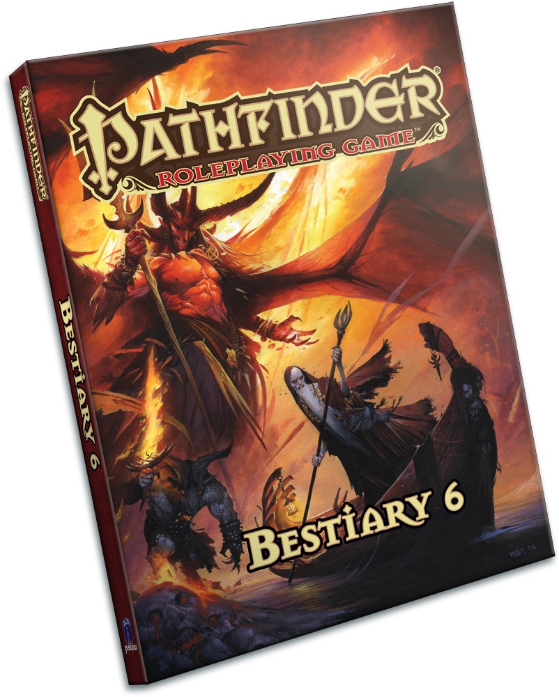
You have Mephistopheles gloriously in the back taking up most of the cover while also making it hard for Charon to steer his boat. There's a Brimorak demon in the corner standing on a skull leaking lava.
Metal as all f@$#.
| Valantrix1 |
| 1 person marked this as a favorite. |
You have Mephistopheles gloriously in the back taking up most of the cover while also making it hard for Charon to steer his boat. There's a Brimorak demon in the corner standing on a skull leaking lava.
Metal as all f~@%.
Thanks Rysky! That does sound pretty awesome. Metal indeed!
 CorvusMask
|
| 1 person marked this as a favorite. |

The floor/"cliff" surrounding the river seems to be made of stone heads/faces leaking blood/lava. Reminds me of more red version of Kingdom Death .-.
 doc the grey
|

Lemartes,
It happens.
Doc,
Maybe he's on the back cover...
Lol doubtful but points for the optimism man ^-^.
Again, the cover is really slick. Totally looks like some kind of heavy metal cover by someone who really digs on that Frank Frazetta vibe.
But, considering the sheer diversity of the content we know is going to be in here, I'm surprised by how focused the cover is on Evil Outsiders. It kind of makes it feel like this is focused on stuff from the fiendish planes more than anything else.
Also, I kind of miss the covers that end up having the big weird monster from mythology/religion/pop culture floating around with more expected fare like the Jabberwock on B2 and the Grendel, Nosferatu, Cthulhu cover of B4 as the juxtaposition usually makes more for a more visually distinct and memorable cover if that makes sense. Like, the minute I look at the Jabberwock on B2 I wanted to know what the hell that was and crack it open or how seeing a vampire from a german silent film on a tabletop cover feels so refreshing that it makes me just want to crack the book open and see what's going on.
Again, I don't dislike this cover (I think it's pretty f~!$ing metal) it just feels like it doesn't show off as much of the diversity of content within the book as the previous ones.
Aside: Building off something mentioned earlier, I totally want to see art of this as a wall poster with Lem jamming out in front of it costumed up as a hardcore metal fan.
| Lemartes |

Lemartes,
It happens.
You know in my defence this could be slapped on the cover of the Book of the Dammed and it would totally work.
Well besides the big "Bestiary 6" part. ;)
| The Gold Sovereign |

Also, I kind of miss the covers that end up having the big weird monster from mythology/religion/pop culture floating around with more expected fare like the Jabberwock on B2 and the Grendel, Nosferatu, Cthulhu cover of B4 as the juxtaposition usually makes more for a more visually distinct and memorable cover if that makes sense. Like, the minute I look at the Jabberwock on B2 I wanted to know what the hell that was and crack it open or how seeing a vampire from a german silent film on a tabletop cover feels so refreshing that it makes me just want to crack the book open and see what's going on.
This cover's "mythological monster" is undoubtedly The Ferryman of Hades, Charon.
However,
The Big Red Charming Devil in the cover is also eye catching, even for those that aren't aware that this is Mephistopheles. Well... Don't forget that Mephistopheles is in fact a really famous devil in religion/pop culture, appearing in movies, books, and games.
| Isabelle Lee |
| 6 people marked this as a favorite. |

Interestingly, the brimorak's inclusion here means it won't have to be reprinted in the Book of the Damned (where it originally appeared). It also means that we can reference them more easily. ^_^
|
DeciusNero
|
| 1 person marked this as a favorite. |

*Nathan explosion voice* Brutal.
Interestingly, the brimorak's inclusion here means it won't have to be reprinted in the Book of the Damned (where it originally appeared). It also means that we can reference them more easily. ^_^
Yesss, I am also pleased by Brimoraks!
|
Gorbacz
|
| 3 people marked this as a favorite. |

Nëëds mörë ümläüts.
| Davia D |
| 1 person marked this as a favorite. |
AmbassadoroftheDominion wrote:So, I was a good little ambassador and decided to read the whole forum scanning for "this is in the book" quotes.
...
-Todd Stewart Monsters (New ones)
I'm not sure how I should feel about a grouping of monsters diffusely described with just my name, not that I'm known for any particular sort of monsters or anything. Of course not. I had fun and I can't wait to be able to talk about them. :)
Keep shamelessly begging Paizo for a protean book on my behalf (because I would never stoop to that level...), that's all I ask. ;)
Hey, you *know* I'm down for that :) Proteans 4evar!
| MMCJawa |

Thomas Seitz wrote:Lemartes,
It happens.
Doc,
Maybe he's on the back cover...
Lol doubtful but points for the optimism man ^-^.
Again, the cover is really slick. Totally looks like some kind of heavy metal cover by someone who really digs on that Frank Frazetta vibe.
But, considering the sheer diversity of the content we know is going to be in here, I'm surprised by how focused the cover is on Evil Outsiders. It kind of makes it feel like this is focused on stuff from the fiendish planes more than anything else.
Compared to uh...past bestiaries, this probably is to some extent going to be pretty heavily weighed to CR 25+ threats, so the cover is probably appropriate for the content.
|
doc the grey
|
doc the grey wrote:Compared to uh...past bestiaries, this probably is to some extent going to be pretty heavily weighed to CR 25+ threats, so the cover is probably appropriate for the content.Thomas Seitz wrote:Lemartes,
It happens.
Doc,
Maybe he's on the back cover...
Lol doubtful but points for the optimism man ^-^.
Again, the cover is really slick. Totally looks like some kind of heavy metal cover by someone who really digs on that Frank Frazetta vibe.
But, considering the sheer diversity of the content we know is going to be in here, I'm surprised by how focused the cover is on Evil Outsiders. It kind of makes it feel like this is focused on stuff from the fiendish planes more than anything else.
I don't doubt that, but considering we know that we also have characters like Ragathiel and Black Butterfly in this alongside Mephistopheles, Charon, etc. I feel like we could have had a more diverse cover. I mean hell, We could have had Ragathiel fighting the Majordomo of hell while Charon ferries the souls of the fallen to Abbadon in the lower 3rd or something to that effect.
|
|
| 8 people marked this as a favorite. |

We've never illustrated monsters fighting on the cover of a Bestiary; the idea has always been to illustrate a group of monsters that could well be attacking the viewer. Whether or not the three monsters illustrated would make a balanced encounter is irrelevant to whether or not the cover looks cool and has a good theme. In this one, we wanted to illustrate a small, medium, and large monster that covered the three evil alignments.

|
DeciusNero
|
| 1 person marked this as a favorite. |
Wonder if that rock skull the brimorak is standing on another beastie?
probably not
| The Gold Sovereign |
I just noticed that Charon is carrying that book again, just as he did in the Book of the Damned cover. I was under the impression that the book was just a cosmetic addition, but it seems it can be of some importance (maybe it's his death note). And he also has the same rowing/staff from BotD cover.
I really miss his hat...
| Alexander Augunas Contributor |
| 2 people marked this as a favorite. |

We've never illustrated monsters fighting on the cover of a Bestiary; the idea has always been to illustrate a group of monsters that could well be attacking the viewer. Whether or not the three monsters illustrated would make a balanced encounter is irrelevant to whether or not the cover looks cool and has a good theme. In this one, we wanted to illustrate a small, medium, and large monster that covered the three evil alignments.
Whelp, I guess whomever got Hell, the Abyss, and Abaddon to unit against them will ultimately end up being a charming puddle of gore somewhere in the Material Plane.
| Dragon78 |
| 1 person marked this as a favorite. |

This cover should have been for the book of the damned, it would have made a lot more sense.

| nighttree |
| 1 person marked this as a favorite. |

I rather prefer this version of Charon....for more imaginative than the usual treatment ;)
|
doc the grey
|
| 1 person marked this as a favorite. |
We've never illustrated monsters fighting on the cover of a Bestiary; the idea has always been to illustrate a group of monsters that could well be attacking the viewer. Whether or not the three monsters illustrated would make a balanced encounter is irrelevant to whether or not the cover looks cool and has a good theme. In this one, we wanted to illustrate a small, medium, and large monster that covered the three evil alignments.
Huh, didn't know that was a design philosophy for the covers. That said, still wish it was a more diverse creature representation like we've had on previous ones. As it stands, this admittedly awesome cover looks more like the final for Book of the Damned, the hardcover than a bestiary featuring kaiju, empyreal lords, and evil santa.
|
Benchak the Nightstalker
Contributor, RPG Superstar 2010 Top 8
|

The monster I was hoping would make the cover did not. I knew it was pretty unlikely though, so I didn't get my hopes up too high. Maybe it'll show up in the previews.
The actual cover is pretty rad though!

|
Gorbacz
|
| 6 people marked this as a favorite. |
The cover is metal.
It conveys the theme of Big Bads and High CR well.
Wayne is a genius.
And above all, virtually none of you is ever going to make a RPG book purchase decision based on cover. For us geeks, these books could all have jet black covers - sure, there'd be some moaning, but I cannot imagine, say, Dragon78 *not* buying Bestiary 6 even if the cover would be blank. The covers are not for us, because we are so deeply invested in the contents of the book (down to scouring the Internet for clues and making lists of monsters we know are in there) that the cover plays pretty much no role in the decision to purchase the book.
The audience for the covers are people who *do* make their purchase decisions based on covers. These are, in order of importance, retailers, distributors and casual random people. The cover needs to grab their attention and those are groups which don't really care about what covers other Paizo books have, as long those covers are also cool enough.
|
|
| 6 people marked this as a favorite. |
The cover is metal.
It conveys the theme of Big Bads and High CR well.
Wayne is a genius.
And above all, virtually none of you is ever going to make a RPG book purchase decision based on cover. For us raving basement nerds, these books could all have jet black covers - sure, there'd be some moaning, but I cannot imagine, say, Dragon78 *not* buying Bestiary 6 even if the cover would be blank. The covers are not for us, because we are so deeply invested in the contents of the book (down to scouring the Internet for clues and making lists of monsters we know are in there) that the cover plays pretty much no role in the decision to purchase the book.
The audience for the covers are people who *do* make their purchase decisions based on covers. These are, in order of importance, retailers, distributors and casual random people. The cover needs to grab their attention and those are groups which don't really care about what covers other Paizo books have, as long those covers are also cool enough.
A very insightful post for the most part (although tainted by unnecessary hostility with the phrase "raving basement nerds"), although I'd say that distributors are more important than retailers, since if a distributor doesn't distribute the book, the retailer's never gonna get to sell it in the first place.
|
Gorbacz
|
Edited the phrase! And I was under the impression that distributors are usually a bit more knowledgeable as to RPG gaming products and push them further onto non-geeky retailers such as regular book stores or supermarkets, but maybe it's the other way round.

| Milo v3 |
| 1 person marked this as a favorite. |

My first impression of the cover was that charon was desperately trying to escape away from the devil, rather than them all being against the viewer.
| Wayne Reynolds Contributing Artist |
| 14 people marked this as a favorite. |

I just noticed that Charon is carrying that book again, just as he did in the Book of the Damned cover. I was under the impression that the book was just a cosmetic addition, but it seems it can be of some importance (maybe it's his
death note). And he also has the same rowing/staff from BotD cover.I really miss his hat...
I felt that Charon needed a drastic visual change from the previous depiction from Horseman of the Apocalypse. Kieran’s artwork for the cover is spectacular. However, I felt the rendition of Charon didn’t quite fit with this particular cover image. After a discussion with Sarah, I got the go-ahead to do a spot of redesigning.
Firstly, depicting Charon as a skeleton in a long black robe had too many similarities to the Grim Reaper from the cover of B5. To make the content of the images different, it was vital that I move away from that visual.Being something of a historical purist, I looked at the original renditions of Charon from ancient Greek mythology. He’s described as an emaciated old man with a long beard, wearing a ragged kyton. His eyes glow like coals in a fire.
I used that as my basis for the redesign.
For continuity, I kept the staff and book. (Which may be made into relics of importance by the design team) However, the brimmed hat really didn’t work. It looked way too modern and completely out of context for the setting portrayed - Both in terms of the environment and the classical Greek theme of the redesign.In addition, the hat didn’t quite look right at the viewpoint angle I was using to depict Charon.
It took a number of renditions before I worked out the problems that the hat was causing.
I grew to hate the hat.
I’m glad I took it out.
Sorry Kieran.
(Not sorry)
|
Gorbacz
|
| 5 people marked this as a favorite. |
I'm glad for the redesign, because between Charon, Thanadaemon and Grim Reaper, the bench for Death-Associated Skeletal Cloaked High Level Threats With Burning Eyes was getting arguably crowded.
| The Gold Sovereign |
Wayne,
I may miss the hat (just because I thought it was fashionable), but I'm already hoping that this is the version/concept adopted for the inside art and from now on.
Why? Mainly because you moved away from the skeleton version and gave him a beard. I also feel like this version in more in tone with the concept Charon represents in the Pathfinder Setting (death by old age) and, in fact, with his mythological description.
Oh, I really appreciated the minor concepts that you maintained, like his oar/staff, the book, his jewelry, and his "foul garb".
And, wow, that boat is astonishing! I hope to see it in the inside art as well.
| Davia D |
| 1 person marked this as a favorite. |
The cover is metal.
It conveys the theme of Big Bads and High CR well.
Wayne is a genius.
And above all, virtually none of you is ever going to make a RPG book purchase decision based on cover. For us geeks, these books could all have jet black covers - sure, there'd be some moaning, but I cannot imagine, say, Dragon78 *not* buying Bestiary 6 even if the cover would be blank. The covers are not for us, because we are so deeply invested in the contents of the book (down to scouring the Internet for clues and making lists of monsters we know are in there) that the cover plays pretty much no role in the decision to purchase the book.
The audience for the covers are people who *do* make their purchase decisions based on covers. These are, in order of importance, retailers, distributors and casual random people. The cover needs to grab their attention and those are groups which don't really care about what covers other Paizo books have, as long those covers are also cool enough.
*Raises hand* I've made decisions based on covers. If multiple are on my 'maybe' list, I'll go with the one with the best cover.
And a bad cover has gotten stuff pushed way down my 'to buy' list. Granted, not normally Paizo stuff, but, like cheesecake covers and such.
| Alexander Augunas Contributor |
| 5 people marked this as a favorite. |
So I am pretty pumped for the rougarou, assuming it's anything like the French myths. There will never be enough 0-Hit shapeshifters to sate my love of shapeshifting.
| Luthorne |
| 5 people marked this as a favorite. |
So I am pretty pumped for the rougarou, assuming it's anything like the French myths. There will never be enough 0-Hit shapeshifters to sate my love of shapeshifting.
A kitsune, a reptoid, a rougarou, and a skinwalker walk into a bar...
...which is why you should put ranks into Perception.
| Alexander Augunas Contributor |
| 5 people marked this as a favorite. |
Alexander Augunas wrote:So I am pretty pumped for the rougarou, assuming it's anything like the French myths. There will never be enough 0-Hit shapeshifters to sate my love of shapeshifting.A kitsune, a reptoid, a rougarou, and a skinwalker walk into a bar...
...which is why you should put ranks into Perception.
+1 for listing them in alphabetical order.
| Eric Hinkle |

James Jacobs wrote:We've never illustrated monsters fighting on the cover of a Bestiary; the idea has always been to illustrate a group of monsters that could well be attacking the viewer. Whether or not the three monsters illustrated would make a balanced encounter is irrelevant to whether or not the cover looks cool and has a good theme. In this one, we wanted to illustrate a small, medium, and large monster that covered the three evil alignments.Whelp, I guess whomever got Hell, the Abyss, and Abaddon to unit against them will ultimately end up being a charming puddle of gore somewhere in the Material Plane.
Unless it's Rovagug, who would probably leave the entire Lower Planes resembling Tokyo after Godzilla paid a visit.
| Davia D |
Alexander Augunas wrote:Unless it's Rovagug, who would probably leave the entire Lower Planes resembling Tokyo after Godzilla paid a visit.James Jacobs wrote:We've never illustrated monsters fighting on the cover of a Bestiary; the idea has always been to illustrate a group of monsters that could well be attacking the viewer. Whether or not the three monsters illustrated would make a balanced encounter is irrelevant to whether or not the cover looks cool and has a good theme. In this one, we wanted to illustrate a small, medium, and large monster that covered the three evil alignments.Whelp, I guess whomever got Hell, the Abyss, and Abaddon to unit against them will ultimately end up being a charming puddle of gore somewhere in the Material Plane.
Hm, interesting how people use the terminology 'lower planes' when in Pathfinder, they aren't exactly lower or exactly together- on the map Abaddon and Hell are at the top and upper right respectively, and the Abyss surrounds everything and is no closer to Abaddon than it is to Elysium.
|
Gorbacz
|
| 2 people marked this as a favorite. |
"Lower planes" is a Planescape term for Evil planes that became a part of universal D&D lingo regardless of the setting.
|
Gorbacz
|
| 1 person marked this as a favorite. |
Gorbacz wrote:"Lower planes" is a Planescape term for Evil planes that became a part of universal D&D lingo regardless of the setting.I guess it does roll off the tongue better than 'upper right planes'.
No, it's just a term that the D&D community associates with Evil planes regardless of what actual cosmology is being used. Just like everybody calls evil outsiders "fiends" regardless of whether the term is actually used in the given setting.
|
the Haunted Jester
|
| 1 person marked this as a favorite. |

I know it has been some time since we have seen a Pathfinder wallpaper. Any chance we could get one with this cover art?
|
Mine all mine...don't touch
|

May I suggest an entry for Bestiary 7? Paizo brand packing peanuts! Usually crunched into subatomic particles that cling to everything. CR 20!